Data Science, amongst other things.

Category: UK House Prices

UK Housing Data – Data Munging for Machine Learning

Hey all,

I’ve been tentatively threatening to write this post for a while now and I’ve been itching to do a bit of machine learning – I’m going to be walking through the steps required to run linear regression and an SVM on our housing sale data to try to predict future house sale prices. I’m not overly confident that it’s going to give us a huge deal of predictive power – any example I see online uses useful things like area of house or number of bedrooms. All I’ve got is when you sold it, where you sold it and the type of house (new or old, detached or terraced, freehold or leasehold) e.t.c. Not to worry – it’ll be a blast all the same.

First things first, which machine learning technique should we use? We’ll be using a supervised algorithm as we have a labelled training set (we can tell our classifier what the right answer is). We’re looking at a regression problem, not a classification problem (we’ve trying to predict a continuous variable, not a discrete one). All in all, that’s screaming linear regression to me. As an additional bonus though, I also happen to know that SVMs work very well for this kind of problem and have used Libsvm for similar things in the past.

In terms of the bits of kit I’ll be using – let’s start off, as I always seem to, in bash.

cut -d ',' -f3- pp-all.csv | cut -d ',' -f1-13 | tr -d '"' > pp_all_for_weka.txt 

Just a bit of formatting but, if you’ve followed the posts through then you’ll have pp-all.csv on your computer. If you’ve not see here for how to get it.

Now we’re here, you may notice the strange filename – Weka is a machine learning library for Java. We’ve been using it a bit at work recently and I fancied getting a bit more experience of it. I’ll be using Weka for the linear regression; I’ve not got the heart to do a Weka installation post just yet (it’s not difficult, I’m just tired) but will do one if there’s any demand. I’m going to be using LibSVM for my support vector machine calculations and again, not going to talk you through the install unless you fancy it. The reason I’ve told you about that is because I’m now going to convert my CSV file into an ARFF file and a libsvm formatted file. While I’m at it, I’m going to convert all of my values (postcodes, dates e.t.c.) into numbers. Doing this allows me to very easily feed this data set into the above programs and get an answer out relatively easily.

Could we write the algorithms ourselves? Sure – but not nearly as well as they’ve already been written. Sidebar: if you’re interested in understanding how all these algorithms work I’d encourage you to check out Andrew Ng’s lecture series on Coursera. It’s excellent.

Anyway, to run the conversion and to output the two different files I wrote the following Python script:

#!/usr/bin/python

class mapping_dictionary(object):

    def __init__(self, output_file, svm_file):
        self.mapping = {}
        self.mapping_count = {}
        self.column_names = ['date', 'postcode', 'f_map', 'n_map', 'l_map', 'addy', 'addy1', 'addy2', 'addy3', 'addy4', 'addy5', 'addy6', 'price']
        self.writer_file = open(output_file, 'w')
        self.svm_file = open(svm_file, 'w')

    def shut_file(self):
        self.writer_file.close()
        self.svm_file.close()

    def add_to_dictionary(self, column, key):
        if column not in self.mapping:
            self.mapping[column] = {}
            self.mapping_count[column] = 0
        if key not in self.mapping[column]:
            self.mapping[column][key] = self.mapping_count[column]
            self.mapping_count[column] += 1

    def interpret_list(self, listy):
        if len(listy) != len(self.column_names):
            print "Error - unexpected number of columns in the line: %d" % len(listy)
            return None
        for index, value in enumerate(listy):
            if index == 12:
                try:
                    value = int(value.strip().strip('n'))
                except:
                    break
            self.add_to_dictionary(self.column_names[index], value)
        self.write_to_file(listy)
        self.write_libsvm_file(listy)

    def write_to_file(self, listy):
        string_to_write = ','.join([str(self.mapping[self.column_names[index]][entry]) for index, entry in enumerate(listy) if index != 12])
        string_to_write += ",%sn" % str(listy[-1])
        self.writer_file.write(string_to_write)

    def write_libsvm_file(self, listy):
        string_to_write = ' '.join([str(index + 1) + ":" + str(self.mapping[self.column_names[index]][entry]) for index, entry in enumerate(listy) if index != 12])
        string_to_write = str(listy[-1]) + " " + string_to_write + "n"
        self.svm_file.write(string_to_write)

mapping = mapping_dictionary('nice_weka_output.txt', 'nice_libsvm_output.txt')
with open('pp_for_weka.txt', 'rb') as f:
    while True:
        line = f.next()
        mapping.interpret_list(line.strip().strip('n').split(','))
    mapping.shut_file()

A reasonable amount of Python happening there – if you were worrying about it, I really wouldn’t. All we’re doing is replacing every field (apart from price) with an integer and outputting that in two different formats as we work our way through the file. If I was being thorough I’d remove the hardcoded list at the top, require a header row, take the filenames as command line arguments and then it’d work as a general tool for formatting CSVs as libsvm and arff files. Actually, that doesn’t sound like a bad idea at all.

Now you’ve got your input files, it’s child’s play to run our algorithms to create models that we can pass new data to. I’ll create a separate post detailing the output of the above two classifiers but it looks like I’ll have to leave them running through the night!

Until then.
Best Housing Investments of the last 20 years

Hey all,

So from that long list I posted I’ve decided I’m most interested in the fastest growing and falling towns in the UK, as measured by the average house selling price. Once we’ve got a bunch of hot/not towns we might even be able to have a look at what these towns looked like before their boom. The hope is then that we’ll be able to find towns in that situation right now and boom, we’re housing moguls.

Given my poor excuse for hardware, we’ll have to start in bash:

 awk -F, '{print $3"-"$4"-"($(NF-3))}' pp-all.csv | tr -d '"' | cut -d '-' -f1,2,3,5 | tr '-' 't' | awk '{summary_array[$2"-"$3"-"$4] += $1; count_array[$2"-"$3"-"$4]++} END {for (region in summary_array) print region"t"summary_array[region]/count_array[region]}' | tr '-' 't' | sort -nk1 -nk2 > average_sale_price_by_town_and_month.txt 

where pp-all.csv is all the UK housing data as downloaded from data.gov.uk. The format of the data and what the above code does is inferrable from the following R code:

library(reshape2)
library(plyr)
library(ggplot2)
myData <- read.csv('average_sale_price_by_town_and_month.txt', header=F, sep='t')
colnames(myData) <- c("Year", "Month", "Town", "Average_Price")
## Let's not make the same mistakes as we did last time - which data should we remove pre-analysis?
summary(count(myData, c('Town'))$freq)
## From that, I'm going to say let's remove any town without 229 points.
myData <- myData[!(myData$Town %in% levels(myData$Town)[(count(myData, c('Town'))$freq < 229)]),]

I’m going to break out of code mode to explain that last line because it is horrible. I’m first grouping my data by town and counting the number of entries – in SQL this’d be SELECT count(date) FROM myData GROUP BY Town . I’m then comparing every entry in the list to 229 (the max number of points each town can have) and producing a logical list of the same size as the number of towns indicating whether the town at that index has a full complement of points. levels(myData$Town) gives me a list of all the towns which is placed against the previously calculated logical list – only towns matching a TRUE are kept. At that point, we’ve got a list containing all the towns we want to keep – myData$Town %in% compares the Town column of myData against this list and acts like a SQL where clause. Finally, in confusing developments, I’ve inverted all of the above logic with an ! – this’ll now only keep columns where the number of entries per town is greater than 228. The comma before the square bracket says to include all columns (we could add filters there if we liked). We assign all of this to itself, in effect filtering the original data frame by removing any lines belonging to towns which don’t have a full complement of points. All in that one line.

In practical advice for the novice R coder (which I’d class myself as) – start with the smallest bit of code you can and then add bits on when you’re comfortable with what they’re doing. Actually, that’s not just true of R – the bash one-liner above would likely be best constructed in exactly the same way.

Anyway, where were we?

myData$Datey <- as.Date(paste(myData$Year, myData$Month, 1, sep='-'), '%Y-%m-%d')
myData <- myData[,!(names(myData) %in% c("Year", "Month"))]
ts_frame <- dcast(myData, Datey ~ Town, value.var="Average_Price")
row.names(ts_frame) <- ts_frame$Datey
ts_frame <- ts_frame[,!(names(ts_frame) %in% c("Datey"))]
growth_frame = data.frame(matrix(0, ncol=1, nrow=length(ncol(ts_frame))))
row.names(growth_frame) <- names(ts_frame)
for (i in 1:ncol(ts_frame)) {
  total_growth <- 100*((ts_frame[length(ts_frame[,i]),i] - ts_frame[1,i])/ts_frame[1,i])
  growth_frame[[names(ts_frame)[i]]] = total_growth
}
long_growth_frame <- melt(growth_frame)
colnames(long_growth_frame) <- c("Town", "Percentage_growth")
long_growth_frame <- long_growth_frame[long_growth_frame$Percentage_growth > 0.1,]
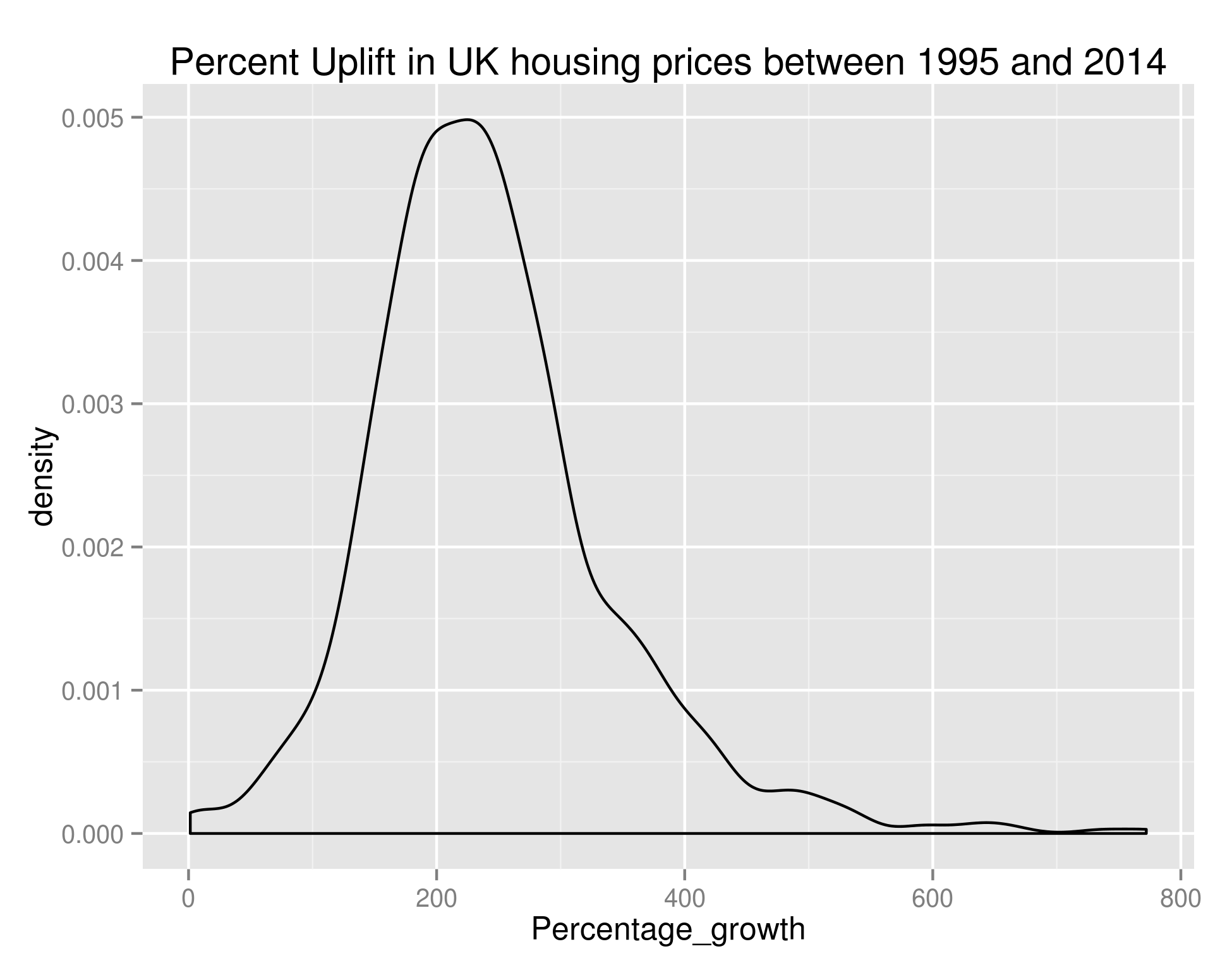
ggplot(long_growth_frame, aes(x=Percentage_growth)) + geom_density() + ggtitle("Percent Uplift in UK housing prices between 1995 and 2014")

giving us:

Growth in UK House Prices

Density of the Percentage Growth of Average House Price (by town) in the UK between 1995 and 2014

As we can see, the bulk of towns experienced between 100% and 400% growth in that time – if anybody can point me towards UK salary figures over that time period I think that’d be a nice set to join this with.

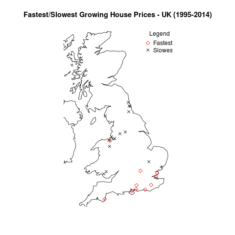
Anyway, let’s take what we’ve done in the previous post on house prices and plot the data on a UK map. There are too many points for me to reasonably plot all of them – let’s go with the top 20 (Red diamonds) and bottom 20 (black crosses):

ordered_growth_frame <- long_growth_frame[order(long_growth_frame$Percentage_growth),]
library(maps)
library(mapdata)
library(RCurl)
library(RJSONIO)
## A couple of functions allowing us to dynamically get the longitude and latitude of regions
construct.geocode.url <- function(address, return.call = "json", sensor = "false") {
  root <- "http://maps.google.com/maps/api/geocode/"
  u <- paste(root, return.call, "?address=", address, "&sensor=", sensor, sep = "")
  return(URLencode(u))
}

gGeoCode <- function(address,verbose=FALSE) {
  if(verbose) cat(address,"n")
  u <- construct.geocode.url(address)
  doc <- getURL(u)
  x <- fromJSON(doc,simplify = FALSE)
  if(x$status=="OK") {
    lat <- x$results[[1]]$geometry$location$lat
    lng <- x$results[[1]]$geometry$location$lng
    return(c(lat, lng))
  } else {
    return(c(NA,NA))
  }
}

map('worldHires',  c('UK', 'Ireland', 'Isle of Man','Isle of Wight'), xlim=c(-7,2), ylim=c(50.1,58.7))  
long_and_lat <- data.frame(sapply(paste(head(ordered_growth_frame, n=20)$Town, ", UK", sep=''), function(x) gGeoCode(x)))
row.names(long_and_lat) <- c("Latitude", "Longitude")
long_and_lat <- data.frame(t(long_and_lat))
points(long_and_lat$Longitude, long_and_lat$Latitude, col=1, pch=4)
long_and_lat <- data.frame(sapply(paste(tail(ordered_growth_frame, n=20)$Town, ", UK", sep=''), function(x) gGeoCode(x)))
row.names(long_and_lat) <- c("Latitude", "Longitude")
long_and_lat <- data.frame(t(long_and_lat))
points(long_and_lat$Longitude, long_and_lat$Latitude, col=2, pch=5)
title('Fastest/Slowest Growing House Prices - UK (1995-2014)')
legend("topright", legend=c("Fastest", "Slowest"), title="Legend", bty="n", pch=c(5,4), col=c("red", "black"), inset=c(-0.05,0))

giving us:

UK Growth Map

The towns with the fastest and slowest growth in average house price since 1995.

So it looks like the South Coast has been the place to buy houses in the last 20 or so years. And the North East/North West were the places to be avoided.

OK – that’s all well and good but it doesn’t really tell us anything about the area we should be buying houses in now. Hold your horses. I’m getting to that. Obviously we’re not really going to be able to learn anything looking at the price difference between the end of our ‘test’ period and the start of our ‘test’ period. We need to build our model over a subset of this data, and test it against the remaining data.

For my next trick (blog post) I’ll look at predicting the fastest growing regions. As a sneak peek, to do we’ll use growth % as the metric we’re trying to predict (a continuous variable) and we’ll create features out of the input data set. I don’t know which method we’ll use yet but it’ll be one of linear regression, SVM regression or neural networks. Likely whichever is best supported by the language I choose to use. I’ve used Libsvm before and found it very good so maybe that.

What we do in life echoes in eternity.

UK House Sales – When should estate agents go on holiday?

Hi all,

If you’ve been following all of these blog posts then you’re in a minority of one. However, you’ll also know that we’ve taken all of the UK house sales in the last 18 years or so and have found a bunch of things out. We’ve seen the spread of average house price by region, we’ve seen seasonality in the average house price, we’ve seen the impact the housing crash had on average house price (not that much) and on number of houses sold (an awful lot). Finally, we investigated seasonality of number of house sales by region and in doing so, found that London suffered the housing crash worse than other areas but almost immediately picked itself up and is in fact (relative to the rest of the country) better off than it was before the crash.

I had a couple of ideas for investigations in my last post – one of which was finding the most sold house in the UK and seeing if there was a correlation between the times a house has sold and its price. I’ll briefly tackle this because it’s one line of bash – working with our file pp-all.csv (all of our data in one big text file) the following command will give us the top 100 most sold properties in the UK in the last 18 years:


cut -d ',' -f5,9-15 pp-all.csv | tr -d '"' | tr ',' ' ' | sort | uniq -c | sort -k1 -n -r | head -n 100

The top 10 are as follows (with the format: # of sales | postcode | address ) :

24 L17 3BP 48 FLAT 5-19 ULLET ROAD LIVERPOOL LIVERPOOL MERSEYSIDE
19 W8 6JE 126 FLAT 1-10 LEXHAM GARDENS LONDON KENSINGTON AND CHELSEA GREATER LONDON
19 LS2 7LY 31 EASTGATE LEEDS LEEDS LEEDS WEST YORKSHIRE
16 SE1 3FF 41 FLAT 67 MALTBY STREET LONDON SOUTHWARK GREATER LONDON
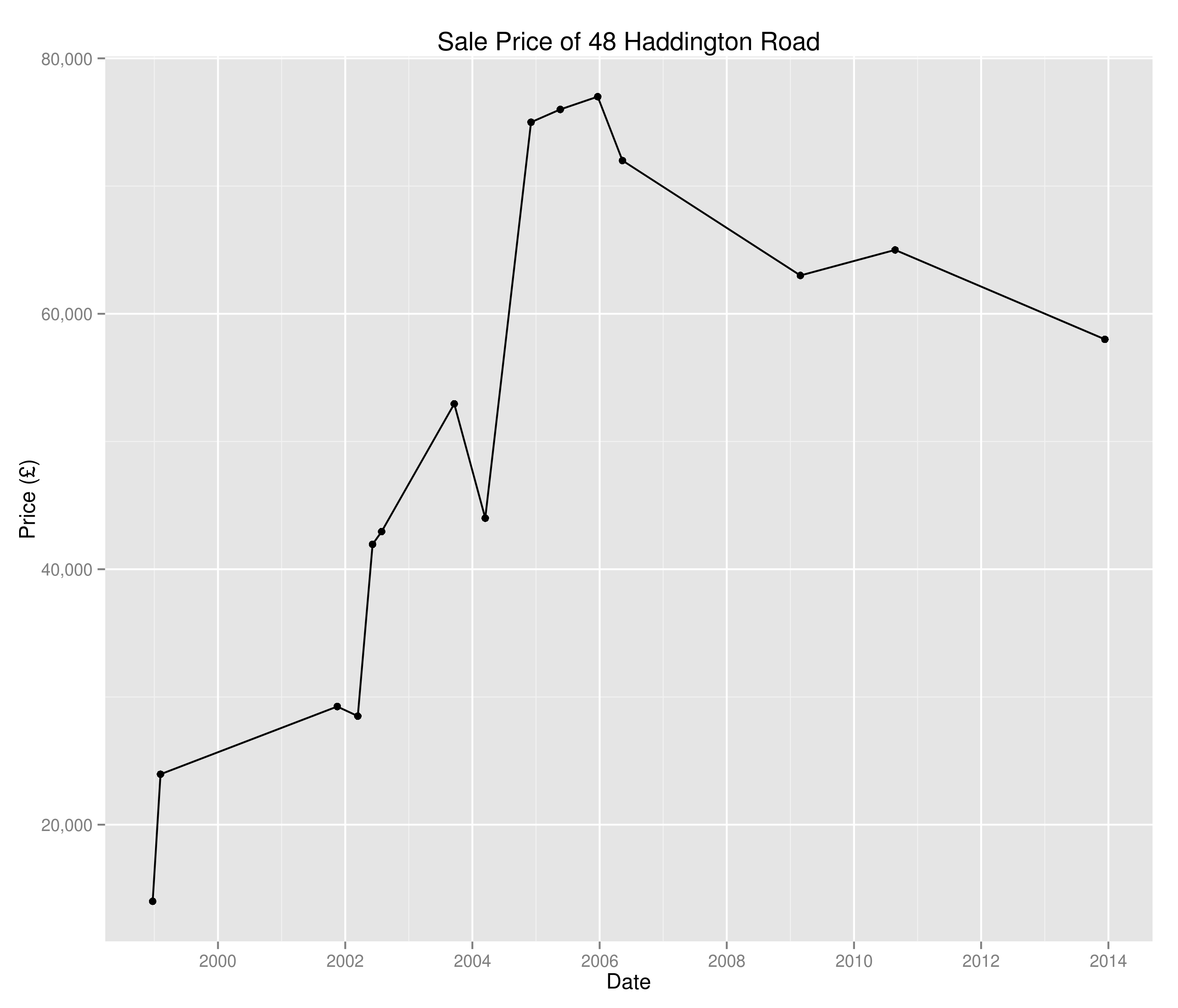
16 PL2 1RR 48 HADDINGTON ROAD PLYMOUTH CITY OF PLYMOUTH CITY OF PLYMOUTH
16 BN43 5AR SHOREHAM COURT 3-10 THE CLOSE SHOREHAM-BY-SEA ADUR WEST SUSSEX
15 IP1 3PW 54 ANGLESEA ROAD IPSWICH IPSWICH IPSWICH SUFFOLK
14 WA16 6JD TATTON LODGE 1-6 MOORSIDE KNUTSFORD CHESHIRE EAST CHESHIRE EAST
14 M3 6DE FRESH 138 APARTMENT 1008 CHAPEL STREET SALFORD SALFORD SALFORD
14 M19 2HF 35 CENTRAL AVENUE MANCHESTER MANCHESTER GREATER MANCHESTER

I decided against pursuing this investigation as a quick hunt on Zoopla tells me that flats 5-19 Ullet Road were sold individually and so we’re just seeing the results of grouping and nothing overly interesting. I guess there are certain houses in there of interest – why has 48 Haddington Road been sold 16 times since 1995?

Sale prices of 48 Haddington Road since 1995

Sale prices of 48 Haddington Road since 1995

I don’t really know and I’m not going to investigate – I think I’d rather look at the age old question:

“When should estate agents take holidays?”

Of course, this is every bit as much a question of where national estate agents should have their staff distributed throughout the year, which region removal companies should target throughout the year, where travelling housing surveyors are most likely to pick up business e.t.c.

In the last post we were able to create time series of the percentage of UK house sales a region was responsible for. Now we’re going to create a whole bunch of time series (one for each region) and perform clustering on them to see when each region peaks and troughs. Note we’re looking at a percentage of total sales here and not absolute numbers – I’m also not looking at the saturation of the market or anything like that.

I’m going to use Markov Clustering in this example – don’t worry too much about this (if you don’t want to), I’ll do a post on Markov Clustering at a later point. For now, all you need to know is that it’ll cluster our data in a sensible way.

So, down to business:

## Get the data I need in a small(er) table
library(reshape2)
library(rEMM)
mini_frame <- data.frame(newFrame$Datey, newFrame$Region, newFrame$Percent)
colnames(mini_frame) <- c("Datey", "Region", "Percent")
ts_frame <- dcast(mini_frame, Datey ~ Region, sum)
## Have found I need to initialize this before I kick off
seasonal_ts_frame <- data.frame(matrix(0, nrow=12, ncol=length(colnames(ts_frame)))
colnames(seasonal_ts_frame) <- colnames(ts_frame)
row.names(seasonal_ts_frame) <- factor(month.name, levels=month.name)
for (i in 1:ncol(ts_frame)) {
    decomposed_ts <- decompose(ts(ts_frame[,i], frequency=12, start=c(1995,1)))$seasonal[c(1:12)]
    seasonal_ts_frame[[colnames(ts_frame)[i]]] <- decomposed_ts
}
cor(seasonal_ts_frame)
emm <- EMM(threshold=0.2, measure="eJaccard")
build(emm, cor(seasonal_ts_frame))
cluster_centres <- data.frame(cluster_centers(emm))
cluster_frame <- data.frame(lapply(cluster_centres, which.max))
row.names(cluster_frame) <- c("Cluster")
cluster_frame <- data.frame(t(cluster_frame))
colnames(cluster_frame) <- c("Region", "Cluster")
cluster_one <- subset(cluster_frame, Cluster==1)
cluster_two <- subset(cluster_frame, Cluster==2)
## A list of all the cluster one regions
seasonal_ts_frame[,(names(seasonal_ts_frame) %in% row.names(cluster_one))]
## Now the biggie - let's see the points on a map
library(maps)
library(mapdata)
library(RCurl)
library(RJSONIO)

## A couple of functions allowing us to dynamically get the longitude and latitude of regions
construct.geocode.url <- function(address, return.call = "json", sensor = "false") {
  root <- "http://maps.google.com/maps/api/geocode/"
  u <- paste(root, return.call, "?address=", address, "&sensor=", sensor, sep = "")
  return(URLencode(u))
}

gGeoCode <- function(address,verbose=FALSE) {
  if(verbose) cat(address,"n")
  u <- construct.geocode.url(address)
  doc <- getURL(u)
  x <- fromJSON(doc,simplify = FALSE)
  if(x$status=="OK") {
    lat <- x$results[[1]]$geometry$location$lat
    lng <- x$results[[1]]$geometry$location$lng
    return(c(lat, lng))
  } else {
    return(c(NA,NA))
  }
}

## Plot a UK map
map('worldHires', c('UK', 'Ireland', 'Isle of Man','Isle of Wight'), xlim=c(-8,2), ylim=c(51.8,54.2))

longitude_and_latitude <- data.frame(sapply(paste(row.names(cluster_one), ", UK", sep=''), function(x) gGeoCode(x)))
row.names(longitude_and_latitude) <- c("Latitude", "Longitude")
longitude_and_latitude <- data.frame(t(longitude_and_latitude))
points(longitude_and_latitude$Longitude, longitude_and_latitude$Latitude, col=1, pch=4)

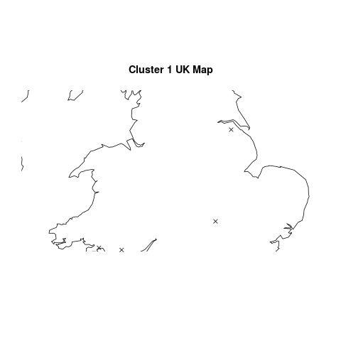
O.K, so there’s an awful lot of R code in there and all to produce a slightly underwhelming graph. Where does the great divide come in seasonality of house sales? Why, in South Wales and North East England of course:

Seasonality Cluster

Regions that break the national housing seasonality pattern

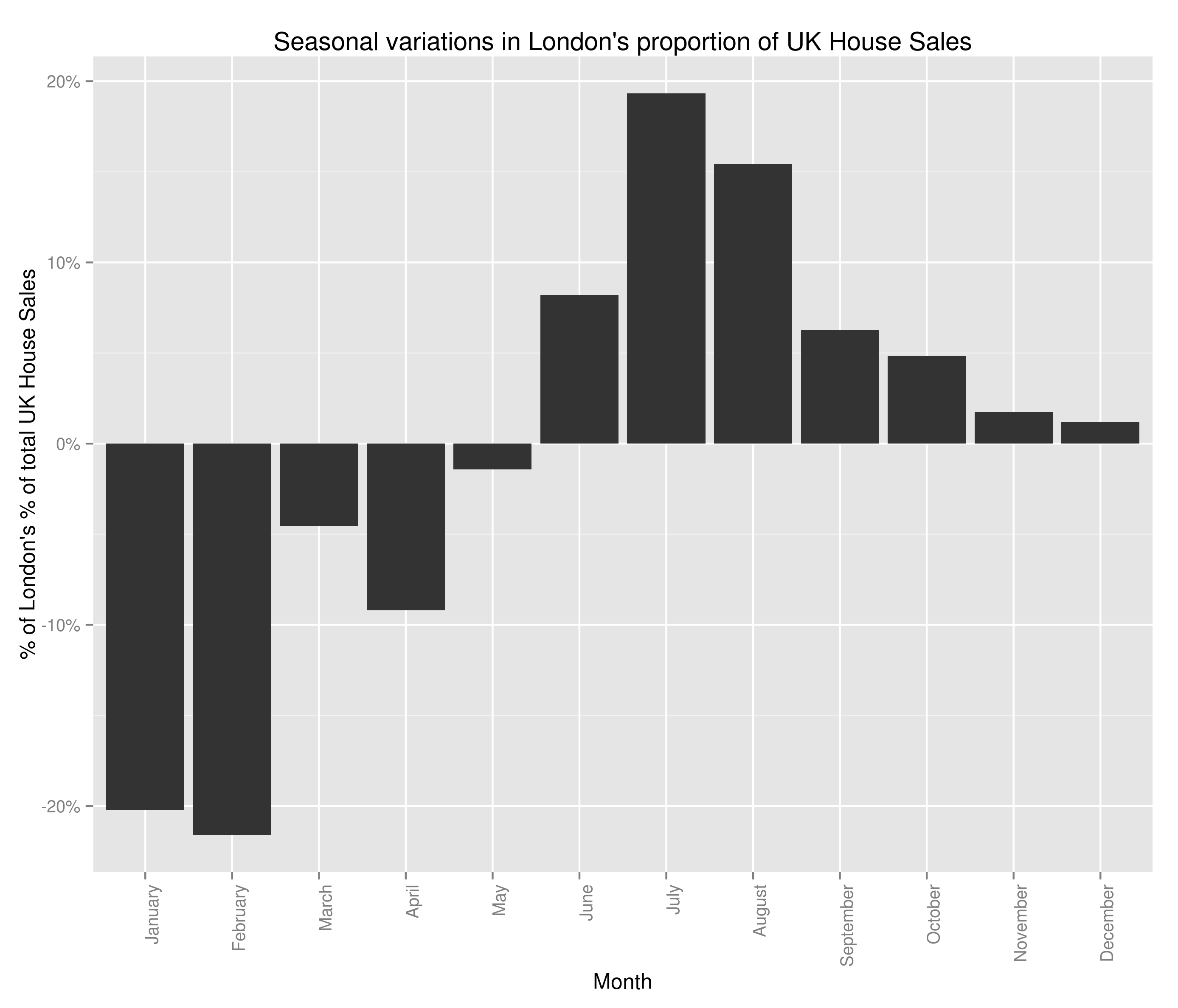
Semi-ignoring our ability to get accurate latitude and longitude using what was at best, a wildly optimistic attempt at doing so, we have some fairly believable (if confusing clusters). The bulk of the country follows the trend set by London:

Seasonal Variations in London's Percent of the UK Housing Market (by number sold)

Seasonal Variations in London’s Percent of the UK Housing Market (by number sold)

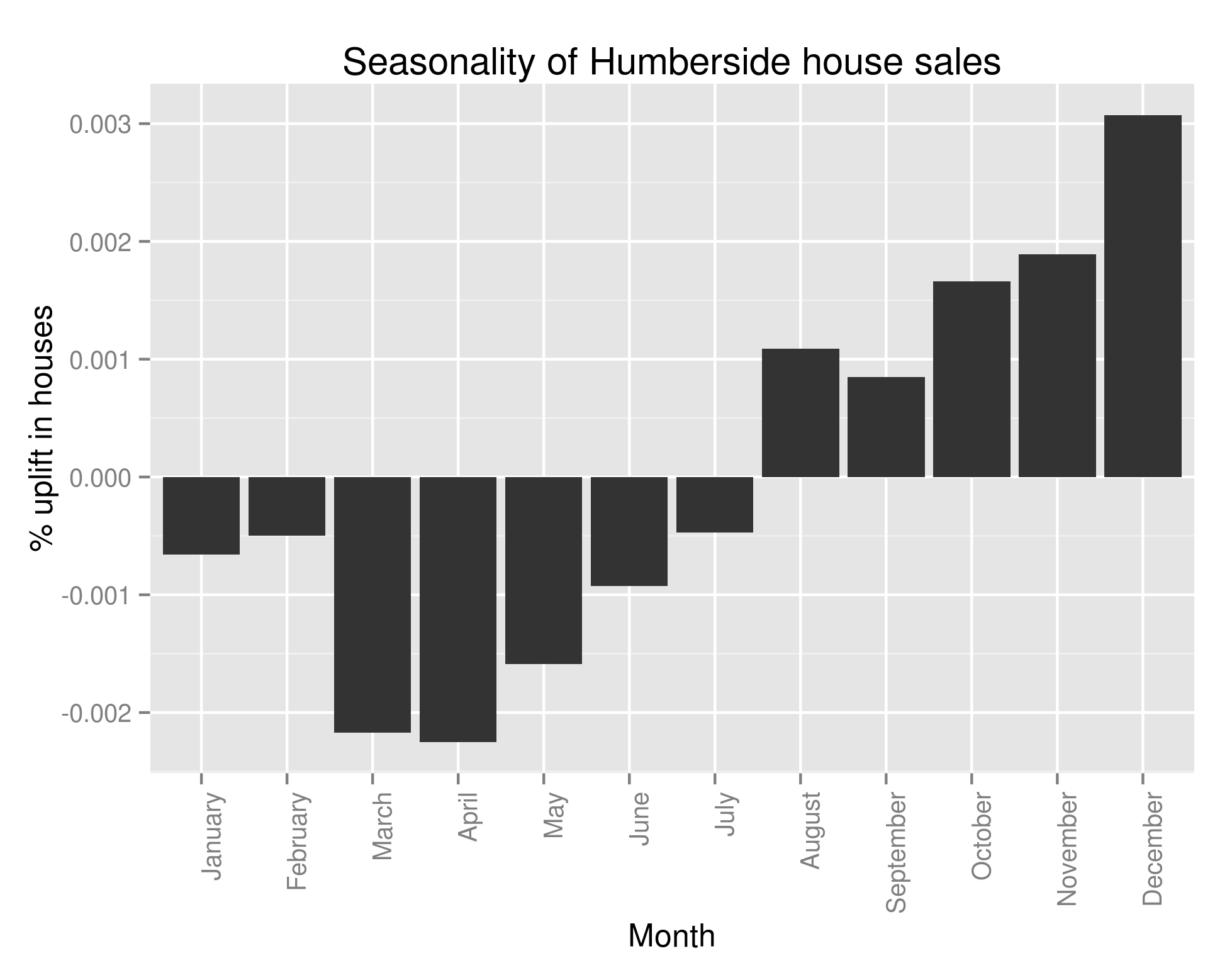
with lots of houses being bought in the summer and many fewer being bought in the winter. However, 6 regions in South Wales (including all of Glamorgan), 2 regions in the North East of England and Avon all follow this trend:

Seasonal Variations in Humberside's Percent of the UK Housing Market (by number sold)

Seasonal Variations in Humberside’s Percent of the UK Housing Market (by number sold)

This struck me as very strange indeed and so I looked at the original data and what should I discover? That almost all of the above analysis is wrong. If only we’d have performed the following query the folly of all that I’ve done would have become clear:

colSums(ts_frame==0) > 200

Every single one of the regions that didn’t follow our pattern had substantial missing data. One with more knowledge of British geography may have been able to spot that those counties had ceased to exist in 1995/6. The reason why I’ve left all that analysis in, aside from the fact that there are a few useful bits of code in there (plotting the regions on a UK map may well be helpful to somebody), is to show that it’s really really important to check your data when you’ve got an unexpected result. It’s also important to check it whatever the result, but in data analysis, if something seems dodgy there’s a good chance it is.

When I strip out all regions with missing data, we in fact see that all of the regions follows the same pattern as Greater London. Bugger.

Going to draw this one to a close – what have we discovered? Well, we now know that every single region in the UK follows the same seasonality pattern when it comes to house sales: lots more in summer than winter. We also know that the average house price follows the same trend. I’ve not shown that the regionality isn’t a factor in the increasing average house price (you could imagine the scenario where the more expensive areas see a greater surge in house sales in the summer than the less expensive areas). I’m not sure what I’m going to work on next – I’m getting a bit sick of house prices.

It’ll likely either be:
1.) Regional variations in average house price.
2.) Which regions see the greatest increase in number of house sales in summer – clustering as before.
3.) Seasonality of any other variable (type of house, new versus old, freehold versus leasehold)
4.) Build a predictive model to calculate something specific (number of old detached houses sold in Derbyshire every month for the next year).
5.) Identify towns with the fastest growing (and falling) average house price over the last x years. Try to use this to predict which areas will see similar areas of growth/decline in the future.
6.) Finding correlated stock opening/closing prices over historical data and using this to make £££££. Obviously that one is a bit different but does involve ££££.

UK House Sales – More Seasonality in Time Series with R

So the average sale price of houses in the UK is seasonal. Does that mean it’s sensible to advise house buyers to only purchase in the winter months? Let’s try to see.

I’m going to have a look and see if the data we have implies that the change in average sale price of a house with the month is actually just a function of some other monthly variation. I don’t really know how to go about doing this but it’s probably best to not let things like that stop me – I’m thinking the first port of call is likely calculate the correlation between the month each of the other factors (excluding price). If there’s a decent correlation (positive or negative) then we might be in trouble and will have to investigate that variable with a bit more seriousness.

Again, that’d be a delightfully easy task if I could hold the entire dataset in memory. Unfortunately I’m not that lucky and so I’ll have to do a bit of aggregation before importing the data to R/Python.

So my independent variables:

1.) Region
2.) Type of house
3.) New or old house
4.) Freehold or leasehold

I’m thinking of the work we did in the last blog post in Python and that that might be the best way to proceed; to generate vectors containing the average proportion of sales due to each ‘test group’ (the factors of the independent variable in question) in each of the relevant years. Once I’ve got that, I’m initially thinking of a twelve variant paired t-test. We’ve got 12 different months – in each month we’ve got a year for which each of the other test groups have a corresponding year, hence the choice of paired t-test. However, previously when I grievously abused the normality assumption required to run a t-test I had a whole bunch of data (800,000 points) and so I was sort of O.K with it. Now, I’ve got 18. We may have to investigate other options – Kruskal-Wallis being at the forefront of those. Anyway – let’s worry about that when we have to.

First things first, let’s get this data into a format we can load into memory:

awk -F, '{print $4"-"$(NF-1)}' pp-all.csv | cut -d '-' -f1,2,4 | tr -d '"' | tr '-' ' ' | sed -e 's/s+/-/' | sed -e 's/s+/,/' | sort | uniq -c | sort -s -nk2 | sed 's/^ *//' | sed -e 's/s+/,/' | awk -F, '{if ($3 != "2014-01") print $0}' > number_of_sales_by_region.txt

Again, a horrible one-liner that I’ll have to apologise for. All it does is give me an output file with the format: Count | Month | Region – off of the back of that I can now use R:

library(plyr)
library(ggplot2)
library(scales)
myData <- read.csv('number_of_sales_by_region.txt', header=F, sep=',', col.names=c("Sales", "Datey", "Region"))
## To store as a date object we need a day - let's assume the first of the month
myData$Datey <- as.Date(paste(myData$Datey, 1, sep="-"), format="%Y-%m-%d")
## I'm not too worried about January 2014 - it makes the lengths of the 'month vectors' uneven and ruins the below graphs
myData <- myData[format(myData$Datey, "%Y") < 2014,]
byYear <- data.frame(aggregate(Sales ~ format(Datey, "%Y"), data = myData, FUN=sum))
colnames(byYear) <- c("Year", "houseSales")
ggplot(byYear, aes(x=Year, y=houseSales)) + geom_bar(stat="identity") + ggtitle("Number of UK House Sales") + theme(axis.text.x = element_text(angle=90, hjust=1)) + scale_y_continuous(name="Houses Sold", labels=comma)
byMonth <- data.frame(aggregate(Sales ~ format(Datey, "%m"), data = myData, FUN=sum))
colnames(byMonth) <- c("Month", "houseSales")
byMonth$Month <- factor(month.name, levels=month.name)
ggplot(byMonth, aes(x=Month, y=houseSales)) + geom_bar(stat="identity") + ggtitle("Number of UK House Sales") + theme(axis.text.x = element_text(angle=90, hjust=1)) + scale_y_continuous(name="Houses Sold", labels=comma)

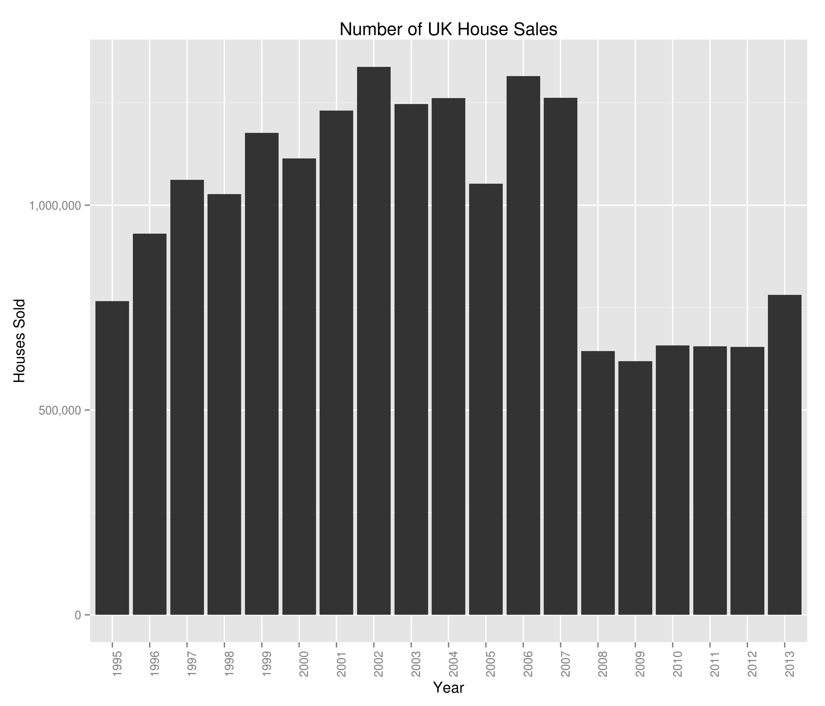
Giving us what’d I’d class as a couple of very interesting graphs:

Number of UK House Sales by Year

Number of UK House Sales by Year

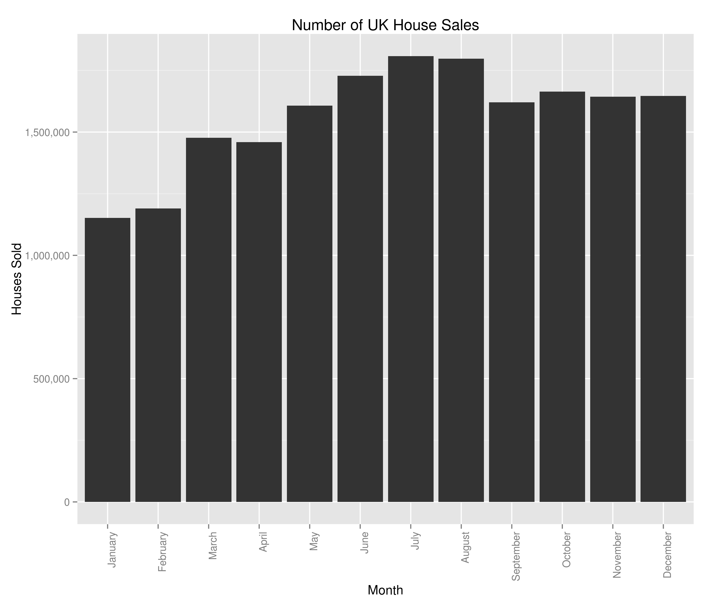
and:

UK House Sales by Month

Number of UK House Sales by Month

In terms of the housing crash, we saw it a bit in the average house sale price but we can see the main impact was a complete slow-down on the number of houses sold. There are potentially hints of a re-awakening in 2013 but I guess we’ll have to see how this year ends up panning out. The monthly variation is interesting and at first glance, counter-intuitive when viewed alongside the average house price data. Naively, you’d expect the average house price to be highest when fewer houses were being sold (what with number of houses being the denominator and all). I’m not too bothered in digging into the relationship between number of houses sold and average house sale price (I’ve got the feeling that it’s the sort of thing economists would concern themselves with) so won’t really be looking at that. I am however now at least a bit interested in the most sold houses in the UK – I don’t know what I’ll uncover but I’m marking it down as something to look at in the future.

Anyway, now we’ve had a first look at our data let’s see if we can track the proportion of UK house sales made by each region. There are likely a few ways to do this in R; I’ll be picking the SQL-esque way because I use SQL a lot more than I use R and so am more familiar with the ideas behind it. I’d be glad to be shown a more paradigmically R way to do it (in the comments):

myData$Year <- format(myData$Datey, "%Y")
myData <- merge(x=myData, y=byYear, by = "Year")
myData$Percent <- 100*(myData$Sales/myData$houseSales)
## I'm not very London-centric but given that they're the biggest house sellers in the UK...
londontimeseries <- ts(myData[myData$Region == 'GREATER LONDON',]$Percent, frequency=12, start=c(1995, 1))
london_decomposed <- decompose(londontimeseries)
plot(london_decomposed)
seasonality <- data.frame(london_decomposed$seasonal[c(1:12)])
colnames(seasonality) <- c("Sales", "Month")
ggplot(seasonality, aes(x=Month, y=Sales)) + geom_bar(stat="identity") + ggtitle("Seasonal variations in London's proportion of UK House Sales") + theme(axis.text.x = element_text(angle=90, hjust=1)) + scale_y_continuous(name="$ of London's % of total UK house sales", labels=percent)

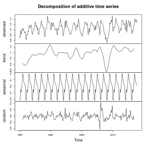
giving:

London's proportion of UK House Sales

The percent of UK house sales that were made in Greater London between 1995 and 2014 and inferences around the overall trend and seasonality

and the bit we were after:

Seasonal Variations in London's Percent of the UK Housing Market (by number sold)

Seasonal Variations in London’s Percent of the UK Housing Market (by number sold)

Well, I don’t really know if that’s good news or bad. It’s good in the fact that we thought to check the factors behind seasonal variations in house price. It’s bad because I can no longer advise people to buy houses in the winter (I’ve checked and there’s a seasonal variation for every region I tried). In all honesty, I think the two graphs above are really interesting. I’m saying that the housing crash effected London more strongly than the rest of the country, but that the market in London bounced back within a year and is now above pre-crash levels. The size of the seasonal variations is pretty marked as well, with 20% swings either way from London’s mean value of percent of total house sales (sorry if the language seems verbose – I’m being careful to be precise).

What does this mean for our investigation into the seasonality of the average house price? Well, I’m confident that the average house price is seasonal but I’m also confident that we can’t use that to advise people when they should be selling their house (just yet).

There are a couple of pieces of analysis I’d now like to do on this data. I think it’d be really interesting to get an idea of the ‘most-sold’ house in the UK since 1995. I also think there may be surprises around the correlation between the number of times a house is sold and its selling price. However, this seasonality by region is also really interesting and I think I’d like to try to cluster regions based on the seasonality of their housing market. It’d be interesting to graph the clusters and see if the divide is North/South, City/Country or something else entirely. Additionally, the (G.C.S.E) economist in me is screaming out for the same investigation as above but with total sale price instead of number sold.

© 2024 DogDogFish

Theme by Anders NorenUp ↑