Data Science, amongst other things.

Category: Data Visualisation

Centre of the Edinburgh Fringe Festival 2017

Centre of the Fringe Festival 2017

See a few posts below for the full details of the map – basically it’s the weighted centre of the Fringe festival.

FAQ

  • That looks obviously wrong. Are you sure it’s right?
    • Honestly, no. Seems pretty fishy to me too. I’ll investigate if I get time but in all honesty, I just ran the same scripts as I wrote last year and it all seemed to work and output answers. This was honestly not much effort at all.
  • Did anybody get you a drink last year as a result of this?
    • No.
  • So it looks like the overall centre of the Fringe moved. Where has it moved to?
    • Basically directly over my work. If you’re in the area and fancy a coffee give me a shout.
  • Can you really call them FAQs if nobody has ever asked any of them?
    • You wouldn’t have thought so, and yet here we are.
  • How do you calculate this again?
    • See the post from last year. Any more questions and let me know.
  • Can I have the scripts so I can run it and do a better job than you?
    • Yes, but let me know. It kind of involves scraping the Fringe website and I don’t want to put that out in the public domain.
  • Given it seems obviously wrong, couldn’t you have checked before posting?
    • Follow-up questions aren’t encouraged. But, it turns out by chance that I posted last years version of this exactly a year ago and I thought I mayerswell try to get this out tonight.


So it goes.

Centre of the Edinburgh Fringe Festival

What is that map all about?

It shows the weighted centre of all of the shows at this year’s Edinburgh Fringe Festival. If you want to be at the centre of the action, staying near there isn’t a bad idea. Use the filters to show you where the centre is for different categories (Theatre, Comedy etc.).

Go On…

Ingredients

  • All of the Fringe shows (with date, time, category and subcategory)
  • All of the Fringe venues (with latitude and longitude)

Recipe

  • Apply a weighting to each show, which is just the number of times it’s on.
  • Get the longitude and latitude of that show’s location.
  • For each subcategory, category, and overall, find the midpoint (according to the weightings calculated above).
  • Plot

Easy. No fuss.

If you’re still curious, ask away. If you’d like to give me beer because I put your bar near the centre of things, good. Do. If you’d like me to find the midpoint of something, let me know. If you’d like me to stop promising to write more and then not doing so, sorry, that’s just unrealistic.

My geekness is a-quivering.

p.s. if there’s sufficient interest I’ll do a tutorial on how to get the data, find the midpoints and then put together the visualization.

Finding Topics in Harry Potter using K-Means Clustering.

I’ll open up with the money-shot – these are all of the clusters that I was able to find using the whole Harry Potter and grouping by chapter:
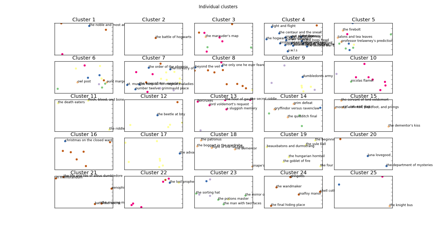
all_clusters_subplot

Every cluster plotted separately.

That’s far too messy to be of any practical use so let’s have a look at a couple of those clusters in more detail:
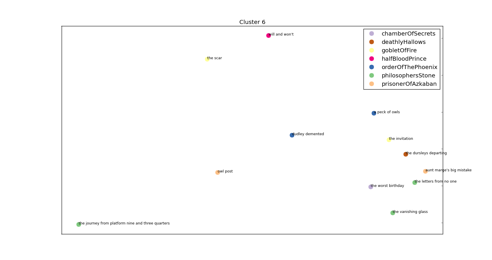
Privet Drive Cluster

One of the clusters – a Dursley/Privet Drive heavy cluster!

and
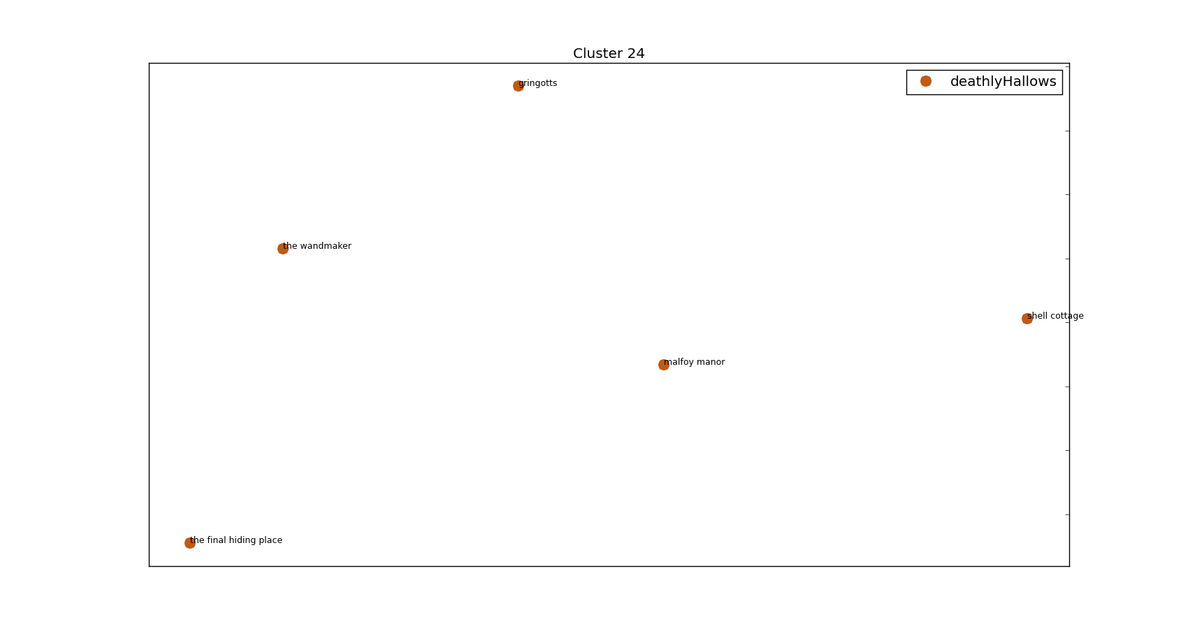
Cluster-23

This is a pretty Griphook/Goblin heavy cluster featured on the storyline in book 7.

Hopefully that’s piqued your interest enough to continue on scrolling and see how we got these clusters – and see the words that tie them all together! The code for generating these is on my Github (https://github.com/Kali89/HarryPotterClusters) and all the graphs and documents are contained there.

I went to a really interesting talk at PyData that was about Latent Dirichlet Allocation, a topic entirely new to me. I thought I’d love to apply it to my favourite book series – Harry Potter. However, that didn’t happen…instead you get this. A heavy rip off of an excellent post (http://brandonrose.org/clustering) that walks through how to cluster documents using a bunch of techniques including K-Means.

Step 1

Get plain text copies of all the Harry Potter books and make sure they’re all formatted in roughly the same way. As is often the case, this step took bloody ages.

Step 2

I want a few different documents – more than 7 (the number of Harry Potter books for the heathens out there) but substantially less than the number of sentences in all 7 books. Treating each chapter as a separate document seemed to make most sense and so here I initialise everything I need and split my books into chapter.

So at this point we’ve nicely got ourselves a list of chapter titles and a list of the associated text (as a string).

Step 3

Now we’ve got our chapters we’re going to want to tokenise the text in them. Basically this means converting a string into discrete tokens – what we’d think of as words. The reason it’s got a fancy name and I’m being a bit careful about my terminology is because tokenisation also takes care of things like punctuation and isn’t as simple as just splitting a string into separate words. Having said that, I’ve basically taken the path of least resistance and so have gone with a very simple tokenisation scheme. I’m also going to skip over the pain of utf-8 encoding/decoding/recoding. I’ve basically just dropped any character that I’ve found in the least bit complicated.

Step 4

Next I’m going to perform TF-IDF on my chapters. Here, I convert each token into a number and look at how many times that token appears in a given document, and how many documents that token appears in overall. So in this instance I’m looking to see how often a given word appears in this particular chapter and in how many chapters throughout all 7 books the token appears in. This gives us an idea of how important/prominent a word is in a given chapter, taking into account how common the word is throughout all the chapters. As an example ‘Harry’ is likely to feature a lot in a given chapter but also is likely to feature in every chapter and so probably isn’t especially important to any given chapter’s classification. ‘Nicolas Flamel’, however, is going to appear a reasonable amount in a few chapters but not at all in all the rest. We therefore know that Nicolas Flamel is important in the chapters he does appear in.

Luckily, I don’t have to worry about the implementation of TF-IDF – sklearn has got it.

This gives me a large sparse matrix with the TF-IDF score for each word in each document as the entries. If you pay close attention to the parameters I’ve passed along to TfidfVectorizer as they are ripe for the changing. Firstly, `max_df=0.75` is saying that I don’t care about words that appear in more than 75% of the chapters. `min_df=0.05` is saying that I don’t care about words that appear in fewer than 5% of chapters. You can see I passed along my tokeniser and that I’m using English stop-words (that is, I’m removing the most common English words). Finally, I’m generating n-grams between 1 and 4.

For those uninitiated with n-grams they’re basically a way of splitting text up into handy little chunks. As an example, 3-grams of the following sentence:

“This is not the greatest song in the world”

would be:

“This is not”, “is not the”, “not the greatest”, “the greatest song”, e.t.c.

This allows me to pick out common phrases such as “Snape said” and “wizarding world”. Again, that’s a setting that is begging to be played about with.

Step 5

Performing K-means clustering we get output like so:


Cluster 18 words:
Top words: maxime,madame maxime,karkaroff,madame,hagrid,cedric,moody,krum,champions,tournament

Chapter: the hungarian horntail, Book: gobletOfFire
Chapter: the goblet of fire, Book: gobletOfFire
Chapter: the four champions, Book: gobletOfFire
Chapter: beauxbatons and durmstrang, Book: gobletOfFire
Chapter: the beginning, Book: gobletOfFire
Chapter: the yule ball, Book: gobletOfFire

which is obviously quite a handy little cluster. It’s successfully managed to only take chapters from one book (given that we’ve not allowed K-means access to the book information that is a bit of a triumph). For those aware of Harry Potter you’ll see this is a Triwizard Tournament heavy cluster. Another example:


Cluster 10 words:
Top words: wormtail,cold voice,voldemort,lord,cauldron,riddle,cedric,man,master,faithful

Chapter: the riddle house, Book: gobletOfFire
Chapter: flesh, blood, and bone, Book: gobletOfFire
Chapter: the death eaters, Book: gobletOfFire


Again, all the clusters are from one book – I’m counting that as a result. Added bonus, they’re not sequential chapters! I happen to know (by being a massive Harry Potter geek) that these chapters are towards the start and end of book 4 and focus heavily on Voldemort and Peter Pettigrew.

So far so good and in fact I could stop here but wouldn’t it be nice to visualise those clusters so we can see the topics we’ve picked out graphically? Even if you said no then it doesn’t really matter. I’m still going to do it.

Step 6

First things first, let’s plot all of the chapters on one graph and colour code them with the book from which they came. It’s not a great way of visualising clusters but it is a great way of seeing how everything is laid out:
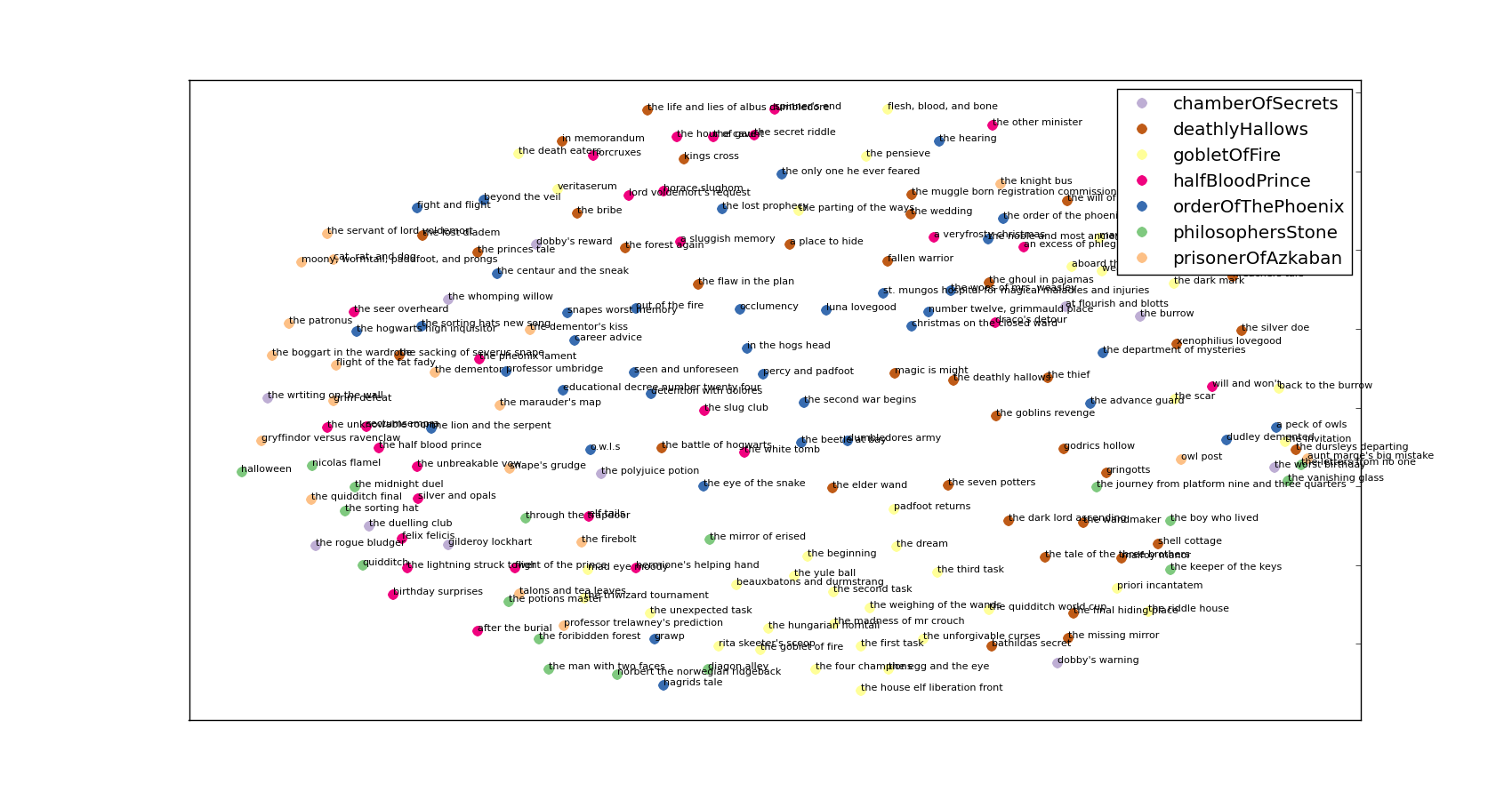
all_clusters

A messy picture of all the chapters projected into 2d space.

Again, this section is shamelessly copied from the aforementioned blog but ultimately we’re projecting the cosine differences between the tf-idf matrix terms into 2-dimensional space. I declare a colour dictionary for each of the books and then rattle through the chapters plotting them.
I’m sure you’ll agree that’s far too messy for anybody to really do anything with. If you’re following along with the code you’ll see that next I generate the subplot figure shown at the top.

Finally, I create plots for each of the clusters – a few examples of which are:


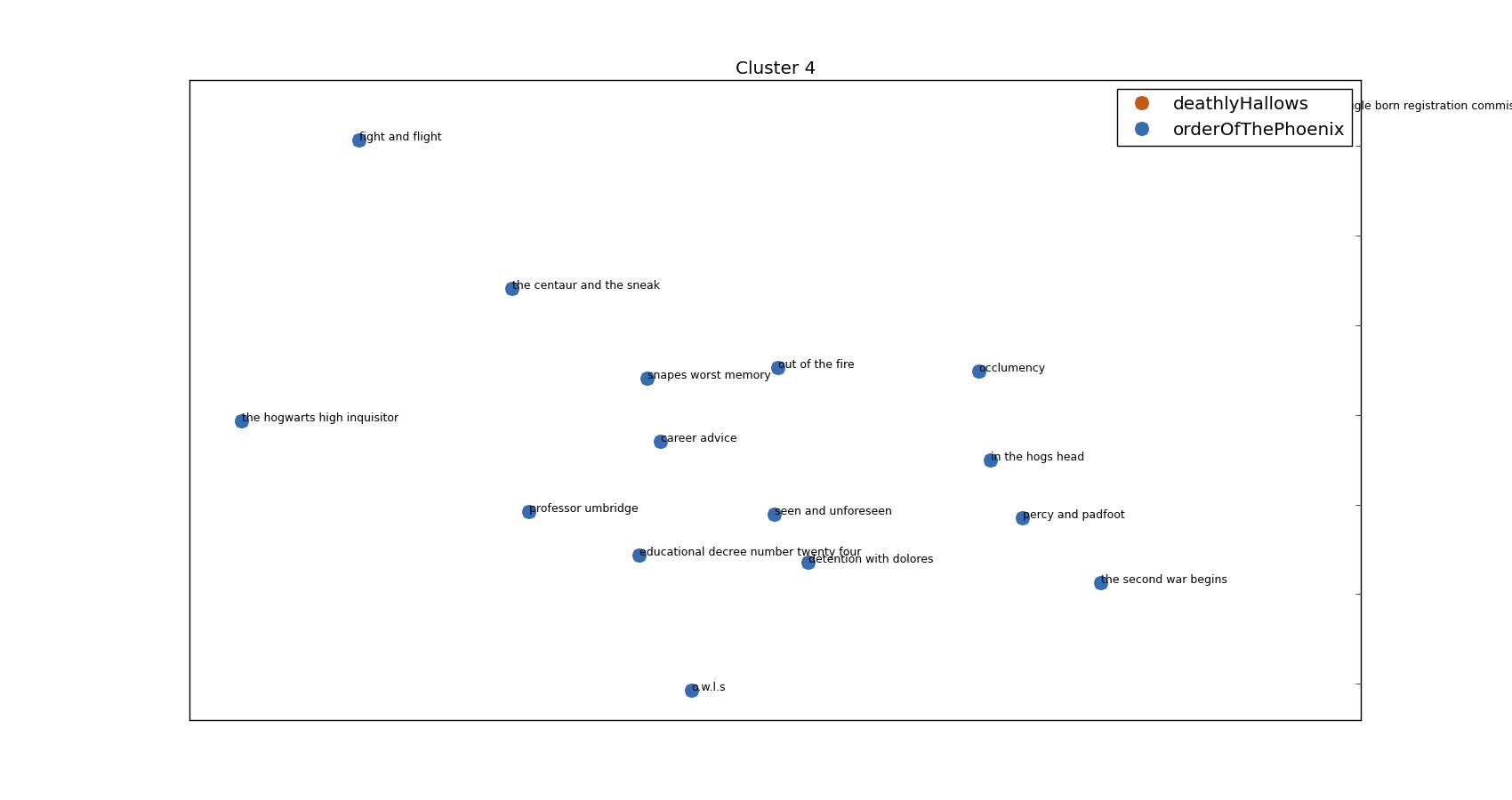
Cluster 3 words:
Top words: umbridge,professor,dont,professor umbridge,snape,sirius,im,said hermione,harrys,youre

Chapter: the muggle born registration commission, Book: deathlyHallows
Chapter: the hogwarts high inquisitor, Book: orderOfThePhoenix
Chapter: o.w.l.s, Book: orderOfThePhoenix
Chapter: the second war begins, Book: orderOfThePhoenix
Chapter: educational decree number twenty four, Book: orderOfThePhoenix
Chapter: the centaur and the sneak, Book: orderOfThePhoenix
Chapter: percy and padfoot, Book: orderOfThePhoenix
Chapter: detention with dolores, Book: orderOfThePhoenix
Chapter: occlumency, Book: orderOfThePhoenix
Chapter: in the hogs head, Book: orderOfThePhoenix
Chapter: out of the fire, Book: orderOfThePhoenix
Chapter: professor umbridge, Book: orderOfThePhoenix
Chapter: fight and flight, Book: orderOfThePhoenix
Chapter: seen and unforeseen, Book: orderOfThePhoenix
Chapter: career advice, Book: orderOfThePhoenix
Chapter: snapes worst memory, Book: orderOfThePhoenix

generates:
Umbridge's cluster

Umbridge’s cluster

Everybody’s favourite professor – Dolores Umbridge!

And another:

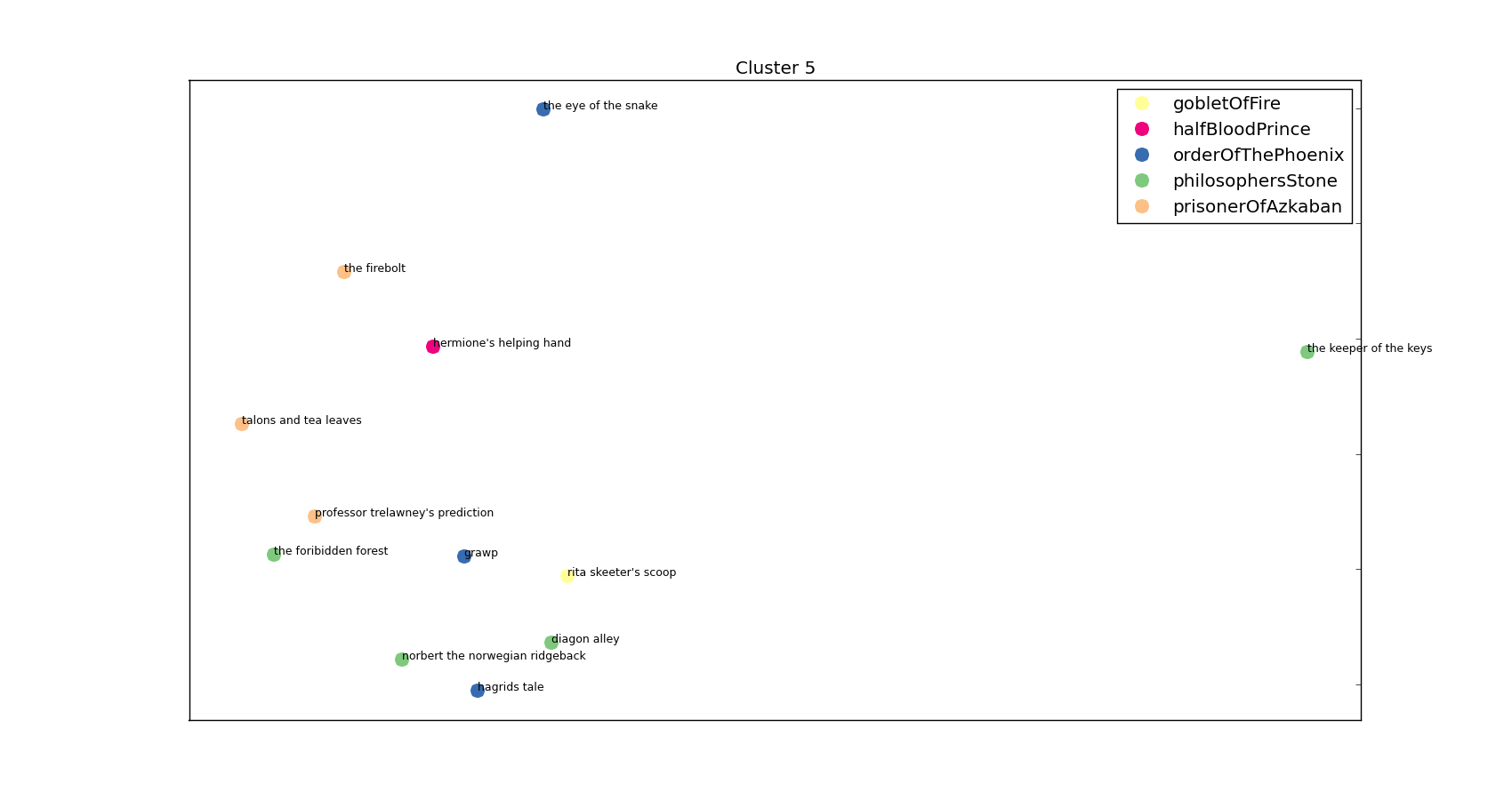
Top words: hagrid,yeh,ter,said hagrid,professor,said hermione,malfoy,o,professor trelawney,trelawney

Chapter: professor trelawney's prediction, Book: prisonerOfAzkaban
Chapter: talons and tea leaves, Book: prisonerOfAzkaban
Chapter: the firebolt, Book: prisonerOfAzkaban
Chapter: diagon alley, Book: philosophersStone
Chapter: the foribidden forest, Book: philosophersStone
Chapter: the keeper of the keys, Book: philosophersStone
Chapter: norbert the norwegian ridgeback, Book: philosophersStone
Chapter: hagrids tale, Book: orderOfThePhoenix
Chapter: the eye of the snake, Book: orderOfThePhoenix
Chapter: grawp, Book: orderOfThePhoenix
Chapter: hermione's helping hand, Book: halfBloodPrince
Chapter: rita skeeter's scoop, Book: gobletOfFire


and visually:
Grawp's brother

Keeper of the Keys

The anti-Umbridge – it’s Hagrid’s cluster!

I’ll stop on the random copy/pasting of the clusters and stick them all on my Github – I think you’ve got the idea! All in all I’m pretty happy with how this has worked but I am very dependent on individual character names. I tried just looking at 2-grams but it usually just gave me ” said” with a few exceptions (‘wizarding world’, ‘said softly’, ‘death eater’, ‘godrics hollow’). I’ve also put almost zero effort into formatting the images – you know roughly what it’s meant to look like: having the pictures look good is an exercise I’m leaving to the reader’s imagination.

There’s loads more stuff I could do but I’m going to eat a chicken and go swimming so it’ll have to wait.

All was well.

Bayesian Testing of Conversion Rate

Hi all,

I’m on a train to the Fringe festival and I’ve managed to bag myself first class tickets! What this means is that I’ve got about 3 hours to kill, unlimited free wine (who knew that was thing!?) and a fairly flaky internet connection. All of that goes together to make now the perfect time to share with you a bit of work I’ve been up to recently.

Firstly, massive props to this particular book: Probabilistic Programming & Bayesian Methods for Hackers

It’s really really good and this testing is just a minor reworking of one of the examples in the book – they say imitation is the sincerest form of flattery no?

Anyway, enough of the wine-induced babbling, on with the Bayesian testing…

The setting of the scene

What I’ll be looking to do here is identify changes in conversion rate (can be any kind of conversion, I’ll use orders/visitors but it doesn’t really matter) in historical data. The reason I say historical data is thusly: this is a good technique for identifying a visualizing changes but it isn’t as good as running a legitimate A/B test. Ideally, we’d implement the change (whatever it is) for one group of customers and not for the rest of the customers and measure relative performance. However, let’s assume that, for whatever reason, you’re looking over a bunch of (conversion) data trying to identify a change.

I’ll artificially generate data so you can run similar examples and get an idea of what our data source looks like:

#!/usr/bin/python

import random
import numpy as np

total_points = 50

## Generate a list containing the number of trials
trials = [random.randint(20,100) for _ in range(total_points)]
results = [np.random.binomial(value, 0.4) if total_point/2 else np.random.binomial(value, 0.3) for index, value in enumerate(trials)]

for trial, result in zip(trials, results):
    print "%dt%d" % (trial, result)

where in our example, trials is going to be the number of visitors on successive days and results is going to be the number of orders.

Pipe that into a file (python generate_conversions.py > conversion_data.txt ) and we’ve got ourself a nice list of conversion data with a change in the rate at some point (halfway in this example) through the data.

The Bayesian Bit

So the idea behind Bayesian statistics revolves around priors and posteriors – your prior is going to be a distribution that represents your (shocker) prior ideas about the result. You’re going to update this prior hypothesis with data as you get it and when you do so the resulting distribution is called the posterior. This is great for a number of reasons – my favourite two are:

  1. You get to set a prior that influences the final outcome. If I’ve got fairly strong ideas about what the conversion rate is (say I think it very likely lies between 80% and 90%) I can reflect that in my prior. When we start any frequentist (non-Bayesian) calculations we assume every probability between 0% and 100% is equally likely – generally that’s not the case.
  2. The final result is a distribution. Distributions are great for visualization, allow for easy comparisons against other distributions and are really easy to show uncertainty on. Do away with all the talk of p-values and show a graph with two ‘conversion distributions’ on and you’re on to a winner.

Shut up and Calculate

Code first – then commentary:

#!/usr/bin/python

import pymc as pm
from matplotlib import pyplot as plt
import matplotlib.dates as mdates
import numpy as np
import datetime

basket_list = []
conversion_list = []

with open('conversion_data.txt', 'rb') as f:
    for line in f:
        baskets, conversions = line.strip().split()
        basket_list.append(int(baskets))
        conversion_list.append(int(conversions))

n_percent_list = len(basket_list)

uniform_one_samples = []
uniform_two_samples = []
tau_samples = []
uniform_one = pm.Uniform('uniform_one', 0, 1)
uniform_two = pm.Uniform('uniform_two', 0, 1)

tau = pm.DiscreteUniform('tau', lower=0, upper=n_percent_list)

@pm.deterministic
def lambda_(tau = tau, uniform_one = uniform_one, uniform_two = uniform_two):
    out = np.zeros(n_percent_list)
    out[:tau] = uniform_one
    out[tau:] = uniform_two
    return out

observations = pm.Binomial('obs', n=basket_list, p=lambda_, value=conversion_list, observed=True)

model = pm.Model([observations, uniform_one, uniform_two, tau])
mcmc = pm.MCMC(model)
mcmc.sample(10000, 2500, 1)

uniform_one_samples = mcmc.trace('uniform_one')[:]
uniform_two_samples = mcmc.trace('uniform_two')[:]
tau_samples = mcmc.trace('tau')[:]

N = tau_samples.shape[0]

conversion_rate = np.zeros(n_percent_list)
for day in range(0, n_percent_list):
    ix = day < tau_samples
    conversion_rate[day] = (uniform_one_samples[ix].sum() + uniform_two_samples[~ix].sum()) / N

plt.subplot(411)
plt.tight_layout()

plt.plot(range(n_percent_list), 100.*conversion_rate, lw=4, color='#E24A33', label='Expected conversion rate')
plt.xlim([0, n_percent_list])
plt.ylim([0,100])
plt.xlabel('Day')
plt.title("Changes in the probability of conversion")
plt.ylabel('Expected conversion rate')
plt.bar(np.arange(n_percent_list), [100.0*convert/basket for convert,basket in zip(conversion_list, basket_list)], color='#348ABD', alpha=0.65, label='Observed conversion rate')
plt.legend(loc='upper right')

ax = plt.subplot(412)

#
plt.hist(uniform_one_samples, histtype='stepfilled', bins=50, alpha=0.85, label="posterior of initial conversion probability", color='#A60628', normed=True)
plt.legend(loc='upper left')

plt.xlim([min(uniform_one_samples),max(uniform_one_samples)])
plt.xlabel("Probability of Conversion")
#
ax = plt.subplot(413)
#
plt.hist(uniform_two_samples, histtype='stepfilled', bins=50, alpha=0.85, label="posterior of later conversion probability", color='#7A68A6', normed=True)
plt.legend(loc='upper left')
plt.xlim([min(uniform_two_samples),max(uniform_two_samples)])
plt.xlabel("Probability of Conversion")
#
#
plt.subplot(414)
w = 1.0/tau_samples.shape[0] * np.ones_like(tau_samples)
plt.hist(tau_samples, bins=n_percent_list, alpha=1, label="posterior of conversion change date", color='#467821', weights=w, rwidth=2.)
plt.xticks(np.arange(n_percent_list))
#
plt.legend(loc='upper left')
plt.xlim([0, n_percent_list])
plt.xlabel("Day of change")
plt.ylabel('P(change occurred)')
#


plt.show()

That’s a fair bit of code – what I’m doing isn’t that complicated. After importing, defining and grabbing the conversion data that we generated in the first script we declare uniform_1 and uniform_2.

We’re going to say that our data ultimately comes from a Binomial distribution where people convert with probability p. However, we are going to say that at some time (given in this example as tau) the value of p changed. p is the conversion of a Binomial distribution and so saying that p changes at some point means we’re saying our conversion rate changed.

Firstly, I declare my priors – I say that uniform_1 and uniform_two, or the conversion before and after the change we’re trying to identify, are both drawn from a uniform distribution that runs between 0 and 1. I’m saying I think the conversion is equally likely to everywhere between 0 and 100%. If you’re doing this properly I’m sure you can improve on this (I’d advise looking into the Beta distribution) but with sufficient data the uniform distribution should work fine.

So, at this point we’ve got the distributions from which our p-values are drawn described by uniform distributions – our first pair of priors.

Next, I declare tau – the time at which our conversion rate changed. I’m using a discrete uniform distribution and saying that it could have happened with equal probability at any time between the first day and the last day. If you’re looking to identify when the biggest change in conversion occurred I’d advise using a discrete uniform distribution. If you’re trying to identify the effect a change on a particular day had then you can be more creative with this prior.

Now we declare _lambda. For the eagle-eyes pseudo-coders amongst you, I’m sure it’s clear but this represents our complete prior belief about the conversion rate (p of a Binomial). We say we think the value of p follows uniform_1 up until tau and then switches to uniform_2.

Then we let pymc take over – we specify our distribution is a binomial with as many trials as we generated in the first script, and with the probabilities given in _lambda. We tell pymc that we obtained the values we’re passing to it and created our distribution. I’m not going to go in what wizardy follows but check out chapter 3 of the book I mentioned at the start if you’re interested. What we end up with (when we grab the traces) is 10,000 numbers drawn from posterior distributions we’ve generated from uniform_1, uniform_2 and tau.

The final calculation builds a vector of Booleans for each day of the data set specifying whether the day is less than each of the 10,000 samples drawn from the tau distribution, or greater than the tau. Then we go along that 10,000 element boolean vector and create a sum – if the day number was less than the tau we take whatever is in the uniform_1 list at that point, otherwise taking what is in the uniform_2 point. Finally dividing by the number of points we drew, we can get an idea of the expected conversion rate (expected value of _lambda).

I get that that section is a bit complicated but if you get it:
a.) I’ve not had enough wine
b.) You’ve got the idea behind the testing so far.

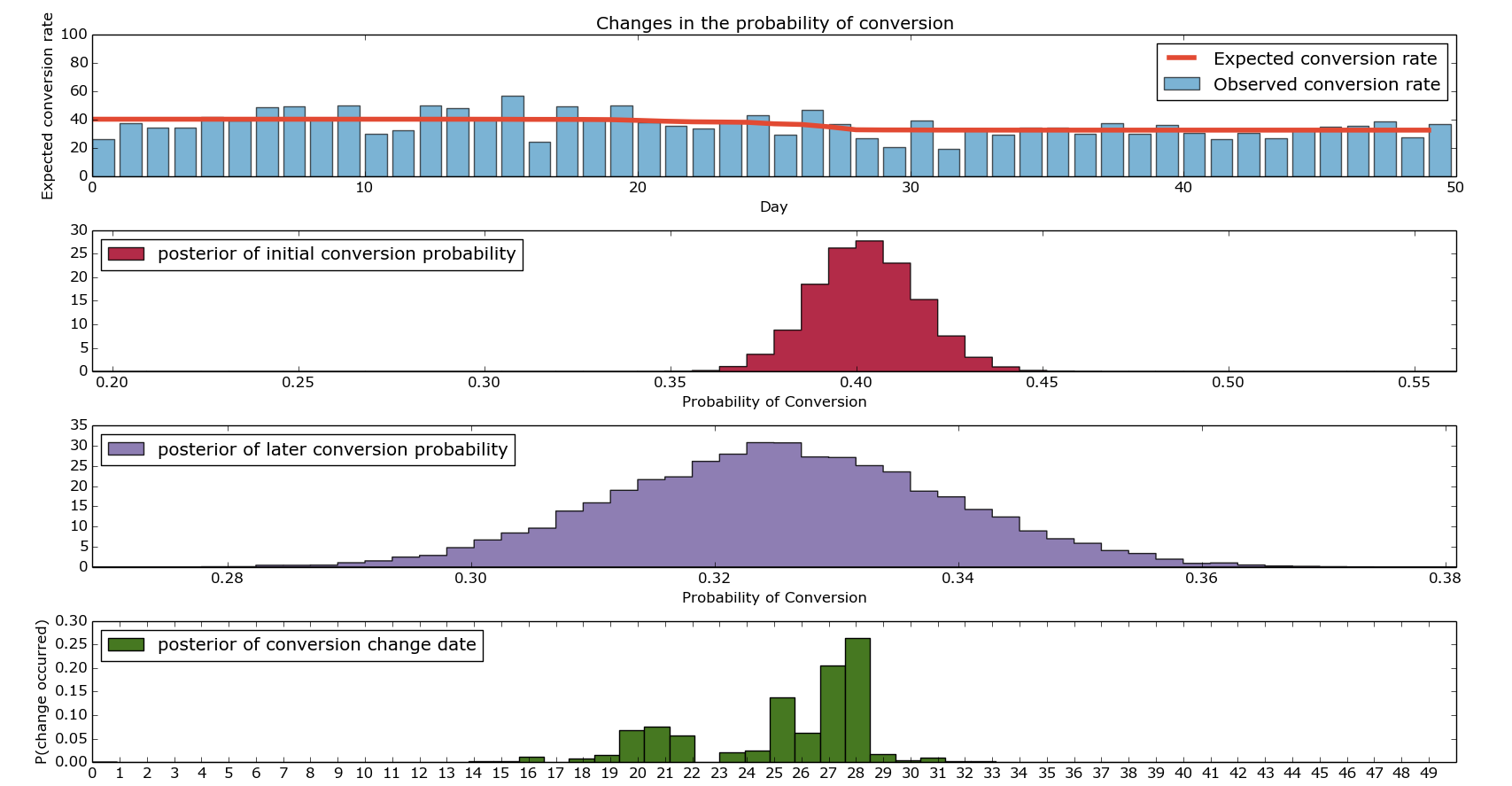
Finally, there’s a lot of Matplotlib plotting stuff all leading us towards the following beautiful picture:

https://dogdogfish.com/wp-content/uploads/2014/08/simple_bayesian_testing.png

Basic Bayesian Conversion Testing/Change Recognition

I hope that shows more clearly what I’ve been trying to explain. Firstly, the top graph shows our expected and our observed conversions. The bars show our ‘actual conversion rates’ on given days – these were the values we artificially generated. The red line is the output of our model discussed in the final point above. The second and third graph show the distributions of the conversion rate from before the change and after the change. If you’re looking to paint a compelling picture, I’d advise putting them both on the same axis, drawing them as densities (not histograms) and adding lines at the 95th percentiles. Finally, the bottom graph shows us when we change in conversion rate likely changed. As you can see, it’s fairly heavily concentrated around the middle (good) but there’s quite a wide range of days around there where it could be.

I’ve found that in practice, it makes sense to run these simulations multiple times (they don’t take very long) and concatenate the results together when working out when a change occurred. I’ll leave that as an exercise given how long this post already is – there’s  a picture of what it looks like at the bottom – the posteriors of the conversion probabilities get a bit messy.

So there we have it – it’s been a bit of a slog and the woman who brings the wine round the train has started laughing when she pours me a new glass (surely a troubling sign). However, we’re now able to run Bayesian conversion tests like a boss and visualize them in a really funky kind of way.

As always, comments are welcome, questions too.

The Lannisters send their regards.

p.s.

Picture when run with multiple iterations…

Multiple Iteration Bayesian Conversion Plots

Mutliple Iterations of Bayesian Conversion Testing.

Bayesian AB Testing using Python

Hi all,

A reasonably big part of the job I do involves running AB tests and I think that’s usually something that falls under the remit of data scientists. Now I could go on and on about the difficulties around tagging tests, choosing test groups, choosing goals and the like. I won’t, but I’ll make at least one point. All of the aforementioned points are very important and are very non-trivial. If you don’t absolutely understand all of the steps a user might take, and how your test will handle these, work a bit harder on that. And outsourcing this problem to your AB testing framework provider…well, I’d not advise it.

Anyway, I recently read this blog post by the engineers over at Lyst and thought it was a really interesting idea. I’m really not a fan of p-values and think that a probability distribution is a much nicer way of communicating a result. With that in mind, the basic logic behind Lyst’s post (if you’ve not got the time/inclination to read it):

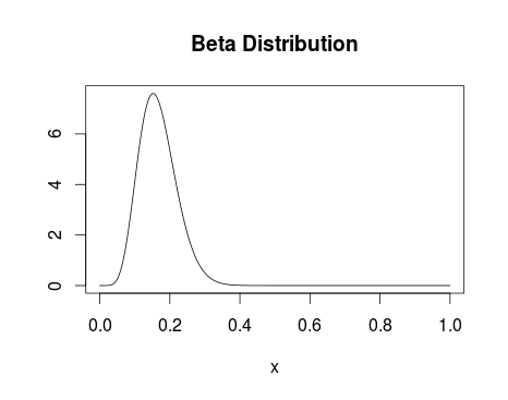
1.) You presumably have a reasonable idea about the distribution of whatever metric you’re plotting – for instance, you’re reasonably confident conversion % lies somewhere between 0 and 25% with the most likely value to be around 15% (as an example). You assume both test groups follow this distribution until you start getting data in to corroborate/contradict that.

Beta Distribution

Beta Distribution with alpha parameter 8 and beta parameter 40.

2.) On getting data in, you update your distribution to take into account these new data points – the distributions evolve with the new data.
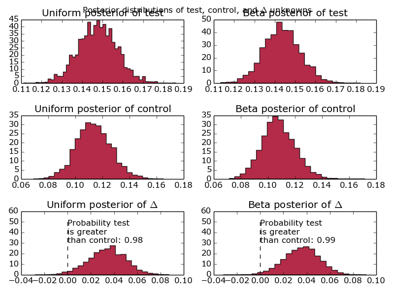
3.) Your end result (see below) gives you a probability distribution for the conversion of both test groups.

Bayesian Test Result

The distribution of conversion for two (randomly generated) test datasets

I’d argue the above picture is much clearer than even the best explained set of p-values. It also really clearly lends itself to calculations along the lines of ‘What is the probability that test group A is better than test group B?’ or ‘how sure are you that test group A is 2% better than test group B?’

Enamoured with this new way of reporting test results, I figured I mayerswell build something to do so. Instead of writing something where the test set-up is tied in with the result plotter I wrote my plotter to take input from stdin.

First things first then, I want something to generate a stream of conversion events:

import random
import time

for _ in range(2000):
    group = 'test' if random.random() > 0.3 else 'control'
    if group == 'test':
        convert = 1 if random.random() < 0.16 else 0
    else:
        convert = 1 if random.random() < 0.10 else 0
    print '%s:%d' % (group, convert)

Easy does it – we’ll look at varying those numbers later. For the uninitiated, that’ll give us fairly uneven test groups with reasonably different conversion percentages.

Now for the plotter. I’ll confess, this is still a work in progress. It currently doesn’t assume anything about the test groups, including the names (taking those from the input stream). However, in future I’m hoping to extend the program to be able to perform multivariate Bayesian AB tests. If it appears messy in places, that’s either because I’m expecting the poor coding practices to lead to me having an easier time extending the code to allow multivariate testing, or because I’m a messy coder.

At this point, massive props to this book: it forms the basis of almost all of this code.

import pymc as pm
import numpy as np
from matplotlib import pyplot as plt
import sys

results_dictionary = {}

## Store all our test results in memory - doesn't allow real-time updating and could get a bit serious if we've got a big set of results
for line in sys.stdin:
    if line == '':
        break
    group, conversion = line.strip().split(':')
    try:
        results_dictionary[group].append(int(conversion))
    except:
        results_dictionary[group] = [int(conversion)]

test_group_a, test_group_b = results_dictionary.keys()

## We'll run this twice, once with uniform prior and once with a beta prior
prior_dict = dict((group, pm.Uniform(group, 0, 1)) for group in results_dictionary.keys())
prior_dict_beta = dict((group, pm.Beta(group, 3, 50)) for group in results_dictionary.keys())

@pm.deterministic
def delta(p_A = prior_dict[test_group_a], p_B = prior_dict[test_group_b]):
    return p_A - p_B

@pm.deterministic
def beta_delta(p_A = prior_dict_beta[test_group_a], p_B = prior_dict_beta[test_group_b]):
    return p_A - p_B

## Bernoulli distribution with the events we've got
observations = dict((group, pm.Bernoulli('obs_%s' % str(group), prior_dict[group], value=events, observed=True)) for group, events in results_dictionary.items())
beta_observations = dict((group, pm.Bernoulli('obs_%s' % str(group), prior_dict_beta[group], value=events, observed=True)) for group, events in results_dictionary.items())

## Markov chain Monte-Carlo methods - returning samples from our updated distributions
mcmc = pm.MCMC([prior_dict[test_group_a], prior_dict[test_group_b], delta, observations[test_group_a], observations[test_group_b]])
mcmc_beta = pm.MCMC([prior_dict_beta[test_group_a], prior_dict_beta[test_group_b], beta_delta, observations[test_group_a], observations[test_group_b]])
mcmc.sample(20000,1000)
mcmc_beta.sample(20000,1000)

## Grab all the samples we need
samples = dict((key, mcmc.trace(key)[:]) for key in results_dictionary.keys())
delta_samples = mcmc.trace('delta')[:]
beta_samples = dict((key, mcmc_beta.trace(key)[:]) for key in results_dictionary.keys())
beta_delta_samples = mcmc_beta.trace('beta_delta')[:]

## It's this easy to work out probabilities of success
prob_a_better = (delta_samples < 0).mean()
prob_a_better_beta = (beta_delta_samples < 0).mean()

### Plotting
ax = plt.subplot(321)
plt.hist(samples[test_group_a], histtype='stepfilled', bins=50, alpha=0.85, label='Uniform posterior of %s' % test_group_a, color='#A60628', normed=True)
plt.suptitle('Posterior distributions of %s, %s, and $Delta$ unknowns' % (test_group_a, test_group_b))
plt.title('Uniform posterior of %s' % test_group_a)
plt.autoscale()
#
ax = plt.subplot(323)
plt.hist(samples[test_group_b], histtype='stepfilled', bins=25, alpha=0.85, label='Uniform posterior of %s' % test_group_b, color='#A60628', normed=True)
plt.title('Uniform posterior of %s' % test_group_b)
plt.autoscale()
#
ax = plt.subplot(325)
plt.hist(delta_samples, histtype='stepfilled', bins=25, alpha=0.85, label='Uniform posterior of $Delta$', color='#A60628', normed=True)
plt.vlines(0, 0, 50, linestyle='--', color='black')
plt.title('Uniform posterior of $Delta$')
plt.autoscale()
plt.annotate('Probability %s nis greater nthan %s: %.2f' % (test_group_a, test_group_b, prob_a_better), (0,30))
#
ax = plt.subplot(322)
plt.hist(beta_samples[test_group_a], histtype='stepfilled', bins=25, alpha=0.85, label='Beta posterior of %s' % test_group_a, color='#A60628', normed=True)
plt.title('Beta posterior of %s' % test_group_a)
plt.autoscale()
#
ax = plt.subplot(324)
plt.hist(beta_samples[test_group_b], histtype='stepfilled', bins=25, alpha=0.85, label='Beta posterior of %s' % test_group_b, color='#A60628', normed=True)
plt.title('Beta posterior of %s' % test_group_b)
plt.autoscale()
#
ax = plt.subplot(326)
plt.hist(beta_delta_samples, histtype='stepfilled', bins=25, alpha=0.85, label='Beta posterior of $Delta$', color='#A60628', normed=True)
plt.vlines(0, 0, 50, linestyle='--', color='black')
plt.autoscale()
plt.annotate('Probability %s nis greater nthan %s: %.2f' % (test_group_a, test_group_b, prob_a_better_beta), (0,30))
plt.title('Beta posterior of $Delta$')
#
plt.tight_layout()
plt.show()

Giving us:

Bayesian AB Testing Graphs

Graphs comparing the conversion of one test group against another, using a Beta distribution and a Uniform distribution as a prior.

First things first, why are there 6 graphs? Well, realistically, given that this is designed to model website conversion, I know what the distribution is likely to look like. Therefore, I say that my initial priors are beta distributions with parameters alpha = 10 and beta = 30. However, I’m well aware that naysayers might quibble with the idea of making such strong assumptions before running the test. Alongside that prior, I’ve included the completely uninformative uniform prior. That basically says that the conversion is equally likely to fall anywhere between 0 and 100%. Another reason for doing this is to show what difference it makes – when we’re looking at < 10 data points, you’ll see fairly big differences between the different prior assumptions. Increase the number of events up past 1000 and the two prior assumptions converge to the same value.

Additionally, we’ve fed in information about the test and control group – where has this delta come from and what’s it all about? That’s simply the difference between the test groups, as a probability distribution. How good is that? Really, that’s what people are interested in and, instead of making them compare two distributions and look at overlaps, we’ve done that for them and presented it as a probability distribution. Well done us.

Move along there.

Finding and Trading Volatile Stocks in Python

Hi all,

Can’t promise that this post won’t be bitty – I’m trying to simultaneously run an SVM and a random forest on a bunch of particle physics data for the Kaggle competition. Check it out, it’s pretty cool. Anyway, my computer is straining under the weight of those calculations and so while that was happening I decided to have a look at stock prices using Python/Pandas again.

After chatting with co-blogger Sean, and based on my (limited, and hilariously bad) experiences of stock trading we decided it’d be interesting to identify volatile stocks that don’t seem to have greatly varying fundamental value. We’re basically looking for the position of a harmonic oscillator in a stock. I’m not graphing that – look it up yourself. The logic being, there’ll be a point at which it it’s profitable to buy a stock like this on a down and sell again when it’s back up. Of course, this requires the assumption that the stock itself isn’t having a fundamental value shift – it’s just suffering from cyclicity. I don’t really know if/how this’ll work but that’s half the fun…

Right, back to it (I’ve caught up with Game of Thrones – get it watched). I’ve thought a reasonable amount about this and have decided our first job is to look at maximizing the following quantity:

frac{Volatility}{Change_{daily}^n Change_{weekly}}

I might also throw in an additional concern – I’d like to be able to enter and exit the market whenever I want – I don’t see this being a big problem for me (I’m not going to be using a lot of money) but it’ll certainly be a concern for bigger players. Let’s cross that bridge if we need to.

So, to start off with, my daily volatility I’m going to define as
frac{sum_{i={day_1}}^{Today} frac{HighPrice_i - LowPrice_i}{ClosePrice_i}}{NumberOfDays}

Hopefully nothing earth-shattering there, just want to see how much it varies over a day. Now while I want the stock price to vary a lot, I want it to head back to where it started. A rapidly increasing/decreasing stock is going to have wildly varying days. However, it’s also going to have a large overall trend. That’s no good for the purposes of finding stocks to buy/sell on a short time period.

Change_{daily} = sqrt{frac{sum_{i={day_1}}^{Today} (frac{ClosePrice_i - OpenPrice_i}{OpenPrice_i})^2}{NumberOfDays}}

Change_{weekly} = sqrt{frac{sum_{i={week_1}}^{Today} (frac{ClosePrice_i - OpenPrice_i}{OpenPrice_i})^2}{NumberOfWeeks}}

Easy does it – the reason I’ve squared the result is basically that I don’t care whether the stock is rising or falling. I’m trying to minimize the overall long-term variations from the mean.

So, how easy is this in Python? Remarkably so. Let’s start off by plotting a scatter graph of some of the more promising stocks.

import numpy as np
from pandas.io.data import DataReader
import pandas as pd
from datetime import datetime
from pylab import savefig

## A list of American Stock Symbols
company_information = pd.read_csv('allcompany.csv')

volatility_measure = []
daily_change_measure = []
weekly_change_measure = []
labels = []

## Let's start out with the biggest 10 companies in my list

for company in company_information.sort(['MarketCap'], ascending=False).head(10)['Symbol']:
    try:
        company_frame = DataReader(company.strip(), 'yahoo', datetime(2013,1,1), datetime.now().date())
        company_frame['Volatility'] = (company_frame['High'] - company_frame['Low'])/company_frame['Close']
        volatility_measure.append(company_frame['Volatility'].mean())
        company_frame['Daily_Change'] = company_frame['Close'].diff()
        daily_change_measure.append(np.sqrt(np.mean(company_frame['Daily_Change']**2)))
        ## Take every 5th row
        weekly_company_frame = company_frame[::5]
        weekly_company_frame['Change'] = weekly_company_frame['Close'].diff()
        weekly_change_measure.append(np.sqrt(np.mean(weekly_company_frame['Change']**2)))
        labels.append(company.strip())
    except:
        print "Problem parsing %s" % company.strip()

for i in range(1,7):
    change_metric = [daily * (weekly ** (1./i)) for daily, weekly in zip(daily_change_measure, weekly_change_measure)]
    ax = plt.subplot(3,2,i)
    plt.xlabel('Log of overall change metric')
    plt.ylabel('Volatility metric')
    plt.title('Weekly power %.2f' % float(1./i))
    plt.scatter(change_metric, volatility_measure, c = volatility_measure, cmap=plt.get_cmap('Spectral'), label='Weekly power %.2f' % float(1./i))
    for label, x, y in zip(labels, change_metric, volatility_measure):
        plt.annotate(label, (x,y), xytext=(0,8), textcoords='offset points')

    plt.gca().set_xscale('log')
    plt.gca().legend_ = None

plt.suptitle('Daily Volatility of Stocks versus Overall Trend')
plt.tight_layout()
plt.show()
savefig('StockVolatility.png')

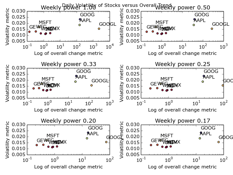
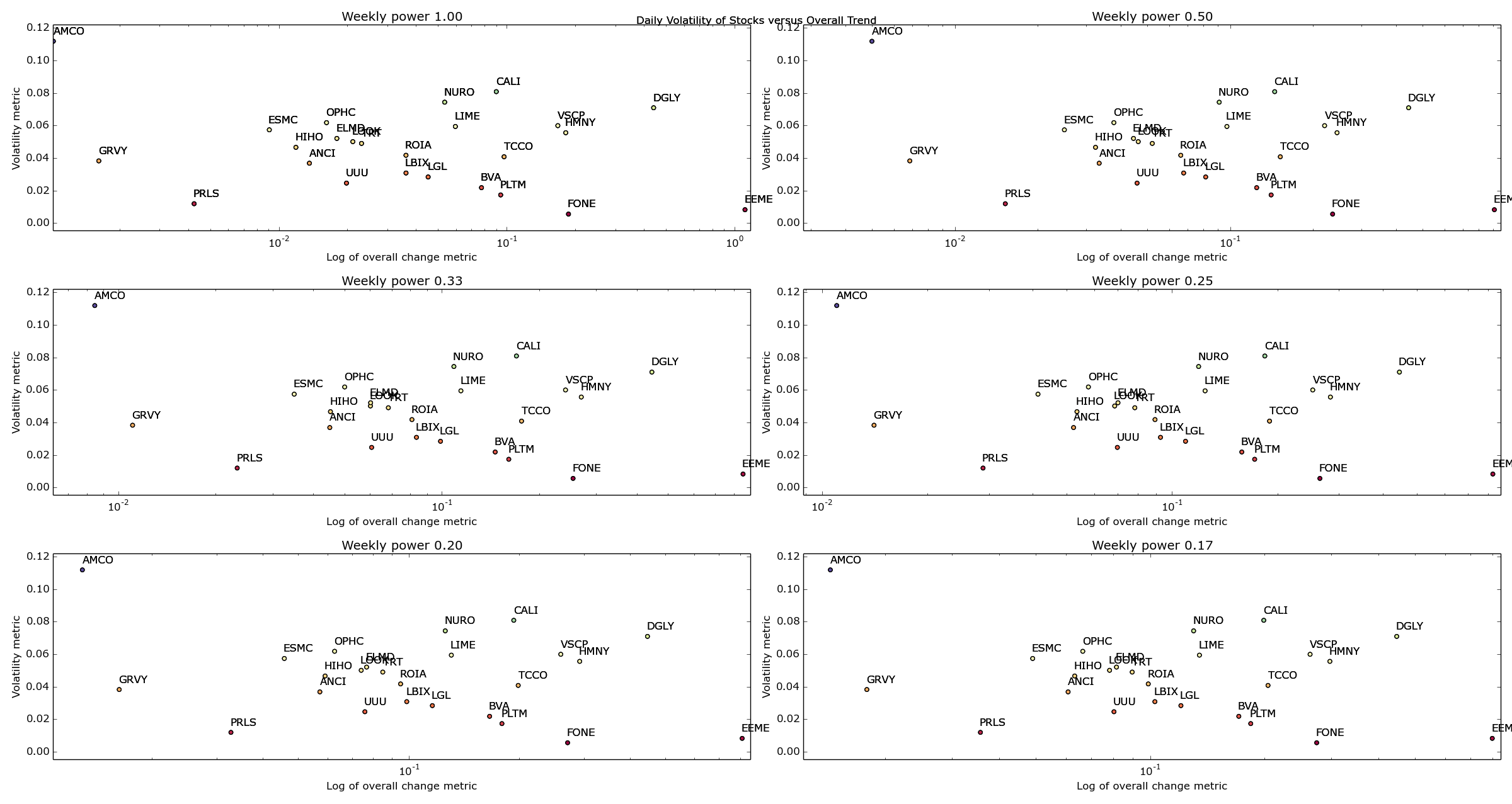
OK – it’s not especially pretty but it gives us the following picture:

Stock Volatility

The 10 biggest US stocks – their daily & weekly change versus their daily volatility

You could also make a fair point that I’ve formatted it poorly. Open it up as big as your browser will let you and you’ll be able to see it nicely. Or, just run the code and create your own picture. It’s dead easy. I promise.

So what can we infer from that picture? I’m going to go ahead and say not a huge deal. Apple & Google have made some crazy ups and downs over the last year or two (mostly ups) and hence I’ve been forced to use a log plot. Other than that, we can see a cluster of the remaining companies with GE seeming the most stable all round. One point I’d like to make now: by defining my metrics in such a way that they don’t really match to anything in reality, I’ve lost the ability to understand exactly what I’ve plotted. What I’m trying to say, is that the log of an overall change metric isn’t an intuitive quantity. Usually, it’s a good idea to pick metrics that have a fairly firm grounding in the real world unless you’ve got a really good reason not to. In my case, my reason is that all I’m trying to do here is identify stocks in the upper left most corner – I don’t care what their values are yet.

I’d also like to make the point here that for this data set, the change of power associated with the weekly metric seems to make no difference. I put it there to express the idea that we’re likely to want a different weighting on the daily and weekly variability depending on how often we want to trade the stock. As I’m hoping to trade multiple times daily, the daily variability is more important to me than the weekly variability (hence my choice of fractional powers of the weekly variable). If you’re looking at trading less regularly, change your parameters accordingly.

Now I’m going to go out on a limb and say that, when looking for daily volatility, the biggest companies in America aren’t the place to go looking. I’m sure that the algorithmic trading people are all over this kind of trade with fancy-pants C++ code designed to execute multiple trades/second. To do this at a reasonably large scale (and to overcome transaction/infrastructure costs) I’m going to say those guys will play with these big companies where a purchase of £1 million+ of shares isn’t going to be such a big deal. Playing in those markets must be the equivalent of going barracuda fishing with a thumb tack and a tie. I think we should start our search towards the lower market caps and work our way up until we’ve got a few hopefuls.

volatility_measure = []
daily_change_measure = []
weekly_change_measure = []
labels = []

for company in company_information[company_information['MarketCap'] > 10000000].sort(['MarketCap']).head(25)['Symbol']:
    try:
        company_frame = DataReader(company.strip(), 'yahoo', datetime(2013,1,1), datetime.now().date())
        company_frame['Volatility'] = (company_frame['High'] - company_frame['Low'])/company_frame['Close']
        volatility_measure.append(company_frame['Volatility'].mean())
        company_frame['Daily_Change'] = company_frame['Close'].diff()
        daily_change_measure.append(np.sqrt(np.mean(company_frame['Daily_Change']**2)))
        ## Take every 5th row
        weekly_company_frame = company_frame[::5]
        weekly_company_frame['Change'] = weekly_company_frame['Close'].diff()
        weekly_change_measure.append(np.sqrt(np.mean(weekly_company_frame['Change']**2)))
        labels.append(company.strip())
    except:
        print "Problem parsing %s" % company.strip()

for i in range(1,7):
    change_metric = [daily * (weekly ** (1./i)) for daily, weekly in zip(daily_change_measure, weekly_change_measure)]
    ax = plt.subplot(3,2,i)
    plt.xlabel('Log of overall change metric')
    plt.ylabel('Volatility metric')
    plt.title('Weekly power %.2f' % float(1./i))
    plt.scatter(change_metric, volatility_measure, c = volatility_measure, cmap=plt.get_cmap('Spectral'), label='Weekly power %.2f' % float(1./i))
    for label, x, y in zip(labels, change_metric, volatility_measure):
        plt.annotate(label, (x,y), xytext=(0,8), textcoords='offset points')

    plt.gca().set_xscale('log')
    plt.gca().legend_ = None
    plt.autoscale(tight=True)

plt.suptitle('Daily Volatility of Stocks versus Overall Trend')
plt.tight_layout()
plt.show()
savefig('SmallerCompanies.png')
Small Companies Volatility

Volatility versus overall change for American companies with Market Caps > $10,000,000

Well bugger me. I don’t know about you but that looks pretty cool to me. Ignore all the gumph in the middle and look at the outliers – AMCO, GRVY, PRLS, DGLY and EEME. These are great examples of companies that are going to be either maximums or minimums for our given metric.

OK – I’m going to call it a night for now but just think of the possibilities open to us now! We can change our date ranges, play around with our metrics and loop through as many stocks as we can find symbols for (harder than you’d think!) until we’ve got a reasonable amount of stocks that we think are great candidates for regularly buying and selling.

Next time, I’ll finalize my list of stocks and hopefully start to gain an idea of when one of these stocks becomes a buy, and when it becomes a sell. That sounds fairly difficult actually. Ah well, that’s the fun.

Winter is coming.

Best Housing Investments of the last 20 years

Hey all,

So from that long list I posted I’ve decided I’m most interested in the fastest growing and falling towns in the UK, as measured by the average house selling price. Once we’ve got a bunch of hot/not towns we might even be able to have a look at what these towns looked like before their boom. The hope is then that we’ll be able to find towns in that situation right now and boom, we’re housing moguls.

Given my poor excuse for hardware, we’ll have to start in bash:

 awk -F, '{print $3"-"$4"-"($(NF-3))}' pp-all.csv | tr -d '"' | cut -d '-' -f1,2,3,5 | tr '-' 't' | awk '{summary_array[$2"-"$3"-"$4] += $1; count_array[$2"-"$3"-"$4]++} END {for (region in summary_array) print region"t"summary_array[region]/count_array[region]}' | tr '-' 't' | sort -nk1 -nk2 > average_sale_price_by_town_and_month.txt 

where pp-all.csv is all the UK housing data as downloaded from data.gov.uk. The format of the data and what the above code does is inferrable from the following R code:

library(reshape2)
library(plyr)
library(ggplot2)
myData <- read.csv('average_sale_price_by_town_and_month.txt', header=F, sep='t')
colnames(myData) <- c("Year", "Month", "Town", "Average_Price")
## Let's not make the same mistakes as we did last time - which data should we remove pre-analysis?
summary(count(myData, c('Town'))$freq)
## From that, I'm going to say let's remove any town without 229 points.
myData <- myData[!(myData$Town %in% levels(myData$Town)[(count(myData, c('Town'))$freq < 229)]),]

I’m going to break out of code mode to explain that last line because it is horrible. I’m first grouping my data by town and counting the number of entries – in SQL this’d be SELECT count(date) FROM myData GROUP BY Town . I’m then comparing every entry in the list to 229 (the max number of points each town can have) and producing a logical list of the same size as the number of towns indicating whether the town at that index has a full complement of points. levels(myData$Town) gives me a list of all the towns which is placed against the previously calculated logical list – only towns matching a TRUE are kept. At that point, we’ve got a list containing all the towns we want to keep – myData$Town %in% compares the Town column of myData against this list and acts like a SQL where clause. Finally, in confusing developments, I’ve inverted all of the above logic with an ! – this’ll now only keep columns where the number of entries per town is greater than 228. The comma before the square bracket says to include all columns (we could add filters there if we liked). We assign all of this to itself, in effect filtering the original data frame by removing any lines belonging to towns which don’t have a full complement of points. All in that one line.

In practical advice for the novice R coder (which I’d class myself as) – start with the smallest bit of code you can and then add bits on when you’re comfortable with what they’re doing. Actually, that’s not just true of R – the bash one-liner above would likely be best constructed in exactly the same way.

Anyway, where were we?

myData$Datey <- as.Date(paste(myData$Year, myData$Month, 1, sep='-'), '%Y-%m-%d')
myData <- myData[,!(names(myData) %in% c("Year", "Month"))]
ts_frame <- dcast(myData, Datey ~ Town, value.var="Average_Price")
row.names(ts_frame) <- ts_frame$Datey
ts_frame <- ts_frame[,!(names(ts_frame) %in% c("Datey"))]
growth_frame = data.frame(matrix(0, ncol=1, nrow=length(ncol(ts_frame))))
row.names(growth_frame) <- names(ts_frame)
for (i in 1:ncol(ts_frame)) {
  total_growth <- 100*((ts_frame[length(ts_frame[,i]),i] - ts_frame[1,i])/ts_frame[1,i])
  growth_frame[[names(ts_frame)[i]]] = total_growth
}
long_growth_frame <- melt(growth_frame)
colnames(long_growth_frame) <- c("Town", "Percentage_growth")
long_growth_frame <- long_growth_frame[long_growth_frame$Percentage_growth > 0.1,]
ggplot(long_growth_frame, aes(x=Percentage_growth)) + geom_density() + ggtitle("Percent Uplift in UK housing prices between 1995 and 2014")

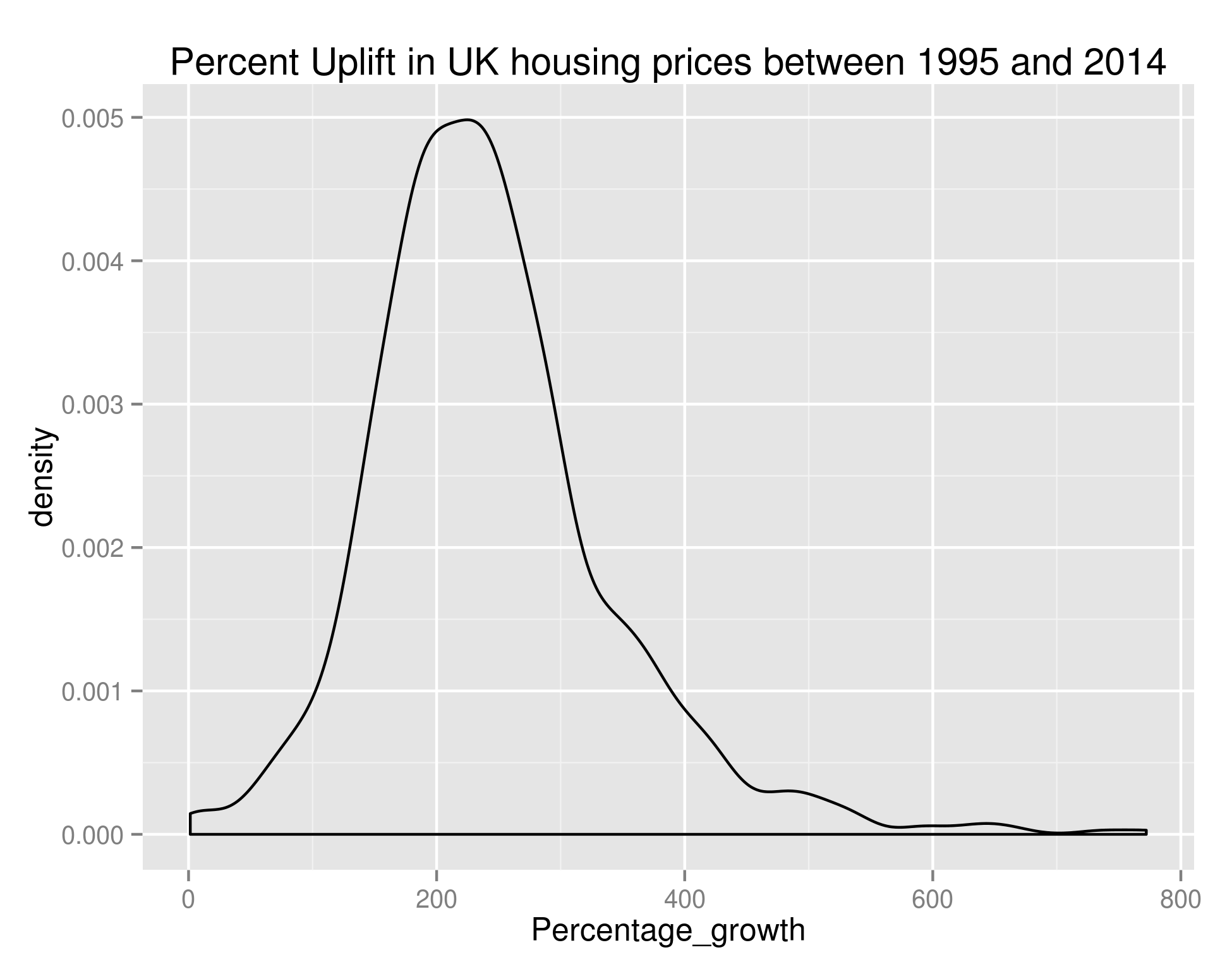
giving us:

Growth in UK House Prices

Density of the Percentage Growth of Average House Price (by town) in the UK between 1995 and 2014

As we can see, the bulk of towns experienced between 100% and 400% growth in that time – if anybody can point me towards UK salary figures over that time period I think that’d be a nice set to join this with.

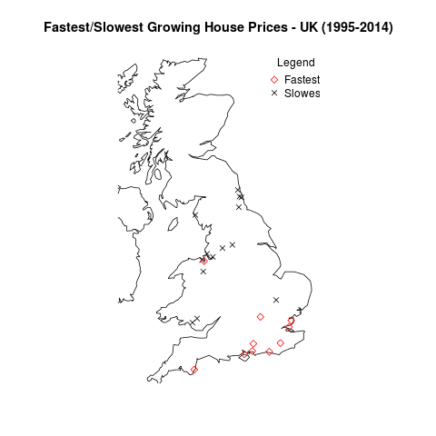
Anyway, let’s take what we’ve done in the previous post on house prices and plot the data on a UK map. There are too many points for me to reasonably plot all of them – let’s go with the top 20 (Red diamonds) and bottom 20 (black crosses):

ordered_growth_frame <- long_growth_frame[order(long_growth_frame$Percentage_growth),]
library(maps)
library(mapdata)
library(RCurl)
library(RJSONIO)
## A couple of functions allowing us to dynamically get the longitude and latitude of regions
construct.geocode.url <- function(address, return.call = "json", sensor = "false") {
  root <- "http://maps.google.com/maps/api/geocode/"
  u <- paste(root, return.call, "?address=", address, "&sensor=", sensor, sep = "")
  return(URLencode(u))
}

gGeoCode <- function(address,verbose=FALSE) {
  if(verbose) cat(address,"n")
  u <- construct.geocode.url(address)
  doc <- getURL(u)
  x <- fromJSON(doc,simplify = FALSE)
  if(x$status=="OK") {
    lat <- x$results[[1]]$geometry$location$lat
    lng <- x$results[[1]]$geometry$location$lng
    return(c(lat, lng))
  } else {
    return(c(NA,NA))
  }
}

map('worldHires',  c('UK', 'Ireland', 'Isle of Man','Isle of Wight'), xlim=c(-7,2), ylim=c(50.1,58.7))  
long_and_lat <- data.frame(sapply(paste(head(ordered_growth_frame, n=20)$Town, ", UK", sep=''), function(x) gGeoCode(x)))
row.names(long_and_lat) <- c("Latitude", "Longitude")
long_and_lat <- data.frame(t(long_and_lat))
points(long_and_lat$Longitude, long_and_lat$Latitude, col=1, pch=4)
long_and_lat <- data.frame(sapply(paste(tail(ordered_growth_frame, n=20)$Town, ", UK", sep=''), function(x) gGeoCode(x)))
row.names(long_and_lat) <- c("Latitude", "Longitude")
long_and_lat <- data.frame(t(long_and_lat))
points(long_and_lat$Longitude, long_and_lat$Latitude, col=2, pch=5)
title('Fastest/Slowest Growing House Prices - UK (1995-2014)')
legend("topright", legend=c("Fastest", "Slowest"), title="Legend", bty="n", pch=c(5,4), col=c("red", "black"), inset=c(-0.05,0))

giving us:

UK Growth Map

The towns with the fastest and slowest growth in average house price since 1995.

So it looks like the South Coast has been the place to buy houses in the last 20 or so years. And the North East/North West were the places to be avoided.

OK – that’s all well and good but it doesn’t really tell us anything about the area we should be buying houses in now. Hold your horses. I’m getting to that. Obviously we’re not really going to be able to learn anything looking at the price difference between the end of our ‘test’ period and the start of our ‘test’ period. We need to build our model over a subset of this data, and test it against the remaining data.

For my next trick (blog post) I’ll look at predicting the fastest growing regions. As a sneak peek, to do we’ll use growth % as the metric we’re trying to predict (a continuous variable) and we’ll create features out of the input data set. I don’t know which method we’ll use yet but it’ll be one of linear regression, SVM regression or neural networks. Likely whichever is best supported by the language I choose to use. I’ve used Libsvm before and found it very good so maybe that.

What we do in life echoes in eternity.

UK House Sales – When should estate agents go on holiday?

Hi all,

If you’ve been following all of these blog posts then you’re in a minority of one. However, you’ll also know that we’ve taken all of the UK house sales in the last 18 years or so and have found a bunch of things out. We’ve seen the spread of average house price by region, we’ve seen seasonality in the average house price, we’ve seen the impact the housing crash had on average house price (not that much) and on number of houses sold (an awful lot). Finally, we investigated seasonality of number of house sales by region and in doing so, found that London suffered the housing crash worse than other areas but almost immediately picked itself up and is in fact (relative to the rest of the country) better off than it was before the crash.

I had a couple of ideas for investigations in my last post – one of which was finding the most sold house in the UK and seeing if there was a correlation between the times a house has sold and its price. I’ll briefly tackle this because it’s one line of bash – working with our file pp-all.csv (all of our data in one big text file) the following command will give us the top 100 most sold properties in the UK in the last 18 years:


cut -d ',' -f5,9-15 pp-all.csv | tr -d '"' | tr ',' ' ' | sort | uniq -c | sort -k1 -n -r | head -n 100

The top 10 are as follows (with the format: # of sales | postcode | address ) :

24 L17 3BP 48 FLAT 5-19 ULLET ROAD LIVERPOOL LIVERPOOL MERSEYSIDE
19 W8 6JE 126 FLAT 1-10 LEXHAM GARDENS LONDON KENSINGTON AND CHELSEA GREATER LONDON
19 LS2 7LY 31 EASTGATE LEEDS LEEDS LEEDS WEST YORKSHIRE
16 SE1 3FF 41 FLAT 67 MALTBY STREET LONDON SOUTHWARK GREATER LONDON
16 PL2 1RR 48 HADDINGTON ROAD PLYMOUTH CITY OF PLYMOUTH CITY OF PLYMOUTH
16 BN43 5AR SHOREHAM COURT 3-10 THE CLOSE SHOREHAM-BY-SEA ADUR WEST SUSSEX
15 IP1 3PW 54 ANGLESEA ROAD IPSWICH IPSWICH IPSWICH SUFFOLK
14 WA16 6JD TATTON LODGE 1-6 MOORSIDE KNUTSFORD CHESHIRE EAST CHESHIRE EAST
14 M3 6DE FRESH 138 APARTMENT 1008 CHAPEL STREET SALFORD SALFORD SALFORD
14 M19 2HF 35 CENTRAL AVENUE MANCHESTER MANCHESTER GREATER MANCHESTER

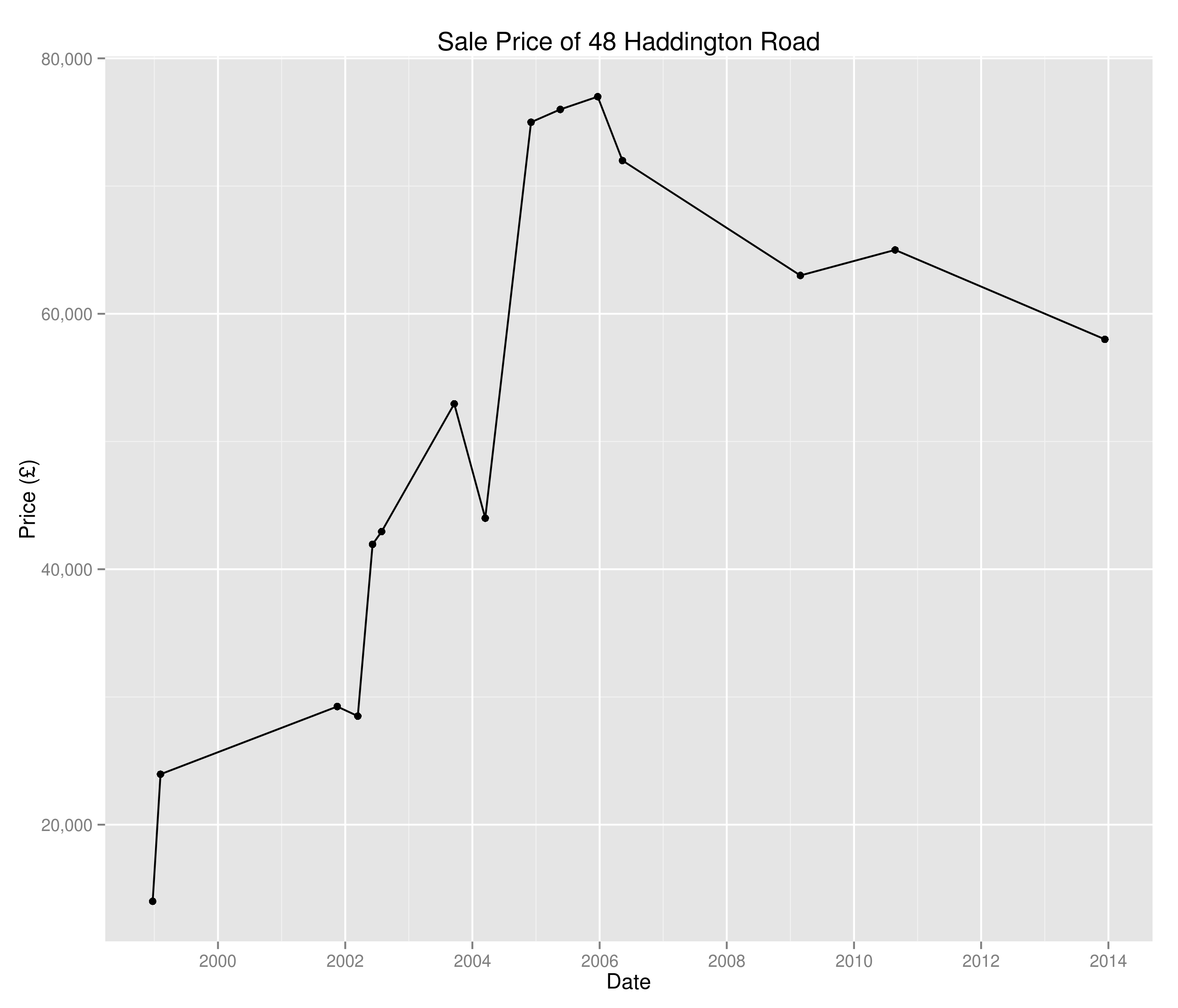
I decided against pursuing this investigation as a quick hunt on Zoopla tells me that flats 5-19 Ullet Road were sold individually and so we’re just seeing the results of grouping and nothing overly interesting. I guess there are certain houses in there of interest – why has 48 Haddington Road been sold 16 times since 1995?

Sale prices of 48 Haddington Road since 1995

Sale prices of 48 Haddington Road since 1995

I don’t really know and I’m not going to investigate – I think I’d rather look at the age old question:

“When should estate agents take holidays?”

Of course, this is every bit as much a question of where national estate agents should have their staff distributed throughout the year, which region removal companies should target throughout the year, where travelling housing surveyors are most likely to pick up business e.t.c.

In the last post we were able to create time series of the percentage of UK house sales a region was responsible for. Now we’re going to create a whole bunch of time series (one for each region) and perform clustering on them to see when each region peaks and troughs. Note we’re looking at a percentage of total sales here and not absolute numbers – I’m also not looking at the saturation of the market or anything like that.

I’m going to use Markov Clustering in this example – don’t worry too much about this (if you don’t want to), I’ll do a post on Markov Clustering at a later point. For now, all you need to know is that it’ll cluster our data in a sensible way.

So, down to business:

## Get the data I need in a small(er) table
library(reshape2)
library(rEMM)
mini_frame <- data.frame(newFrame$Datey, newFrame$Region, newFrame$Percent)
colnames(mini_frame) <- c("Datey", "Region", "Percent")
ts_frame <- dcast(mini_frame, Datey ~ Region, sum)
## Have found I need to initialize this before I kick off
seasonal_ts_frame <- data.frame(matrix(0, nrow=12, ncol=length(colnames(ts_frame)))
colnames(seasonal_ts_frame) <- colnames(ts_frame)
row.names(seasonal_ts_frame) <- factor(month.name, levels=month.name)
for (i in 1:ncol(ts_frame)) {
    decomposed_ts <- decompose(ts(ts_frame[,i], frequency=12, start=c(1995,1)))$seasonal[c(1:12)]
    seasonal_ts_frame[[colnames(ts_frame)[i]]] <- decomposed_ts
}
cor(seasonal_ts_frame)
emm <- EMM(threshold=0.2, measure="eJaccard")
build(emm, cor(seasonal_ts_frame))
cluster_centres <- data.frame(cluster_centers(emm))
cluster_frame <- data.frame(lapply(cluster_centres, which.max))
row.names(cluster_frame) <- c("Cluster")
cluster_frame <- data.frame(t(cluster_frame))
colnames(cluster_frame) <- c("Region", "Cluster")
cluster_one <- subset(cluster_frame, Cluster==1)
cluster_two <- subset(cluster_frame, Cluster==2)
## A list of all the cluster one regions
seasonal_ts_frame[,(names(seasonal_ts_frame) %in% row.names(cluster_one))]
## Now the biggie - let's see the points on a map
library(maps)
library(mapdata)
library(RCurl)
library(RJSONIO)

## A couple of functions allowing us to dynamically get the longitude and latitude of regions
construct.geocode.url <- function(address, return.call = "json", sensor = "false") {
  root <- "http://maps.google.com/maps/api/geocode/"
  u <- paste(root, return.call, "?address=", address, "&sensor=", sensor, sep = "")
  return(URLencode(u))
}

gGeoCode <- function(address,verbose=FALSE) {
  if(verbose) cat(address,"n")
  u <- construct.geocode.url(address)
  doc <- getURL(u)
  x <- fromJSON(doc,simplify = FALSE)
  if(x$status=="OK") {
    lat <- x$results[[1]]$geometry$location$lat
    lng <- x$results[[1]]$geometry$location$lng
    return(c(lat, lng))
  } else {
    return(c(NA,NA))
  }
}

## Plot a UK map
map('worldHires', c('UK', 'Ireland', 'Isle of Man','Isle of Wight'), xlim=c(-8,2), ylim=c(51.8,54.2))

longitude_and_latitude <- data.frame(sapply(paste(row.names(cluster_one), ", UK", sep=''), function(x) gGeoCode(x)))
row.names(longitude_and_latitude) <- c("Latitude", "Longitude")
longitude_and_latitude <- data.frame(t(longitude_and_latitude))
points(longitude_and_latitude$Longitude, longitude_and_latitude$Latitude, col=1, pch=4)

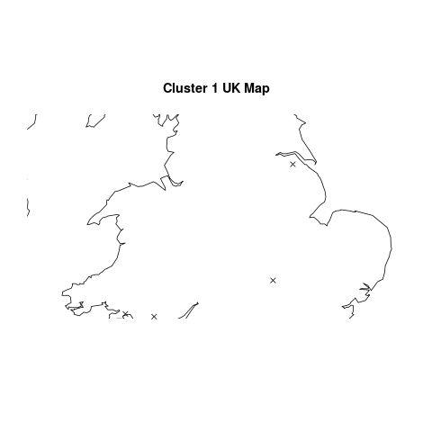
O.K, so there’s an awful lot of R code in there and all to produce a slightly underwhelming graph. Where does the great divide come in seasonality of house sales? Why, in South Wales and North East England of course:

Seasonality Cluster

Regions that break the national housing seasonality pattern

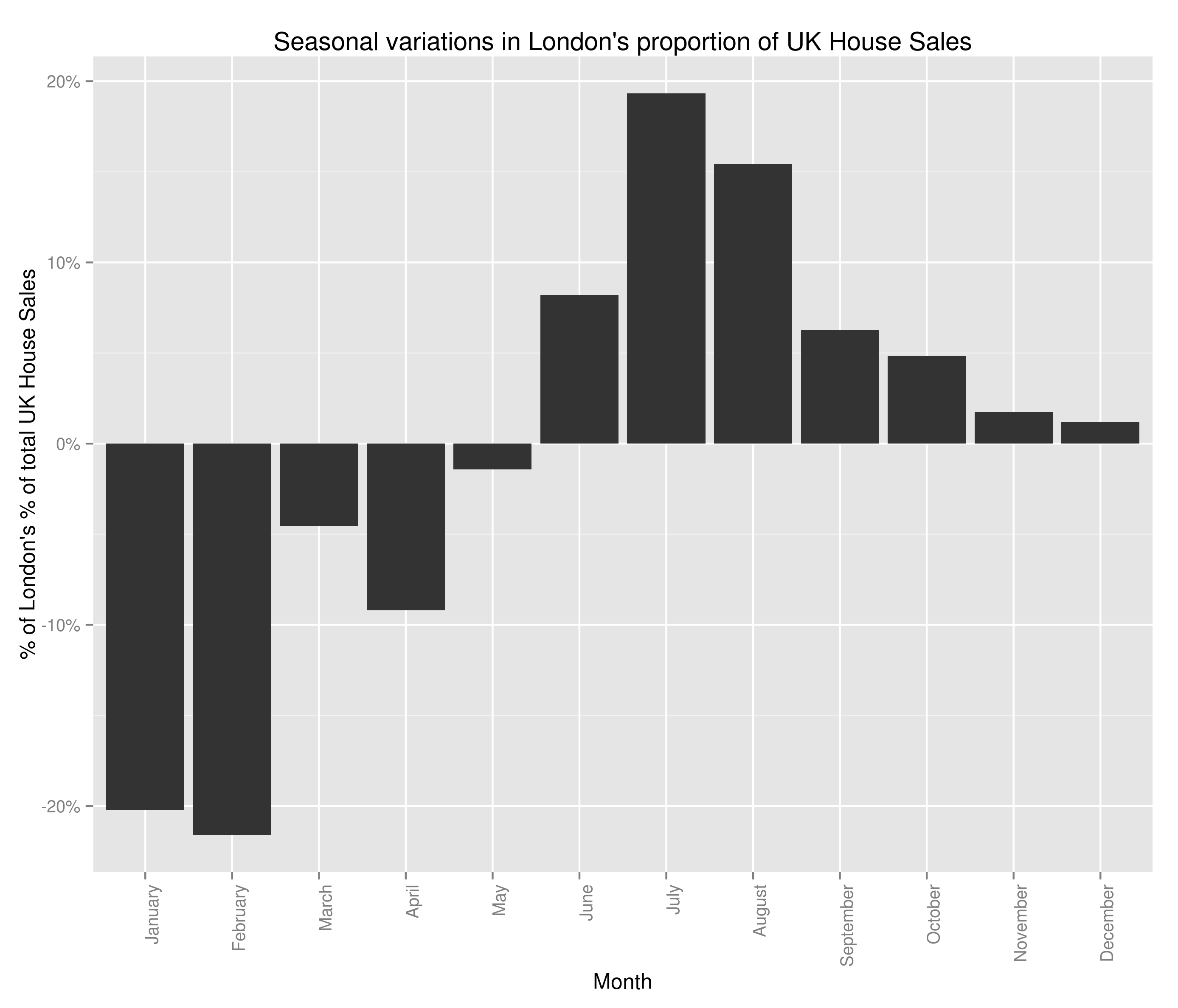
Semi-ignoring our ability to get accurate latitude and longitude using what was at best, a wildly optimistic attempt at doing so, we have some fairly believable (if confusing clusters). The bulk of the country follows the trend set by London:

Seasonal Variations in London's Percent of the UK Housing Market (by number sold)

Seasonal Variations in London’s Percent of the UK Housing Market (by number sold)

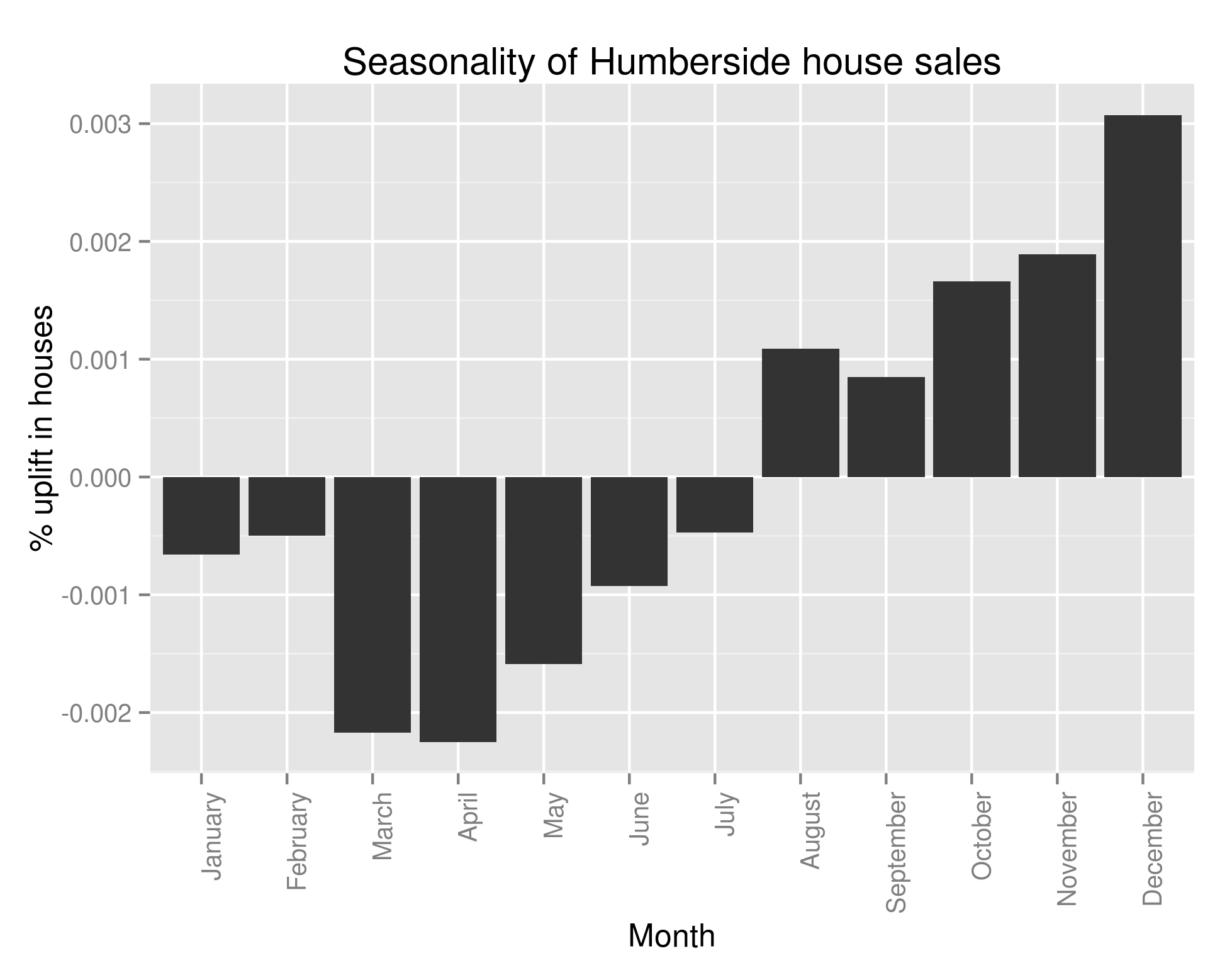
with lots of houses being bought in the summer and many fewer being bought in the winter. However, 6 regions in South Wales (including all of Glamorgan), 2 regions in the North East of England and Avon all follow this trend:

Seasonal Variations in Humberside's Percent of the UK Housing Market (by number sold)

Seasonal Variations in Humberside’s Percent of the UK Housing Market (by number sold)

This struck me as very strange indeed and so I looked at the original data and what should I discover? That almost all of the above analysis is wrong. If only we’d have performed the following query the folly of all that I’ve done would have become clear:

colSums(ts_frame==0) > 200

Every single one of the regions that didn’t follow our pattern had substantial missing data. One with more knowledge of British geography may have been able to spot that those counties had ceased to exist in 1995/6. The reason why I’ve left all that analysis in, aside from the fact that there are a few useful bits of code in there (plotting the regions on a UK map may well be helpful to somebody), is to show that it’s really really important to check your data when you’ve got an unexpected result. It’s also important to check it whatever the result, but in data analysis, if something seems dodgy there’s a good chance it is.

When I strip out all regions with missing data, we in fact see that all of the regions follows the same pattern as Greater London. Bugger.

Going to draw this one to a close – what have we discovered? Well, we now know that every single region in the UK follows the same seasonality pattern when it comes to house sales: lots more in summer than winter. We also know that the average house price follows the same trend. I’ve not shown that the regionality isn’t a factor in the increasing average house price (you could imagine the scenario where the more expensive areas see a greater surge in house sales in the summer than the less expensive areas). I’m not sure what I’m going to work on next – I’m getting a bit sick of house prices.

It’ll likely either be:
1.) Regional variations in average house price.
2.) Which regions see the greatest increase in number of house sales in summer – clustering as before.
3.) Seasonality of any other variable (type of house, new versus old, freehold versus leasehold)
4.) Build a predictive model to calculate something specific (number of old detached houses sold in Derbyshire every month for the next year).
5.) Identify towns with the fastest growing (and falling) average house price over the last x years. Try to use this to predict which areas will see similar areas of growth/decline in the future.
6.) Finding correlated stock opening/closing prices over historical data and using this to make £££££. Obviously that one is a bit different but does involve ££££.

Average House Price Visualization using Python and Google Charts

Hi all,

Only yesterday I came across a rich store of data that I had hitherto been unaware of; namely, data.gov.uk. Giddy with joy, I perused the mountains of interesting data and thought it’d be fun to pull together a visualization based on some of it. One particular set caught my eye: all of the house sales in the UK in the last 19 years (link to the data at the bottom).

So,  the first question that sprung to mind was “How does the average house price vary by region?”

First things first, let’s calculate the average house price per locale using (only) Python:


def average_price(year):
    with open('pp-' + str(year) + '.csv', 'rb') as f:
        lines = f.readlines()[1:]
        for line in lines:
            try:
                identifier, price, date, postcode, type_of_house, new, freehold_or_leasehold, address_1, address_2, address_3, address_4, address_5, address_6, address_7, letter = line.split(',')
            except:
                continue
            try:
                data_dictionary[address_7.strip('"').lower()].append(int(price.strip('"')))
            except:
                data_dictionary[address_7.strip('"').lower()] = [int(price.strip('"'))]
        final_results = dict((key, sum(value)/float(len(value))) for key,value in data_dictionary.iteritems())
        return final_results

So, we’ve built ourselves a nice little function that’ll take the year as an input, open up the relevant data file, calculate the average house price by region and return the result in a dictionary. Easy does it.

Please note at this point that there are a million ways to do what we’ve just done ranging from sticking the raw CSV into Excel and using pivot tables, loading the data into R and performing an aggregate on the region, using Panda’s excellent data frames or in fact using a bash one-liner (a favourite of mine):
cut -d ',' -f2,14 pp-2014.csv | tr -d '"' | awk '{region[$2] += $1; region_count[$2]++;} END { for (area in region) print area"t"region[area]/region_count[area]}' .
However, I’m sticking to Python for reasons hopefully soon to become clear.

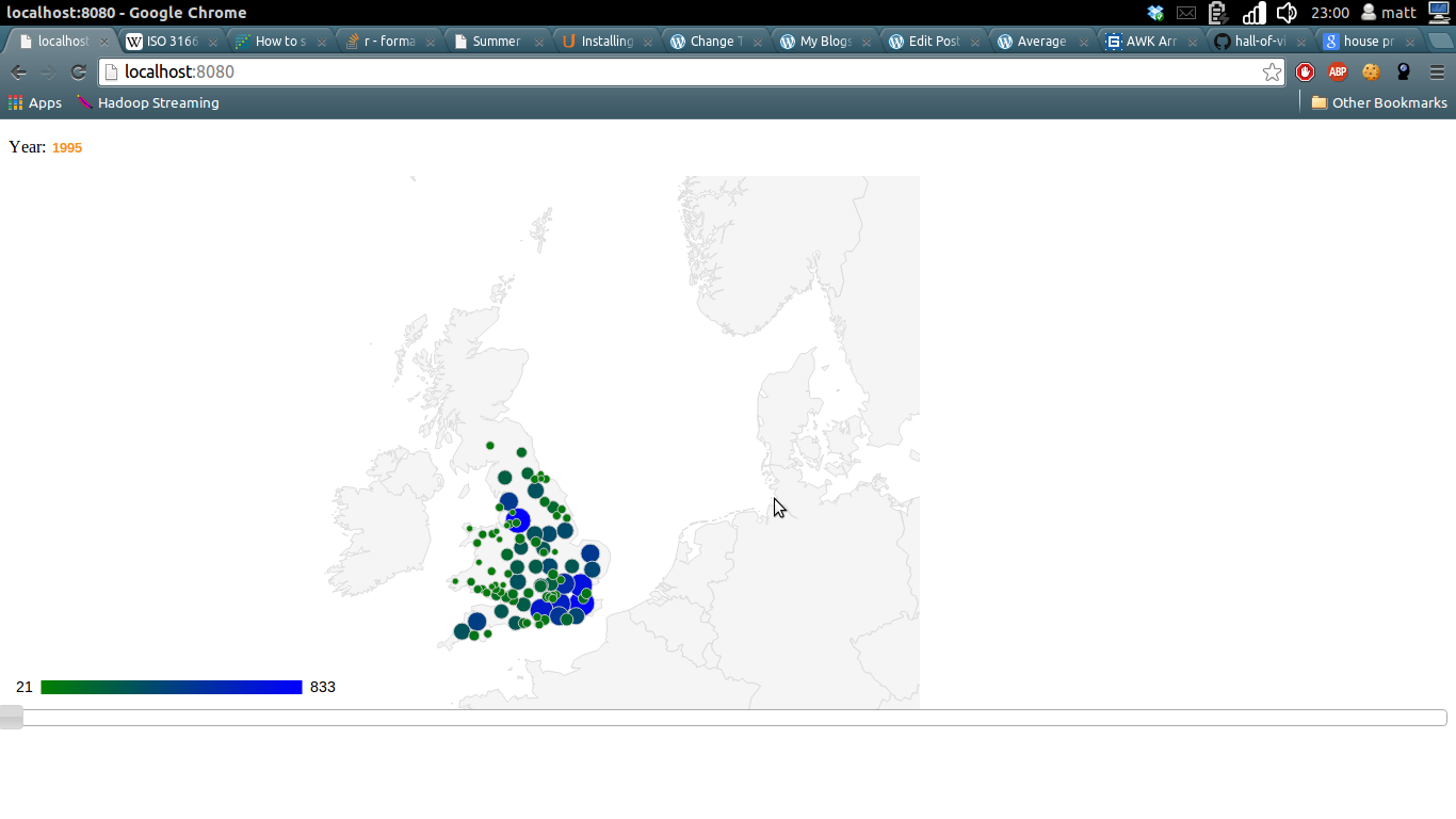
So now we can see that Stoke-on-Trent is very cheap and London is very expensive. Can we see this data changing over time?

I decided the nicest way of piecing this together was using a jQuery slider to select the year, a Google Geocharts frontend to visualize the data and then a lightweight Python web framework to hold the whole thing together. I chose web.py because I’ve used it before and think it’s great for work with AJAX and is also useful when you’ve already written your Python functions and just need something that won’t get in your way too much.

I’m not going to show all the code here but you can find my finished versions on my Github:
Back end
Front end

There are a couple of details that are contained in that code that I’ve not dealt with.

Firstly, Google Charts API doesn’t work with the place names listed in the Government data. As such, you’ll see I’ve written a little lookup function to map Government place names to ISO-3166 Codes as required by Google. There’s a bit of fuzzy matching going on here but if you navigate around in that repo, you’ll find I tested a few things and settled on a decent solution. When I can be bothered I’ll go and tidy that up by filling in the missing ISO codes manually.

Secondly, you’ll notice (if you get this running on your own computer) that the visualization is fairly slow. It runs calculations over the entire data set each time a query is run. What’s more, it then tries to render around 100 points on the Google Chart. Given that there are only a limited number of ways you’d ever want the user to be able to query the data and that the data doesn’t change day on day, you’d want to pre-aggregate the results and store them in a database somewhere.

Thirdly, you’ll note that this blog doesn’t contain the visualization. Pretty shoddy on my part, just haven’t got around to doing that yet.

That’s one of the problems with this data science malarkey, I could spend my time building my own blog platform that allows me to serve simple web apps. I could spend my time sticking in a simple database caching solution to speed up the apps on localhost. I could tidy up the fuzzy matching on the ISO codes to create an 100% correct mapping. However, it seems much more interesting to head off and see what else this data contains.

Next stop – is there a better time to buy/sell a house? Do house prices go up in certain months? I’ll try to answer that question fairly thoroughly with due consideration to statistical significance along the way.

© 2024 DogDogFish

Theme by Anders NorenUp ↑