Hi all,
I’m on a train to the Fringe festival and I’ve managed to bag myself first class tickets! What this means is that I’ve got about 3 hours to kill, unlimited free wine (who knew that was thing!?) and a fairly flaky internet connection. All of that goes together to make now the perfect time to share with you a bit of work I’ve been up to recently.
Firstly, massive props to this particular book: Probabilistic Programming & Bayesian Methods for Hackers
It’s really really good and this testing is just a minor reworking of one of the examples in the book – they say imitation is the sincerest form of flattery no?
Anyway, enough of the wine-induced babbling, on with the Bayesian testing…
The setting of the scene
What I’ll be looking to do here is identify changes in conversion rate (can be any kind of conversion, I’ll use orders/visitors but it doesn’t really matter) in historical data. The reason I say historical data is thusly: this is a good technique for identifying a visualizing changes but it isn’t as good as running a legitimate A/B test. Ideally, we’d implement the change (whatever it is) for one group of customers and not for the rest of the customers and measure relative performance. However, let’s assume that, for whatever reason, you’re looking over a bunch of (conversion) data trying to identify a change.
I’ll artificially generate data so you can run similar examples and get an idea of what our data source looks like:
#!/usr/bin/python

import random
import numpy as np

total_points = 50

## Generate a list containing the number of trials
trials = [random.randint(20,100) for _ in range(total_points)]
results = [np.random.binomial(value, 0.4) if total_point/2 else np.random.binomial(value, 0.3) for index, value in enumerate(trials)]

for trial, result in zip(trials, results):
    print "%dt%d" % (trial, result)
where in our example, trials is going to be the number of visitors on successive days and results is going to be the number of orders.
Pipe that into a file (python generate_conversions.py > conversion_data.txt ) and we’ve got ourself a nice list of conversion data with a change in the rate at some point (halfway in this example) through the data.
The Bayesian Bit
So the idea behind Bayesian statistics revolves around priors and posteriors – your prior is going to be a distribution that represents your (shocker) prior ideas about the result. You’re going to update this prior hypothesis with data as you get it and when you do so the resulting distribution is called the posterior. This is great for a number of reasons – my favourite two are:
- You get to set a prior that influences the final outcome. If I’ve got fairly strong ideas about what the conversion rate is (say I think it very likely lies between 80% and 90%) I can reflect that in my prior. When we start any frequentist (non-Bayesian) calculations we assume every probability between 0% and 100% is equally likely – generally that’s not the case.
- The final result is a distribution. Distributions are great for visualization, allow for easy comparisons against other distributions and are really easy to show uncertainty on. Do away with all the talk of p-values and show a graph with two ‘conversion distributions’ on and you’re on to a winner.
Shut up and Calculate
Code first – then commentary:
#!/usr/bin/python

import pymc as pm
from matplotlib import pyplot as plt
import matplotlib.dates as mdates
import numpy as np
import datetime

basket_list = []
conversion_list = []

with open('conversion_data.txt', 'rb') as f:
    for line in f:
        baskets, conversions = line.strip().split()
        basket_list.append(int(baskets))
        conversion_list.append(int(conversions))

n_percent_list = len(basket_list)

uniform_one_samples = []
uniform_two_samples = []
tau_samples = []
uniform_one = pm.Uniform('uniform_one', 0, 1)
uniform_two = pm.Uniform('uniform_two', 0, 1)

tau = pm.DiscreteUniform('tau', lower=0, upper=n_percent_list)

@pm.deterministic
def lambda_(tau = tau, uniform_one = uniform_one, uniform_two = uniform_two):
    out = np.zeros(n_percent_list)
    out[:tau] = uniform_one
    out[tau:] = uniform_two
    return out

observations = pm.Binomial('obs', n=basket_list, p=lambda_, value=conversion_list, observed=True)

model = pm.Model([observations, uniform_one, uniform_two, tau])
mcmc = pm.MCMC(model)
mcmc.sample(10000, 2500, 1)

uniform_one_samples = mcmc.trace('uniform_one')[:]
uniform_two_samples = mcmc.trace('uniform_two')[:]
tau_samples = mcmc.trace('tau')[:]

N = tau_samples.shape[0]

conversion_rate = np.zeros(n_percent_list)
for day in range(0, n_percent_list):
    ix = day < tau_samples
    conversion_rate[day] = (uniform_one_samples[ix].sum() + uniform_two_samples[~ix].sum()) / N

plt.subplot(411)
plt.tight_layout()

plt.plot(range(n_percent_list), 100.*conversion_rate, lw=4, color='#E24A33', label='Expected conversion rate')
plt.xlim([0, n_percent_list])
plt.ylim([0,100])
plt.xlabel('Day')
plt.title("Changes in the probability of conversion")
plt.ylabel('Expected conversion rate')
plt.bar(np.arange(n_percent_list), [100.0*convert/basket for convert,basket in zip(conversion_list, basket_list)], color='#348ABD', alpha=0.65, label='Observed conversion rate')
plt.legend(loc='upper right')

ax = plt.subplot(412)

#
plt.hist(uniform_one_samples, histtype='stepfilled', bins=50, alpha=0.85, label="posterior of initial conversion probability", color='#A60628', normed=True)
plt.legend(loc='upper left')

plt.xlim([min(uniform_one_samples),max(uniform_one_samples)])
plt.xlabel("Probability of Conversion")
#
ax = plt.subplot(413)
#
plt.hist(uniform_two_samples, histtype='stepfilled', bins=50, alpha=0.85, label="posterior of later conversion probability", color='#7A68A6', normed=True)
plt.legend(loc='upper left')
plt.xlim([min(uniform_two_samples),max(uniform_two_samples)])
plt.xlabel("Probability of Conversion")
#
#
plt.subplot(414)
w = 1.0/tau_samples.shape[0] * np.ones_like(tau_samples)
plt.hist(tau_samples, bins=n_percent_list, alpha=1, label="posterior of conversion change date", color='#467821', weights=w, rwidth=2.)
plt.xticks(np.arange(n_percent_list))
#
plt.legend(loc='upper left')
plt.xlim([0, n_percent_list])
plt.xlabel("Day of change")
plt.ylabel('P(change occurred)')
#


plt.show()
That’s a fair bit of code – what I’m doing isn’t that complicated. After importing, defining and grabbing the conversion data that we generated in the first script we declare uniform_1 and uniform_2.
We’re going to say that our data ultimately comes from a Binomial distribution where people convert with probability p. However, we are going to say that at some time (given in this example as tau) the value of p changed. p is the conversion of a Binomial distribution and so saying that p changes at some point means we’re saying our conversion rate changed.
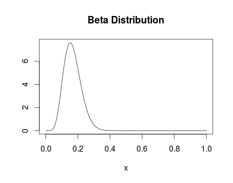
Firstly, I declare my priors – I say that uniform_1 and uniform_two, or the conversion before and after the change we’re trying to identify, are both drawn from a uniform distribution that runs between 0 and 1. I’m saying I think the conversion is equally likely to everywhere between 0 and 100%. If you’re doing this properly I’m sure you can improve on this (I’d advise looking into the Beta distribution) but with sufficient data the uniform distribution should work fine.
So, at this point we’ve got the distributions from which our p-values are drawn described by uniform distributions – our first pair of priors.
Next, I declare tau – the time at which our conversion rate changed. I’m using a discrete uniform distribution and saying that it could have happened with equal probability at any time between the first day and the last day. If you’re looking to identify when the biggest change in conversion occurred I’d advise using a discrete uniform distribution. If you’re trying to identify the effect a change on a particular day had then you can be more creative with this prior.
Now we declare _lambda. For the eagle-eyes pseudo-coders amongst you, I’m sure it’s clear but this represents our complete prior belief about the conversion rate (p of a Binomial). We say we think the value of p follows uniform_1 up until tau and then switches to uniform_2.
Then we let pymc take over – we specify our distribution is a binomial with as many trials as we generated in the first script, and with the probabilities given in _lambda. We tell pymc that we obtained the values we’re passing to it and created our distribution. I’m not going to go in what wizardy follows but check out chapter 3 of the book I mentioned at the start if you’re interested. What we end up with (when we grab the traces) is 10,000 numbers drawn from posterior distributions we’ve generated from uniform_1, uniform_2 and tau.
The final calculation builds a vector of Booleans for each day of the data set specifying whether the day is less than each of the 10,000 samples drawn from the tau distribution, or greater than the tau. Then we go along that 10,000 element boolean vector and create a sum – if the day number was less than the tau we take whatever is in the uniform_1 list at that point, otherwise taking what is in the uniform_2 point. Finally dividing by the number of points we drew, we can get an idea of the expected conversion rate (expected value of _lambda).
I get that that section is a bit complicated but if you get it:
a.) I’ve not had enough wine
b.) You’ve got the idea behind the testing so far.
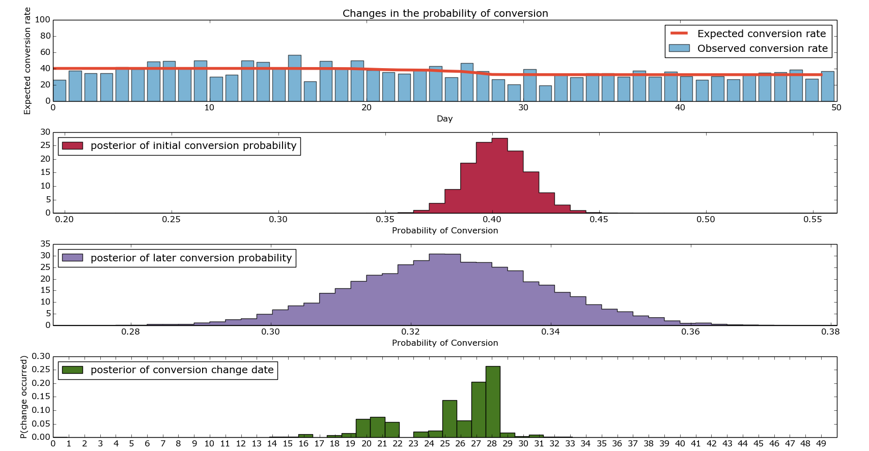
Finally, there’s a lot of Matplotlib plotting stuff all leading us towards the following beautiful picture:
I hope that shows more clearly what I’ve been trying to explain. Firstly, the top graph shows our expected and our observed conversions. The bars show our ‘actual conversion rates’ on given days – these were the values we artificially generated. The red line is the output of our model discussed in the final point above. The second and third graph show the distributions of the conversion rate from before the change and after the change. If you’re looking to paint a compelling picture, I’d advise putting them both on the same axis, drawing them as densities (not histograms) and adding lines at the 95th percentiles. Finally, the bottom graph shows us when we change in conversion rate likely changed. As you can see, it’s fairly heavily concentrated around the middle (good) but there’s quite a wide range of days around there where it could be.
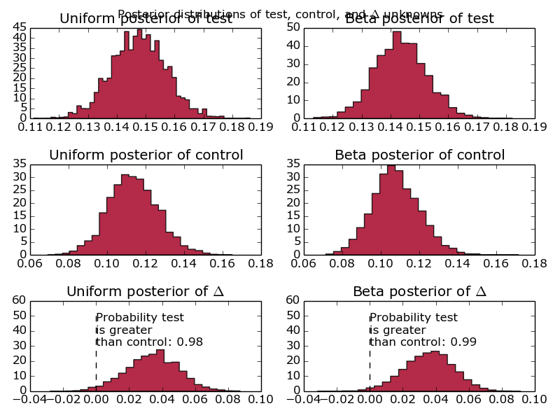
I’ve found that in practice, it makes sense to run these simulations multiple times (they don’t take very long) and concatenate the results together when working out when a change occurred. I’ll leave that as an exercise given how long this post already is – there’s a picture of what it looks like at the bottom – the posteriors of the conversion probabilities get a bit messy.
So there we have it – it’s been a bit of a slog and the woman who brings the wine round the train has started laughing when she pours me a new glass (surely a troubling sign). However, we’re now able to run Bayesian conversion tests like a boss and visualize them in a really funky kind of way.
As always, comments are welcome, questions too.
The Lannisters send their regards.
p.s.
Picture when run with multiple iterations…


