Data Science, amongst other things.

Tag: Pandas

Generating B2B sales data in Python

‘Sup

Look, I’m sorry. Yet again, I’ve not written any blog posts for ages. Let’s all get over it and move on to something more important. Sales. Let’s imagine you’re an organisation selling B2B. You use Salesforce (or any other platform). You’ve got plenty of opportunities and a history of those opportunities. You’ve gone and built a sales pipeline.

Good work. That’s not an easy thing to do.

Now you want to use that pipeline to get better at sales. You want to use the data you’ve got to help forecast what you’ll do in the future. You want to know the value of what you’ve already got in the pipeline. You want to know what the most valuable activities you perform are. I’m not going to be able to fit all of that into one post so I’ll break things up into parts and (I’ve said this before only to underdeliver) FINISH THE SERIES.

However, for part 1 I’m actually only going to focus on generating some dummy data to play with. “What!? That’s none of the things you said you’d do!” No. It’s not. However, if you’re able to find me a B2B company with a small number of sales who are willing to publicly share all their data then fair play to you. Lacking that I’m going to have to create a dummy set of data and make it halfway believable. In doing this I’ve made a few assumptions (that I’m later going to try to show). It’s a bit circular but don’t be that guy. What I’m doing is broadly legit and if you look at the data and don’t think it’s reasonable then I’m providing the code so you can change whichever bit you find egregious. Even better, just use your actual company’s sales data (assuming you’re lucky enough to have it).

I’ll be building a dataframe that resembles a Salesforce pipeline – it’s going to have the following rows:

Stage – this is the ‘Salesforce/Hubspot/<don’t care>’ stage in the pipeline. Measures how far along an opportunity is.
Name – got to keep track of the opportunities using something
Value – how much money are we going to make from this opportunity. Daily, Monthly, Annually. Doesn’t matter.
Days – this is the date the opportunity entered the stage given. Going to be important later for time-dependence stuff.

So, let’s begin (all code also available here)

import numpy as np
import random
import matplotlib
from matplotlib import pyplot as plt
import datetime
from datetime import datetime as dt
from scipy import stats
import pandas as pd

def weighted_pick(weights, n_picks):
    t = np.cumsum(weights)
    s = np.sum(weights)
    return np.searchsorted(t, np.random.rand(n_picks)*s)

pre_stages = [('Contact initiated', 0.8, 10), ('Meeting booked', 0.6, 20), ('Trial booked', 0.4, 15), ('Proposal sent', 0.3, 25), ('Contract sent', 0.2, 10)]

closed_stages = ['Closed Won', 'Closed Lost']

success_stages = ['Closed Won']

Here I’m declaring a few things that are going to be useful to me later. I want all of the stages in the pipeline that I care about, the closed stages and the success stages. The code is probably a bit brittle regarding the random addition of closed and success stages but is fine for new ‘pre_stages’. The parameters are the probability that the opportunity will fall out of this stage (rather than move on successfully) and something else that we’ll talk about later.

WORDS = open('/usr/share/dict/words', 'rb').read().splitlines()

NUM_POINTS = 400
AVERAGE_SALE_PRICE = 3500
SD_SALE_PRICE = 1000

sales_opportunities = [(entry.title(), np.random.normal(AVERAGE_SALE_PRICE, SD_SALE_PRICE)) for entry in np.random.choice(WORDS, NUM_POINTS, replace=False)]

Here I’m generating a list of ‘company names’, picking words randomly from a dictionary. In all honesty, just looking through the list of company names is pretty fun in itself. I’m also assuming that the revenue I make from my product is a normal distribution with mean and standard deviation given as ‘AVERAGE_SALE_PRICE’ and ‘SD_SALE_PRICE’. Not rocket science. But it is an assumption I’m making – let’s chalk it down. First assumption: revenue/client is normally distributed. Then we build a list of sales opportunities and their value.

start_date = datetime.datetime.now() - datetime.timedelta(days = 365*2)
days_range = range(365*2)
y = [float(entry)/365. for entry in days_range]

indices = weighted_pick(np.exp(y), NUM_POINTS)

Second assumption I’m going to make in generating this data – you’re working for the right kind of start-up/business. Basically, the number of opportunities created are going to broadly follow an exponential distribution. That is, you specify how many opportunities enter the pipeline with ‘NUM_POINTS’ and we’re going to distribute those according to an exponential distribution. I’m saying that the company starts 2 years ago – again, change if you don’t like it.

sales_data = [[pre_stages[0][0], name_value_pair[0], name_value_pair[1], start_date + datetime.timedelta(days = index)] for name_value_pair, index in zip(sales_opportunities, indices)]

remaining_opportunities_frame = pd.DataFrame(sales_data)
remaining_opportunities_frame.columns = ['Stage', 'Name', 'Value', 'Days']

sales_data_frame = pd.DataFrame(sales_data)
sales_data_frame.columns = ['Stage', 'Name', 'Value', 'Days']

finished_list = set([])

OK. Now I’ve got the first set of entries that’ll make up my final dataframe – it’s all of the opportunities with the value (generated from a normal distribution) and the time the opportunity entered the pipeline (generated via an exponential distribution). I’m going to create a few things for later, namely a dataframe containing all of the live opportunities and our final dataframe containing all the rows we’re going to care about.

for stage_index, stage in enumerate(pre_stages[1:]):

    next_stage = pd.DataFrame([(sales_opp[1], index, np.argmax(entry)) for sales_opp in sales_data for index, entry in enumerate(np.random.multinomial(1, [0.99, (1. - stage[1])/100., stage[1]/100.0], (datetime.datetime.now() - sales_opp[3]).days)) if entry[0] != 1 and sales_opp[1] not in finished_list])

The above line is where it’s all at. Let me explain slowly and then again, even slower. My intuition is this – I think that the probability that an opportunity converts (moves from its current stage to the next stage) is proportional to the negative exponential of the time spent in that stage. Let’s be clearer. I’m going to make the third assumption – that the probability of moving to the next stage broadly follows a negative exponential. What’s more, I think that each stage will have its own characteristic drop off rate (or half-life, for those of you thinking this looks mightily like radioactive decay). You know how before I said I’d added a parameter to ‘pre_stages’ and I’d explain it. That’s what ‘pre_stages[x][2]’ is. So, for a given stage in the sales pipeline, for each opportunity left in the previous stage, for every day between when the opportunity entered the stage and now I run the multinomial line. The multinomial line is going to return a binary array of three elements where exactly one of the elements is filled. The first element will be filled in 99% of cases – I’ve chosen to set this and if you don’t like it then change it to something else. It means that, for every day between the opportunity entering the state and today there’s a 99% the opportunity will still be in that state at the end of the day. If the second element is filled then that means that the opportunity succeeded on that particular day (with probability given by the stage parameter). Finally, if the third element is filled then the opportunity died on that particular day. ‘Index’ gives us the number of days that’ve happened since the opportunity entered the stage and the argmax gives us whether we succeeded or failed (you’ll see we’re ignoring days when we neither succeeded or failed).

    next_stage.columns = ['Name', 'Days', 'Status']

    meh = next_stage.ix[next_stage.groupby('Name').Days.idxmin()]
    tempy_frame = meh.merge(remaining_opportunities_frame[['Name', 'Value', 'Days']], how='inner', on='Name')

    tempy_frame['new_date'] = tempy_frame.apply(lambda x: x.Days_y + datetime.timedelta(days = x.Days_x), axis=1)

    tempy_frame = tempy_frame[['Name', 'Value', 'new_date', 'Status']]
    tempy_frame.columns = ['Name', 'Value', 'Days', 'Status']

    success_frame = tempy_frame[tempy_frame.Status == 1]
    success_frame = success_frame.drop('Status', 1)
    success_frame.insert(0, 'Stage', pre_stages[stage_index + 1][0] if stage_index + 1 < len(pre_stages) - 1 else success_stages[0])

    failure_frame = tempy_frame[tempy_frame.Status == 2]
    failure_frame = failure_frame.drop('Status', 1)
    failure_frame.insert(0, 'Stage', closed_stages[1])

    sales_data_frame = sales_data_frame.append(success_frame).append(failure_frame)

That was a crazy line – but it contained most of the interesting stuff we do. From here on in we grab the first of the days that the opportunity moved (we actually kept all of the days in the above line but we’re only allowing each opportunity to move out of each stage once!), add the number of days to the original date we entered the stage to find the day we move into the next stage and then create the rows that we need.

    finished_frame = sales_data_frame.groupby('Name').apply(lambda x: x.Stage.isin(closed_stages).any())
    finished_list = set(finished_list).union(set(finished_frame[finished_frame == True].index.values))
    remaining_opportunities = remaining_opportunities_frame[~remaining_opportunities_frame.Name.isin(finished_list)]

Finally, there’s a bit of tidying up to make sure that we don’t calculate anything for any of the opportunities that have died

dates = matplotlib.dates.date2num(sales_data_frame[sales_data_frame.Stage == success_stages[0]].sort('Days').Days.astype(dt))
revenue = sales_data_frame[sales_data_frame.Stage == success_stages[0]].sort('Days').Value.cumsum().values

plt.plot_date(dates, revenue, 'b-')
plt.xlabel('Date')
plt.ylabel('Revenue')
plt.title('Company revenue over time')
plt.show()

sales_data_frame.to_csv('generated_data.csv', index=False)

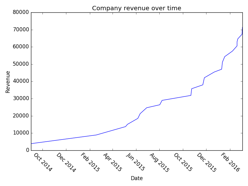
Quite a lot of work, really, just to generate some ‘likely looking’ sales data. Again, if you’ve got your own then use it! However, up till now I’ve just asserted that it’s likely looking. If you play around with it you can actually see some pretty interesting stuff. Firstly, with lots and lots of data point (N = 8000) you see that the company revenue growth looks very exponential:
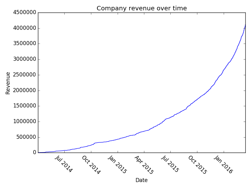
8000points

However, it’s unlikely that you’ve got 8000 B2B transactions in your sales pipeline (if you do, kudos!). Let’s examine the situation where you’ve got 150:
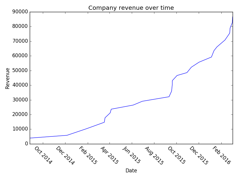
150points

And a once more with 150:

150points3

I think it’s interesting that, even though we’ve literally built this whole pipeline using exponential growth – we still look flat in a lot of places. Hopefully that might provide some solace if you’re struggling with sales and think you’re not hitting your exponential growth. Play around with the parameters and you can see what sort of effect increasing your conversion at various stages has on your overall revenue etc. Or just read the company names – they’re also pretty good.

Right, I’m counting that as broadly done. We’ve got sales data that nobody will mind me analysing in a public forum. Stay tuned/subscribe/email me to keep in touch for part 2. We’ll imagine that we’ve started with this data and we’ll try to assign a total value to our pipeline, and maybe even get onto predicting how many opportunities will progress in the next N days.
Finding and Trading Volatile Stocks in Python

Hi all,

Can’t promise that this post won’t be bitty – I’m trying to simultaneously run an SVM and a random forest on a bunch of particle physics data for the Kaggle competition. Check it out, it’s pretty cool. Anyway, my computer is straining under the weight of those calculations and so while that was happening I decided to have a look at stock prices using Python/Pandas again.

After chatting with co-blogger Sean, and based on my (limited, and hilariously bad) experiences of stock trading we decided it’d be interesting to identify volatile stocks that don’t seem to have greatly varying fundamental value. We’re basically looking for the position of a harmonic oscillator in a stock. I’m not graphing that – look it up yourself. The logic being, there’ll be a point at which it it’s profitable to buy a stock like this on a down and sell again when it’s back up. Of course, this requires the assumption that the stock itself isn’t having a fundamental value shift – it’s just suffering from cyclicity. I don’t really know if/how this’ll work but that’s half the fun…

Right, back to it (I’ve caught up with Game of Thrones – get it watched). I’ve thought a reasonable amount about this and have decided our first job is to look at maximizing the following quantity:

frac{Volatility}{Change_{daily}^n Change_{weekly}}

I might also throw in an additional concern – I’d like to be able to enter and exit the market whenever I want – I don’t see this being a big problem for me (I’m not going to be using a lot of money) but it’ll certainly be a concern for bigger players. Let’s cross that bridge if we need to.

So, to start off with, my daily volatility I’m going to define as
frac{sum_{i={day_1}}^{Today} frac{HighPrice_i - LowPrice_i}{ClosePrice_i}}{NumberOfDays}

Hopefully nothing earth-shattering there, just want to see how much it varies over a day. Now while I want the stock price to vary a lot, I want it to head back to where it started. A rapidly increasing/decreasing stock is going to have wildly varying days. However, it’s also going to have a large overall trend. That’s no good for the purposes of finding stocks to buy/sell on a short time period.

Change_{daily} = sqrt{frac{sum_{i={day_1}}^{Today} (frac{ClosePrice_i - OpenPrice_i}{OpenPrice_i})^2}{NumberOfDays}}

Change_{weekly} = sqrt{frac{sum_{i={week_1}}^{Today} (frac{ClosePrice_i - OpenPrice_i}{OpenPrice_i})^2}{NumberOfWeeks}}

Easy does it – the reason I’ve squared the result is basically that I don’t care whether the stock is rising or falling. I’m trying to minimize the overall long-term variations from the mean.

So, how easy is this in Python? Remarkably so. Let’s start off by plotting a scatter graph of some of the more promising stocks.

import numpy as np
from pandas.io.data import DataReader
import pandas as pd
from datetime import datetime
from pylab import savefig

## A list of American Stock Symbols
company_information = pd.read_csv('allcompany.csv')

volatility_measure = []
daily_change_measure = []
weekly_change_measure = []
labels = []

## Let's start out with the biggest 10 companies in my list

for company in company_information.sort(['MarketCap'], ascending=False).head(10)['Symbol']:
    try:
        company_frame = DataReader(company.strip(), 'yahoo', datetime(2013,1,1), datetime.now().date())
        company_frame['Volatility'] = (company_frame['High'] - company_frame['Low'])/company_frame['Close']
        volatility_measure.append(company_frame['Volatility'].mean())
        company_frame['Daily_Change'] = company_frame['Close'].diff()
        daily_change_measure.append(np.sqrt(np.mean(company_frame['Daily_Change']**2)))
        ## Take every 5th row
        weekly_company_frame = company_frame[::5]
        weekly_company_frame['Change'] = weekly_company_frame['Close'].diff()
        weekly_change_measure.append(np.sqrt(np.mean(weekly_company_frame['Change']**2)))
        labels.append(company.strip())
    except:
        print "Problem parsing %s" % company.strip()

for i in range(1,7):
    change_metric = [daily * (weekly ** (1./i)) for daily, weekly in zip(daily_change_measure, weekly_change_measure)]
    ax = plt.subplot(3,2,i)
    plt.xlabel('Log of overall change metric')
    plt.ylabel('Volatility metric')
    plt.title('Weekly power %.2f' % float(1./i))
    plt.scatter(change_metric, volatility_measure, c = volatility_measure, cmap=plt.get_cmap('Spectral'), label='Weekly power %.2f' % float(1./i))
    for label, x, y in zip(labels, change_metric, volatility_measure):
        plt.annotate(label, (x,y), xytext=(0,8), textcoords='offset points')

    plt.gca().set_xscale('log')
    plt.gca().legend_ = None

plt.suptitle('Daily Volatility of Stocks versus Overall Trend')
plt.tight_layout()
plt.show()
savefig('StockVolatility.png')

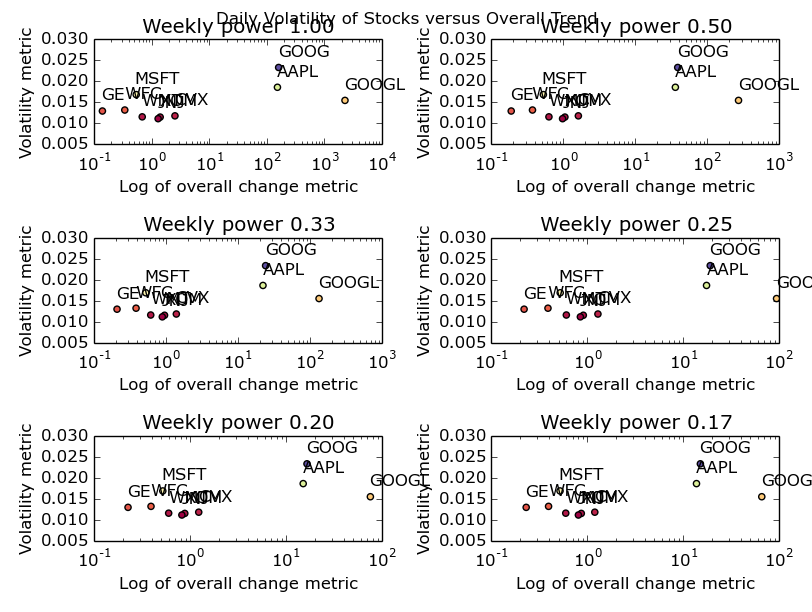
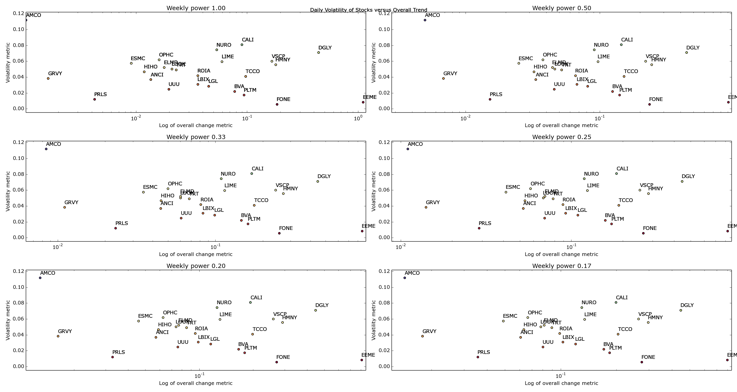
OK – it’s not especially pretty but it gives us the following picture:

Stock Volatility

The 10 biggest US stocks – their daily & weekly change versus their daily volatility

You could also make a fair point that I’ve formatted it poorly. Open it up as big as your browser will let you and you’ll be able to see it nicely. Or, just run the code and create your own picture. It’s dead easy. I promise.

So what can we infer from that picture? I’m going to go ahead and say not a huge deal. Apple & Google have made some crazy ups and downs over the last year or two (mostly ups) and hence I’ve been forced to use a log plot. Other than that, we can see a cluster of the remaining companies with GE seeming the most stable all round. One point I’d like to make now: by defining my metrics in such a way that they don’t really match to anything in reality, I’ve lost the ability to understand exactly what I’ve plotted. What I’m trying to say, is that the log of an overall change metric isn’t an intuitive quantity. Usually, it’s a good idea to pick metrics that have a fairly firm grounding in the real world unless you’ve got a really good reason not to. In my case, my reason is that all I’m trying to do here is identify stocks in the upper left most corner – I don’t care what their values are yet.

I’d also like to make the point here that for this data set, the change of power associated with the weekly metric seems to make no difference. I put it there to express the idea that we’re likely to want a different weighting on the daily and weekly variability depending on how often we want to trade the stock. As I’m hoping to trade multiple times daily, the daily variability is more important to me than the weekly variability (hence my choice of fractional powers of the weekly variable). If you’re looking at trading less regularly, change your parameters accordingly.

Now I’m going to go out on a limb and say that, when looking for daily volatility, the biggest companies in America aren’t the place to go looking. I’m sure that the algorithmic trading people are all over this kind of trade with fancy-pants C++ code designed to execute multiple trades/second. To do this at a reasonably large scale (and to overcome transaction/infrastructure costs) I’m going to say those guys will play with these big companies where a purchase of £1 million+ of shares isn’t going to be such a big deal. Playing in those markets must be the equivalent of going barracuda fishing with a thumb tack and a tie. I think we should start our search towards the lower market caps and work our way up until we’ve got a few hopefuls.

volatility_measure = []
daily_change_measure = []
weekly_change_measure = []
labels = []

for company in company_information[company_information['MarketCap'] > 10000000].sort(['MarketCap']).head(25)['Symbol']:
    try:
        company_frame = DataReader(company.strip(), 'yahoo', datetime(2013,1,1), datetime.now().date())
        company_frame['Volatility'] = (company_frame['High'] - company_frame['Low'])/company_frame['Close']
        volatility_measure.append(company_frame['Volatility'].mean())
        company_frame['Daily_Change'] = company_frame['Close'].diff()
        daily_change_measure.append(np.sqrt(np.mean(company_frame['Daily_Change']**2)))
        ## Take every 5th row
        weekly_company_frame = company_frame[::5]
        weekly_company_frame['Change'] = weekly_company_frame['Close'].diff()
        weekly_change_measure.append(np.sqrt(np.mean(weekly_company_frame['Change']**2)))
        labels.append(company.strip())
    except:
        print "Problem parsing %s" % company.strip()

for i in range(1,7):
    change_metric = [daily * (weekly ** (1./i)) for daily, weekly in zip(daily_change_measure, weekly_change_measure)]
    ax = plt.subplot(3,2,i)
    plt.xlabel('Log of overall change metric')
    plt.ylabel('Volatility metric')
    plt.title('Weekly power %.2f' % float(1./i))
    plt.scatter(change_metric, volatility_measure, c = volatility_measure, cmap=plt.get_cmap('Spectral'), label='Weekly power %.2f' % float(1./i))
    for label, x, y in zip(labels, change_metric, volatility_measure):
        plt.annotate(label, (x,y), xytext=(0,8), textcoords='offset points')

    plt.gca().set_xscale('log')
    plt.gca().legend_ = None
    plt.autoscale(tight=True)

plt.suptitle('Daily Volatility of Stocks versus Overall Trend')
plt.tight_layout()
plt.show()
savefig('SmallerCompanies.png')
Small Companies Volatility

Volatility versus overall change for American companies with Market Caps > $10,000,000

Well bugger me. I don’t know about you but that looks pretty cool to me. Ignore all the gumph in the middle and look at the outliers – AMCO, GRVY, PRLS, DGLY and EEME. These are great examples of companies that are going to be either maximums or minimums for our given metric.

OK – I’m going to call it a night for now but just think of the possibilities open to us now! We can change our date ranges, play around with our metrics and loop through as many stocks as we can find symbols for (harder than you’d think!) until we’ve got a reasonable amount of stocks that we think are great candidates for regularly buying and selling.

Next time, I’ll finalize my list of stocks and hopefully start to gain an idea of when one of these stocks becomes a buy, and when it becomes a sell. That sounds fairly difficult actually. Ah well, that’s the fun.

Winter is coming.

Stock Prices and Python – Pandas to the rescue

Hi all,

Today I fancy a bit of a play around with stock prices – I recently took the plunge into the world of stocks & shares and have been getting more and more interested in the financial world as I’ve become more and more exposed to it through savings. I’m a bit sceptical as to being able to find anything ‘new’ or any real arbitrage opportunities – mostly because there’s a billion (trillion?) dollar industry built off of the back of stock trading. It attracts some really smart people with some really powerful gear and a whole lot of money to invest. However, there’s no harm in having a look around and seeing what interesting things we can do with the data.

R is well good but I want a bit more freedom with this little project and I’m missing Python. I find that with R, I spend a lot of my time getting data into the right format to be able to use the tools that already exist. With Python, if I’m silly enough to decide on a strange data structure then I can. I shouldn’t, but I can.

Ordinarily I like the Python & SQL combination and tend not to rely too heavily on the ‘Python analysis stack’ of Pandas/iPython/Scipy/Matplotlib, only pulling things in when necessary. I was going to follow the same pure Python & SQL route for this project until I found an awesome little feature of Pandas – in-built Google and Yahoo stock data integration. It’s not that much work to build this sort of thing yourself but why reinvent the wheel? 🙂

So – I guess we should start with some sort of question, shall we see if we can plot some of the big tech players (AMZ, GOOGL, FB e.t.c.) against the whole tech sector. Given the recent headlines in that area it should be interesting and at least give us some ideas about future work.

As a lazy person, I’m not necessarily inclined to manually go through a list of stock symbols and decide if they’re tech or even go through a list of tech stock and type them into a text file. A quick google shows me that there’s nothing (that I could find) in the way of a regularly updated text file of what I’m after but it shouldn’t be too difficult to coax Python into doing this for me – let’s start off with the NASDAQ site.

If you have a look, you’ll see it’s fairly regular in its URL structure and the URLs are easily craftable – there’s an annoying amount of pagination but you can’t have everything. Actually, hold the phone. You can download the list as a CSV – winner winner chicken dinner.

Downloading all the company information we get a CSV with the following headers:

Symbol Name LastSale MarketCap ADR TSO IPOyear Sector Industry Summary Quote

All I’m really after for now is the sector and symbol – market cap will prove useful but basically I think I can agree we’ve hit the jackpot!

Time for the Python:

from pandas.io.data import DataReader
import pandas as pd
from datetime import datetime
import numpy as np
company_information = pd.read_csv('allcompany.csv')
mega_frame = [DataReader(company.strip(),  "yahoo", datetime(2014,1,1), datetime.now().date()) for company in company_information[company_information.Sector == 'Technology']['Symbol']]
symbol_list = [symbol for symbol in company_information[company_information.Sector == 'Technology']['Symbol']]

At this point we’ve got all the data since the start of the year on every tech stock listed on the NASDAQ, NYSE and AMEX and it’s taken us 6 lines. Note that the population of mega_frame takes a fairly long time. In retrospect, we should have filtered further

20 minutes later and I’m regretting my decision to get all of them.

Cancelled it and switched to the first 50 – will just prove concept first.

Right, now I’ve got a list containing data frames – one for each of the first 50 tech stocks. Let’s throw in a percentage change column and make sure all our data frames are of the same length to avoid problems at a later date:

mega_frame = [stock for stock in mega_frame if len(stock) == 79]
symbol_list = [symbol_list[index] for index in len(symbol_list) if len(mega_frame[i]) == 79]
for stock_index in range(len(mega_frame)):
    mega_frame[stock_index]['perc_change'] = 100*((mega_frame[stock_index]['Close'] - mega_frame[stock_index]['Open'])/mega_frame[stock_index]['Open'])
## The modal value is 79 hence 79
percentage_change_list = [stock['perc_change'] for stock in mega_frame]

Now we’re going to create a correlation matrix out of those lists to see the most strongly correlated tech stocks over that time period (and in our subset). I’m also going to look at the negatively correlated stocks – you wouldn’t expect to see a strong negative correlation for two stocks in the same sector and region but it won’t hurt to look:

correlation_matrix = np.corrcoef(percentage_change_list)
## Correlation with yourself is no big deal
for i in range(np.shape(correlation_matrix)[0]):
    for j in range(np.shape(correlation_matrix)[1]):
        if i == j:
             correlation_matrix[i][j] = 0
maximum_indices = np.argmax(correlation_matrix, axis=1)
minimum_indices = np.argmin(correlation_matrix, axis=1)
for index in range(np.shape(correlation_matrix)[0]):
    print "Stock %s is best correlated with stock %s: %.3g" % (my_list[index], my_list[maximum_indices[index]], correlation_matrix[index][maximum_indices[index]])
    print "Stock %s is worst correlated with stock %s: %.3g" % (my_list[index], my_list[minimum_indices[index]], correlation_matrix[index][minimum_indices[index]])

So there we have it (I’ll leave it to run over all the tech stocks overnight) – a fairly quick and simple way to find the most correlated tech stocks in America over a given time period.

Now this isn’t a particularly great way of doing this, as I said earlier, there are people who dedicate their lives to this. If the fancy takes me, I’ll have a look at a few of these (maximal spanning trees, stability of eigenvectors of correlation matrices e.t.c) and see what improvements we can make to our very simple model.

© 2024 DogDogFish

Theme by Anders NorenUp ↑