Data Science, amongst other things.

Tag: R

Drugs prescribed by the NHS

Hi All,

As always, apologies for the length of time between posts – think this is a record. I was working on stuff I’m not allowed to share (work stuff, then Kaggle stuff) and got minorly derailed by Game of Thrones. Finished all the TV series, and one of the books. And Life of Pi. And I’m working my way through the Book Thief. So yeah, a tad derailed.

However, I’ve got a lazy Sunday and I saw an advert on TV that really annoyed me. It was basically along the lines of ‘did your doctor mess up? Why not sue them?’ and I think that it takes us towards where the Americans are. Which, when it comes to healthcare, is not where we want to go. Given that in the UK, if you’re being treated by a doctor it’s almost certainly an NHS doctor it seems pretty sucky that people are being encouraged to sue them. Puts the price up for everybody and makes people less likely to become doctors and whatnot. Anyway, this isn’t a political rant blog – I thought I’d have a look and see what data is available on the NHS to see if I could show the effects of an increase in litigation on the standard on medical care provided/costs (and ideally, contrast with America). In short, I couldn’t. The data that I wanted just wasn’t there. However, there was data on the drugs that the GPs for the NHS prescribes (at least between Jan and June in 2012) by practice with cost data. That seemed pretty interesting and so here we are.

I’ve been playing around with Google’s coLaboratory (check it out here) and would have loved to use this to do this particular bit of analysis. However, after playing round with it for a bit and struggling with external documents, finding my Google docs and various libraries I wanted I’ve decided to leave it for a while until coLaboratory becomes a tad more mature. Lots of promise there and with good Google Analytics API integration we could transform analytics practices at my company. Certainly one to watch.

Anyway, without that I’ll think of the questions I want to answer first and then pick my tool. Firstly, the data…

The data

As ever, data.gov.uk to the rescue – head here and download yourself a nice copy of the data:

http://data.gov.uk/dataset/gp-practice-prescribing-data

Once you’ve got a copy of all the data and the list of practices in England (I used the most recent one) we’re ready to start asking some questions of the data…

The Analysis

First off, let’s pick something simple – which drug costs the NHS most in each of the months of our test set, and overall.

Total Drug Cost

This actually seems to lend itself to the mapreduce paradigm pretty nicely – the mapper seems pretty unnecessary and as I’ve not got a cluster to hand (and this doesn’t warrant me spinning one up with AWS) I’ll just write a quick reducer in Python and use the Unix sort. For what it’s worth, I think I might write something about spinning up a quick cluster on AWS in the near future. It’s a fairly useful skill to have and given the increasing reluctance of my computer to perform the most basic of tasks, I think a fair bit of my future data analysis might have to happen in the cloud. Anyway, this is what my command will look like once I’m done:

awk 'FNR>1{print}' T201202PDP IEXT.CSV | sort -t , -k5 | python spending_reducer.py

Nothing too complicated there. I’m ignoring the first line (the awk command), then sorting the whole file based on the 4th column (the drug id) and piping the whole thing into the following reducer:

#!/usr/bin/python

import sys

current_drug = None
current_cost = 0.0

for line in sys.stdin:
    authority, trust, practice, drug_code, drug_name, number_bought, ni_cost, act_cost, period = line.strip().split(',')
    act_cost = float(act_cost.lstrip('0'))
    if drug_name == current_drug:
        current_cost += act_cost
    else:
        if current_drug:
            print current_drug + "t" + str(current_cost)
        current_drug = drug_name
        current_cost = act_cost

print current_drug + "t" + str(current_cost)

Nothing too difficult there – we’re just keeping track of the drug we’re on and adding up as we go. If I had no fear for the amount of RAM I had we could’ve accomplished the same thing without the laborious sorting step using associative arrays in awk. But for the next stage – the total across all 6 months, I am very afraid (RAM wise) and so we can run the same query with a bit of wildcarding:

awk 'FNR>1{print}' T20120[1-6]P*.CSV | sort -t , -k5 | python spending_reducer.py > drugs_by_spend.txt

This runs the same calculation over every file matching that wildcard pattern (all the data between 2012/01 and 2012/06. Note that this’ll take a little time – that sort is reasonably expensive over the 4 or so gigabytes of data we’ve got. Now we’ll pull together a few graphs and for this I think we’ll use R…

my_frame <- data.frame(read.csv('drugs_by_spend.txt', header=F, sep="t", colnames=c("Drug", "Spend")))
my_frame <- my_frame[order(-my_frame$Spend),]
head(my_frame)

The top 5 drugs, by spend, in the first half of 2012 were:

  1. Fluticasone Propionate (Inh)
  2. Atorvastatin
  3. Enteral Nutrition
  4. Pregabalin
  5. Budesonide

Between them these cost: £738,620,789

Wow – that’s a hell of a lot. In 6 months, the actual costs of these drugs alone was more than £700million!

The total cost of drugs prescribed in that time period: £2,785,540,256

So I think we can surmise that lots of money is spent by the NHS – OK, I suppose that’s no surprise. For the non-doctors amongst us (that includes me) that list features two anti-asthmatic treatments i.e. those inhalers that I’m sure a lot of you have (also includes me). A quick Wikipedia shows that Pfizer holds the patent to at least a couple of those drugs (or at least did, Atorvastatin has expired) – it might be interesting to stick the patent holder next to these drugs. Maybe later…

Right, there’s lots that we could do here but I’m going to call it a day for now. In the future I think I’ll try and get more months of data and then start to look at evolving trends. To do that, I’ll use an AWS cluster and so will write something and using that.

Until then.
Best Housing Investments of the last 20 years

Hey all,

So from that long list I posted I’ve decided I’m most interested in the fastest growing and falling towns in the UK, as measured by the average house selling price. Once we’ve got a bunch of hot/not towns we might even be able to have a look at what these towns looked like before their boom. The hope is then that we’ll be able to find towns in that situation right now and boom, we’re housing moguls.

Given my poor excuse for hardware, we’ll have to start in bash:

 awk -F, '{print $3"-"$4"-"($(NF-3))}' pp-all.csv | tr -d '"' | cut -d '-' -f1,2,3,5 | tr '-' 't' | awk '{summary_array[$2"-"$3"-"$4] += $1; count_array[$2"-"$3"-"$4]++} END {for (region in summary_array) print region"t"summary_array[region]/count_array[region]}' | tr '-' 't' | sort -nk1 -nk2 > average_sale_price_by_town_and_month.txt 

where pp-all.csv is all the UK housing data as downloaded from data.gov.uk. The format of the data and what the above code does is inferrable from the following R code:

library(reshape2)
library(plyr)
library(ggplot2)
myData <- read.csv('average_sale_price_by_town_and_month.txt', header=F, sep='t')
colnames(myData) <- c("Year", "Month", "Town", "Average_Price")
## Let's not make the same mistakes as we did last time - which data should we remove pre-analysis?
summary(count(myData, c('Town'))$freq)
## From that, I'm going to say let's remove any town without 229 points.
myData <- myData[!(myData$Town %in% levels(myData$Town)[(count(myData, c('Town'))$freq < 229)]),]

I’m going to break out of code mode to explain that last line because it is horrible. I’m first grouping my data by town and counting the number of entries – in SQL this’d be SELECT count(date) FROM myData GROUP BY Town . I’m then comparing every entry in the list to 229 (the max number of points each town can have) and producing a logical list of the same size as the number of towns indicating whether the town at that index has a full complement of points. levels(myData$Town) gives me a list of all the towns which is placed against the previously calculated logical list – only towns matching a TRUE are kept. At that point, we’ve got a list containing all the towns we want to keep – myData$Town %in% compares the Town column of myData against this list and acts like a SQL where clause. Finally, in confusing developments, I’ve inverted all of the above logic with an ! – this’ll now only keep columns where the number of entries per town is greater than 228. The comma before the square bracket says to include all columns (we could add filters there if we liked). We assign all of this to itself, in effect filtering the original data frame by removing any lines belonging to towns which don’t have a full complement of points. All in that one line.

In practical advice for the novice R coder (which I’d class myself as) – start with the smallest bit of code you can and then add bits on when you’re comfortable with what they’re doing. Actually, that’s not just true of R – the bash one-liner above would likely be best constructed in exactly the same way.

Anyway, where were we?

myData$Datey <- as.Date(paste(myData$Year, myData$Month, 1, sep='-'), '%Y-%m-%d')
myData <- myData[,!(names(myData) %in% c("Year", "Month"))]
ts_frame <- dcast(myData, Datey ~ Town, value.var="Average_Price")
row.names(ts_frame) <- ts_frame$Datey
ts_frame <- ts_frame[,!(names(ts_frame) %in% c("Datey"))]
growth_frame = data.frame(matrix(0, ncol=1, nrow=length(ncol(ts_frame))))
row.names(growth_frame) <- names(ts_frame)
for (i in 1:ncol(ts_frame)) {
  total_growth <- 100*((ts_frame[length(ts_frame[,i]),i] - ts_frame[1,i])/ts_frame[1,i])
  growth_frame[[names(ts_frame)[i]]] = total_growth
}
long_growth_frame <- melt(growth_frame)
colnames(long_growth_frame) <- c("Town", "Percentage_growth")
long_growth_frame <- long_growth_frame[long_growth_frame$Percentage_growth > 0.1,]
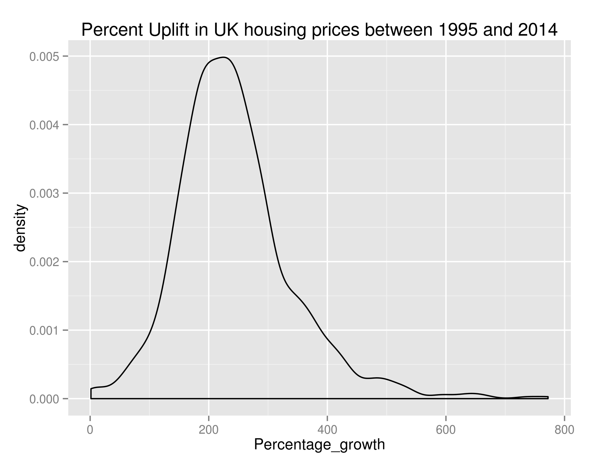
ggplot(long_growth_frame, aes(x=Percentage_growth)) + geom_density() + ggtitle("Percent Uplift in UK housing prices between 1995 and 2014")

giving us:

Growth in UK House Prices

Density of the Percentage Growth of Average House Price (by town) in the UK between 1995 and 2014

As we can see, the bulk of towns experienced between 100% and 400% growth in that time – if anybody can point me towards UK salary figures over that time period I think that’d be a nice set to join this with.

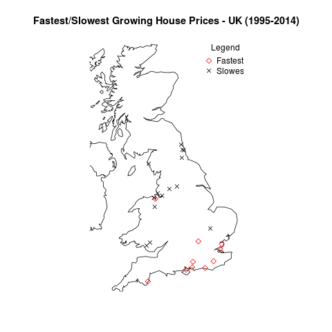
Anyway, let’s take what we’ve done in the previous post on house prices and plot the data on a UK map. There are too many points for me to reasonably plot all of them – let’s go with the top 20 (Red diamonds) and bottom 20 (black crosses):

ordered_growth_frame <- long_growth_frame[order(long_growth_frame$Percentage_growth),]
library(maps)
library(mapdata)
library(RCurl)
library(RJSONIO)
## A couple of functions allowing us to dynamically get the longitude and latitude of regions
construct.geocode.url <- function(address, return.call = "json", sensor = "false") {
  root <- "http://maps.google.com/maps/api/geocode/"
  u <- paste(root, return.call, "?address=", address, "&sensor=", sensor, sep = "")
  return(URLencode(u))
}

gGeoCode <- function(address,verbose=FALSE) {
  if(verbose) cat(address,"n")
  u <- construct.geocode.url(address)
  doc <- getURL(u)
  x <- fromJSON(doc,simplify = FALSE)
  if(x$status=="OK") {
    lat <- x$results[[1]]$geometry$location$lat
    lng <- x$results[[1]]$geometry$location$lng
    return(c(lat, lng))
  } else {
    return(c(NA,NA))
  }
}

map('worldHires',  c('UK', 'Ireland', 'Isle of Man','Isle of Wight'), xlim=c(-7,2), ylim=c(50.1,58.7))  
long_and_lat <- data.frame(sapply(paste(head(ordered_growth_frame, n=20)$Town, ", UK", sep=''), function(x) gGeoCode(x)))
row.names(long_and_lat) <- c("Latitude", "Longitude")
long_and_lat <- data.frame(t(long_and_lat))
points(long_and_lat$Longitude, long_and_lat$Latitude, col=1, pch=4)
long_and_lat <- data.frame(sapply(paste(tail(ordered_growth_frame, n=20)$Town, ", UK", sep=''), function(x) gGeoCode(x)))
row.names(long_and_lat) <- c("Latitude", "Longitude")
long_and_lat <- data.frame(t(long_and_lat))
points(long_and_lat$Longitude, long_and_lat$Latitude, col=2, pch=5)
title('Fastest/Slowest Growing House Prices - UK (1995-2014)')
legend("topright", legend=c("Fastest", "Slowest"), title="Legend", bty="n", pch=c(5,4), col=c("red", "black"), inset=c(-0.05,0))

giving us:

UK Growth Map

The towns with the fastest and slowest growth in average house price since 1995.

So it looks like the South Coast has been the place to buy houses in the last 20 or so years. And the North East/North West were the places to be avoided.

OK – that’s all well and good but it doesn’t really tell us anything about the area we should be buying houses in now. Hold your horses. I’m getting to that. Obviously we’re not really going to be able to learn anything looking at the price difference between the end of our ‘test’ period and the start of our ‘test’ period. We need to build our model over a subset of this data, and test it against the remaining data.

For my next trick (blog post) I’ll look at predicting the fastest growing regions. As a sneak peek, to do we’ll use growth % as the metric we’re trying to predict (a continuous variable) and we’ll create features out of the input data set. I don’t know which method we’ll use yet but it’ll be one of linear regression, SVM regression or neural networks. Likely whichever is best supported by the language I choose to use. I’ve used Libsvm before and found it very good so maybe that.

What we do in life echoes in eternity.

UK House Sales – When should estate agents go on holiday?

Hi all,

If you’ve been following all of these blog posts then you’re in a minority of one. However, you’ll also know that we’ve taken all of the UK house sales in the last 18 years or so and have found a bunch of things out. We’ve seen the spread of average house price by region, we’ve seen seasonality in the average house price, we’ve seen the impact the housing crash had on average house price (not that much) and on number of houses sold (an awful lot). Finally, we investigated seasonality of number of house sales by region and in doing so, found that London suffered the housing crash worse than other areas but almost immediately picked itself up and is in fact (relative to the rest of the country) better off than it was before the crash.

I had a couple of ideas for investigations in my last post – one of which was finding the most sold house in the UK and seeing if there was a correlation between the times a house has sold and its price. I’ll briefly tackle this because it’s one line of bash – working with our file pp-all.csv (all of our data in one big text file) the following command will give us the top 100 most sold properties in the UK in the last 18 years:


cut -d ',' -f5,9-15 pp-all.csv | tr -d '"' | tr ',' ' ' | sort | uniq -c | sort -k1 -n -r | head -n 100

The top 10 are as follows (with the format: # of sales | postcode | address ) :

24 L17 3BP 48 FLAT 5-19 ULLET ROAD LIVERPOOL LIVERPOOL MERSEYSIDE
19 W8 6JE 126 FLAT 1-10 LEXHAM GARDENS LONDON KENSINGTON AND CHELSEA GREATER LONDON
19 LS2 7LY 31 EASTGATE LEEDS LEEDS LEEDS WEST YORKSHIRE
16 SE1 3FF 41 FLAT 67 MALTBY STREET LONDON SOUTHWARK GREATER LONDON
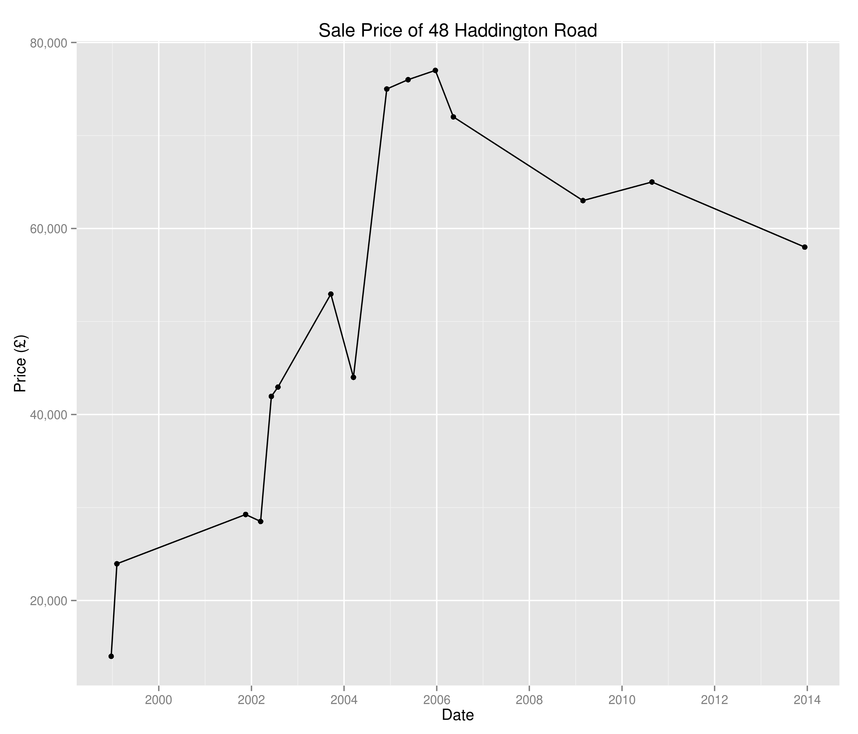
16 PL2 1RR 48 HADDINGTON ROAD PLYMOUTH CITY OF PLYMOUTH CITY OF PLYMOUTH
16 BN43 5AR SHOREHAM COURT 3-10 THE CLOSE SHOREHAM-BY-SEA ADUR WEST SUSSEX
15 IP1 3PW 54 ANGLESEA ROAD IPSWICH IPSWICH IPSWICH SUFFOLK
14 WA16 6JD TATTON LODGE 1-6 MOORSIDE KNUTSFORD CHESHIRE EAST CHESHIRE EAST
14 M3 6DE FRESH 138 APARTMENT 1008 CHAPEL STREET SALFORD SALFORD SALFORD
14 M19 2HF 35 CENTRAL AVENUE MANCHESTER MANCHESTER GREATER MANCHESTER

I decided against pursuing this investigation as a quick hunt on Zoopla tells me that flats 5-19 Ullet Road were sold individually and so we’re just seeing the results of grouping and nothing overly interesting. I guess there are certain houses in there of interest – why has 48 Haddington Road been sold 16 times since 1995?

Sale prices of 48 Haddington Road since 1995

Sale prices of 48 Haddington Road since 1995

I don’t really know and I’m not going to investigate – I think I’d rather look at the age old question:

“When should estate agents take holidays?”

Of course, this is every bit as much a question of where national estate agents should have their staff distributed throughout the year, which region removal companies should target throughout the year, where travelling housing surveyors are most likely to pick up business e.t.c.

In the last post we were able to create time series of the percentage of UK house sales a region was responsible for. Now we’re going to create a whole bunch of time series (one for each region) and perform clustering on them to see when each region peaks and troughs. Note we’re looking at a percentage of total sales here and not absolute numbers – I’m also not looking at the saturation of the market or anything like that.

I’m going to use Markov Clustering in this example – don’t worry too much about this (if you don’t want to), I’ll do a post on Markov Clustering at a later point. For now, all you need to know is that it’ll cluster our data in a sensible way.

So, down to business:

## Get the data I need in a small(er) table
library(reshape2)
library(rEMM)
mini_frame <- data.frame(newFrame$Datey, newFrame$Region, newFrame$Percent)
colnames(mini_frame) <- c("Datey", "Region", "Percent")
ts_frame <- dcast(mini_frame, Datey ~ Region, sum)
## Have found I need to initialize this before I kick off
seasonal_ts_frame <- data.frame(matrix(0, nrow=12, ncol=length(colnames(ts_frame)))
colnames(seasonal_ts_frame) <- colnames(ts_frame)
row.names(seasonal_ts_frame) <- factor(month.name, levels=month.name)
for (i in 1:ncol(ts_frame)) {
    decomposed_ts <- decompose(ts(ts_frame[,i], frequency=12, start=c(1995,1)))$seasonal[c(1:12)]
    seasonal_ts_frame[[colnames(ts_frame)[i]]] <- decomposed_ts
}
cor(seasonal_ts_frame)
emm <- EMM(threshold=0.2, measure="eJaccard")
build(emm, cor(seasonal_ts_frame))
cluster_centres <- data.frame(cluster_centers(emm))
cluster_frame <- data.frame(lapply(cluster_centres, which.max))
row.names(cluster_frame) <- c("Cluster")
cluster_frame <- data.frame(t(cluster_frame))
colnames(cluster_frame) <- c("Region", "Cluster")
cluster_one <- subset(cluster_frame, Cluster==1)
cluster_two <- subset(cluster_frame, Cluster==2)
## A list of all the cluster one regions
seasonal_ts_frame[,(names(seasonal_ts_frame) %in% row.names(cluster_one))]
## Now the biggie - let's see the points on a map
library(maps)
library(mapdata)
library(RCurl)
library(RJSONIO)

## A couple of functions allowing us to dynamically get the longitude and latitude of regions
construct.geocode.url <- function(address, return.call = "json", sensor = "false") {
  root <- "http://maps.google.com/maps/api/geocode/"
  u <- paste(root, return.call, "?address=", address, "&sensor=", sensor, sep = "")
  return(URLencode(u))
}

gGeoCode <- function(address,verbose=FALSE) {
  if(verbose) cat(address,"n")
  u <- construct.geocode.url(address)
  doc <- getURL(u)
  x <- fromJSON(doc,simplify = FALSE)
  if(x$status=="OK") {
    lat <- x$results[[1]]$geometry$location$lat
    lng <- x$results[[1]]$geometry$location$lng
    return(c(lat, lng))
  } else {
    return(c(NA,NA))
  }
}

## Plot a UK map
map('worldHires', c('UK', 'Ireland', 'Isle of Man','Isle of Wight'), xlim=c(-8,2), ylim=c(51.8,54.2))

longitude_and_latitude <- data.frame(sapply(paste(row.names(cluster_one), ", UK", sep=''), function(x) gGeoCode(x)))
row.names(longitude_and_latitude) <- c("Latitude", "Longitude")
longitude_and_latitude <- data.frame(t(longitude_and_latitude))
points(longitude_and_latitude$Longitude, longitude_and_latitude$Latitude, col=1, pch=4)

O.K, so there’s an awful lot of R code in there and all to produce a slightly underwhelming graph. Where does the great divide come in seasonality of house sales? Why, in South Wales and North East England of course:

Seasonality Cluster

Regions that break the national housing seasonality pattern

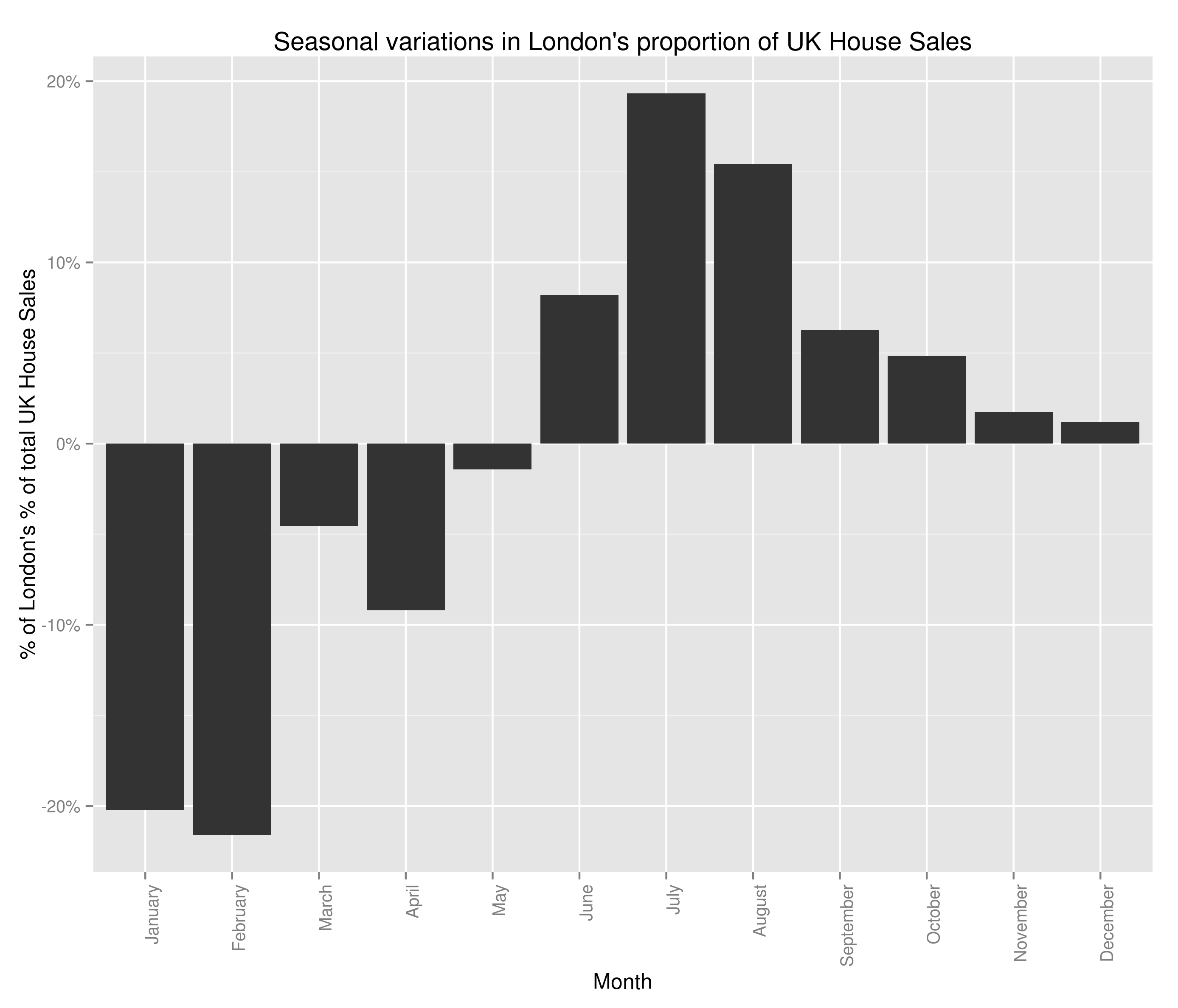
Semi-ignoring our ability to get accurate latitude and longitude using what was at best, a wildly optimistic attempt at doing so, we have some fairly believable (if confusing clusters). The bulk of the country follows the trend set by London:

Seasonal Variations in London's Percent of the UK Housing Market (by number sold)

Seasonal Variations in London’s Percent of the UK Housing Market (by number sold)

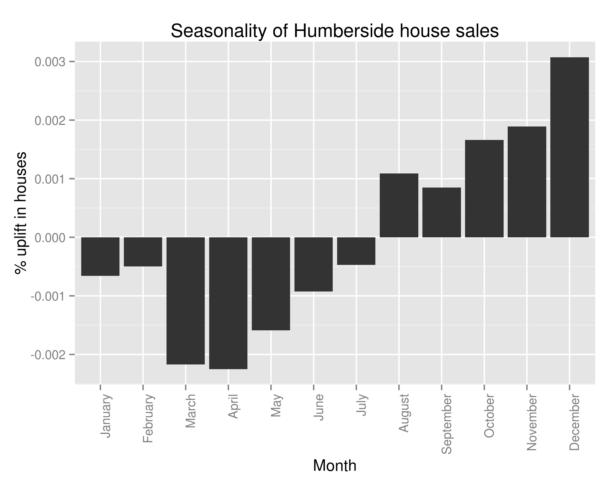
with lots of houses being bought in the summer and many fewer being bought in the winter. However, 6 regions in South Wales (including all of Glamorgan), 2 regions in the North East of England and Avon all follow this trend:

Seasonal Variations in Humberside's Percent of the UK Housing Market (by number sold)

Seasonal Variations in Humberside’s Percent of the UK Housing Market (by number sold)

This struck me as very strange indeed and so I looked at the original data and what should I discover? That almost all of the above analysis is wrong. If only we’d have performed the following query the folly of all that I’ve done would have become clear:

colSums(ts_frame==0) > 200

Every single one of the regions that didn’t follow our pattern had substantial missing data. One with more knowledge of British geography may have been able to spot that those counties had ceased to exist in 1995/6. The reason why I’ve left all that analysis in, aside from the fact that there are a few useful bits of code in there (plotting the regions on a UK map may well be helpful to somebody), is to show that it’s really really important to check your data when you’ve got an unexpected result. It’s also important to check it whatever the result, but in data analysis, if something seems dodgy there’s a good chance it is.

When I strip out all regions with missing data, we in fact see that all of the regions follows the same pattern as Greater London. Bugger.

Going to draw this one to a close – what have we discovered? Well, we now know that every single region in the UK follows the same seasonality pattern when it comes to house sales: lots more in summer than winter. We also know that the average house price follows the same trend. I’ve not shown that the regionality isn’t a factor in the increasing average house price (you could imagine the scenario where the more expensive areas see a greater surge in house sales in the summer than the less expensive areas). I’m not sure what I’m going to work on next – I’m getting a bit sick of house prices.

It’ll likely either be:
1.) Regional variations in average house price.
2.) Which regions see the greatest increase in number of house sales in summer – clustering as before.
3.) Seasonality of any other variable (type of house, new versus old, freehold versus leasehold)
4.) Build a predictive model to calculate something specific (number of old detached houses sold in Derbyshire every month for the next year).
5.) Identify towns with the fastest growing (and falling) average house price over the last x years. Try to use this to predict which areas will see similar areas of growth/decline in the future.
6.) Finding correlated stock opening/closing prices over historical data and using this to make £££££. Obviously that one is a bit different but does involve ££££.

UK House Sales – More Seasonality in Time Series with R

So the average sale price of houses in the UK is seasonal. Does that mean it’s sensible to advise house buyers to only purchase in the winter months? Let’s try to see.

I’m going to have a look and see if the data we have implies that the change in average sale price of a house with the month is actually just a function of some other monthly variation. I don’t really know how to go about doing this but it’s probably best to not let things like that stop me – I’m thinking the first port of call is likely calculate the correlation between the month each of the other factors (excluding price). If there’s a decent correlation (positive or negative) then we might be in trouble and will have to investigate that variable with a bit more seriousness.

Again, that’d be a delightfully easy task if I could hold the entire dataset in memory. Unfortunately I’m not that lucky and so I’ll have to do a bit of aggregation before importing the data to R/Python.

So my independent variables:

1.) Region
2.) Type of house
3.) New or old house
4.) Freehold or leasehold

I’m thinking of the work we did in the last blog post in Python and that that might be the best way to proceed; to generate vectors containing the average proportion of sales due to each ‘test group’ (the factors of the independent variable in question) in each of the relevant years. Once I’ve got that, I’m initially thinking of a twelve variant paired t-test. We’ve got 12 different months – in each month we’ve got a year for which each of the other test groups have a corresponding year, hence the choice of paired t-test. However, previously when I grievously abused the normality assumption required to run a t-test I had a whole bunch of data (800,000 points) and so I was sort of O.K with it. Now, I’ve got 18. We may have to investigate other options – Kruskal-Wallis being at the forefront of those. Anyway – let’s worry about that when we have to.

First things first, let’s get this data into a format we can load into memory:

awk -F, '{print $4"-"$(NF-1)}' pp-all.csv | cut -d '-' -f1,2,4 | tr -d '"' | tr '-' ' ' | sed -e 's/s+/-/' | sed -e 's/s+/,/' | sort | uniq -c | sort -s -nk2 | sed 's/^ *//' | sed -e 's/s+/,/' | awk -F, '{if ($3 != "2014-01") print $0}' > number_of_sales_by_region.txt

Again, a horrible one-liner that I’ll have to apologise for. All it does is give me an output file with the format: Count | Month | Region – off of the back of that I can now use R:

library(plyr)
library(ggplot2)
library(scales)
myData <- read.csv('number_of_sales_by_region.txt', header=F, sep=',', col.names=c("Sales", "Datey", "Region"))
## To store as a date object we need a day - let's assume the first of the month
myData$Datey <- as.Date(paste(myData$Datey, 1, sep="-"), format="%Y-%m-%d")
## I'm not too worried about January 2014 - it makes the lengths of the 'month vectors' uneven and ruins the below graphs
myData <- myData[format(myData$Datey, "%Y") < 2014,]
byYear <- data.frame(aggregate(Sales ~ format(Datey, "%Y"), data = myData, FUN=sum))
colnames(byYear) <- c("Year", "houseSales")
ggplot(byYear, aes(x=Year, y=houseSales)) + geom_bar(stat="identity") + ggtitle("Number of UK House Sales") + theme(axis.text.x = element_text(angle=90, hjust=1)) + scale_y_continuous(name="Houses Sold", labels=comma)
byMonth <- data.frame(aggregate(Sales ~ format(Datey, "%m"), data = myData, FUN=sum))
colnames(byMonth) <- c("Month", "houseSales")
byMonth$Month <- factor(month.name, levels=month.name)
ggplot(byMonth, aes(x=Month, y=houseSales)) + geom_bar(stat="identity") + ggtitle("Number of UK House Sales") + theme(axis.text.x = element_text(angle=90, hjust=1)) + scale_y_continuous(name="Houses Sold", labels=comma)

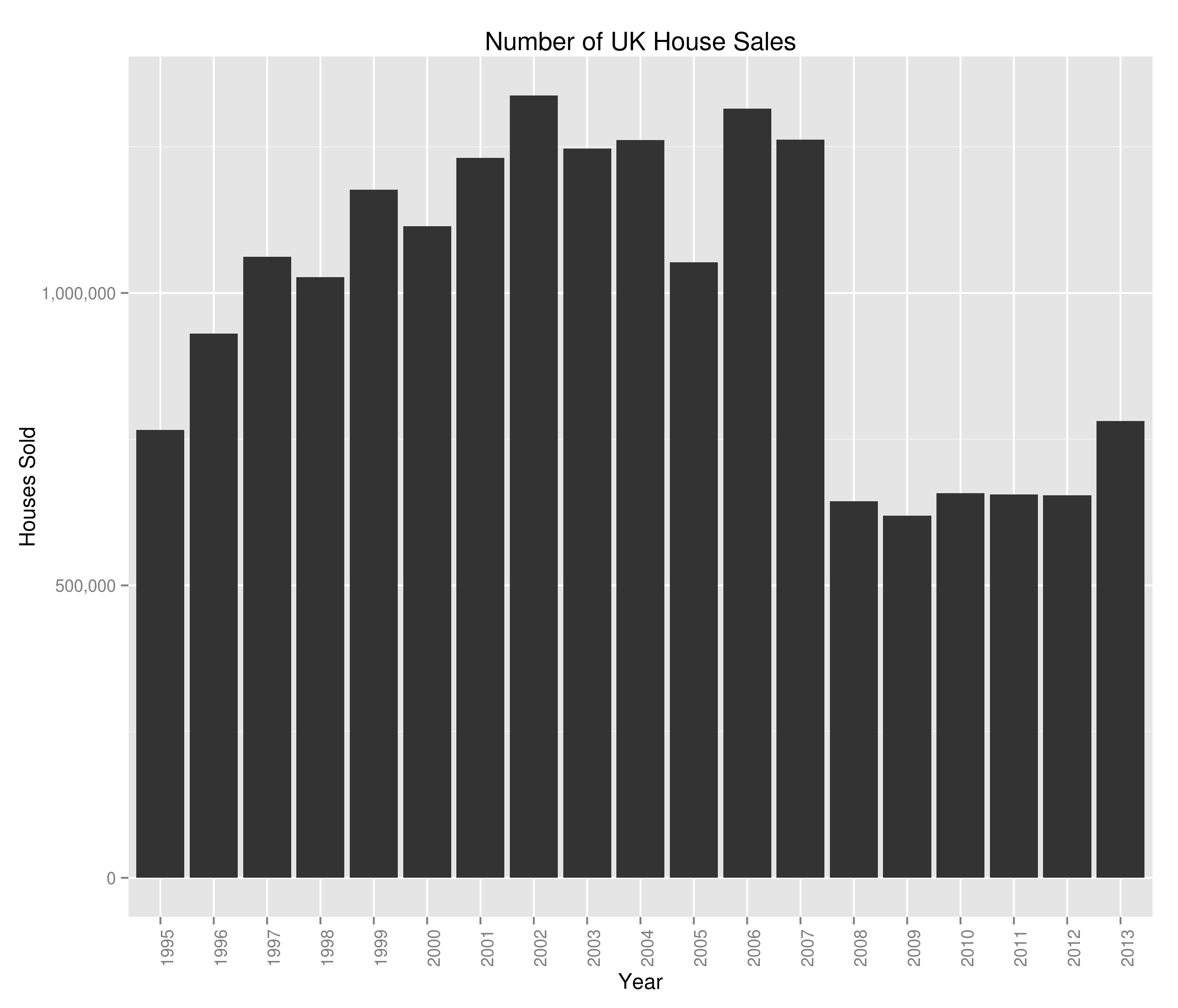
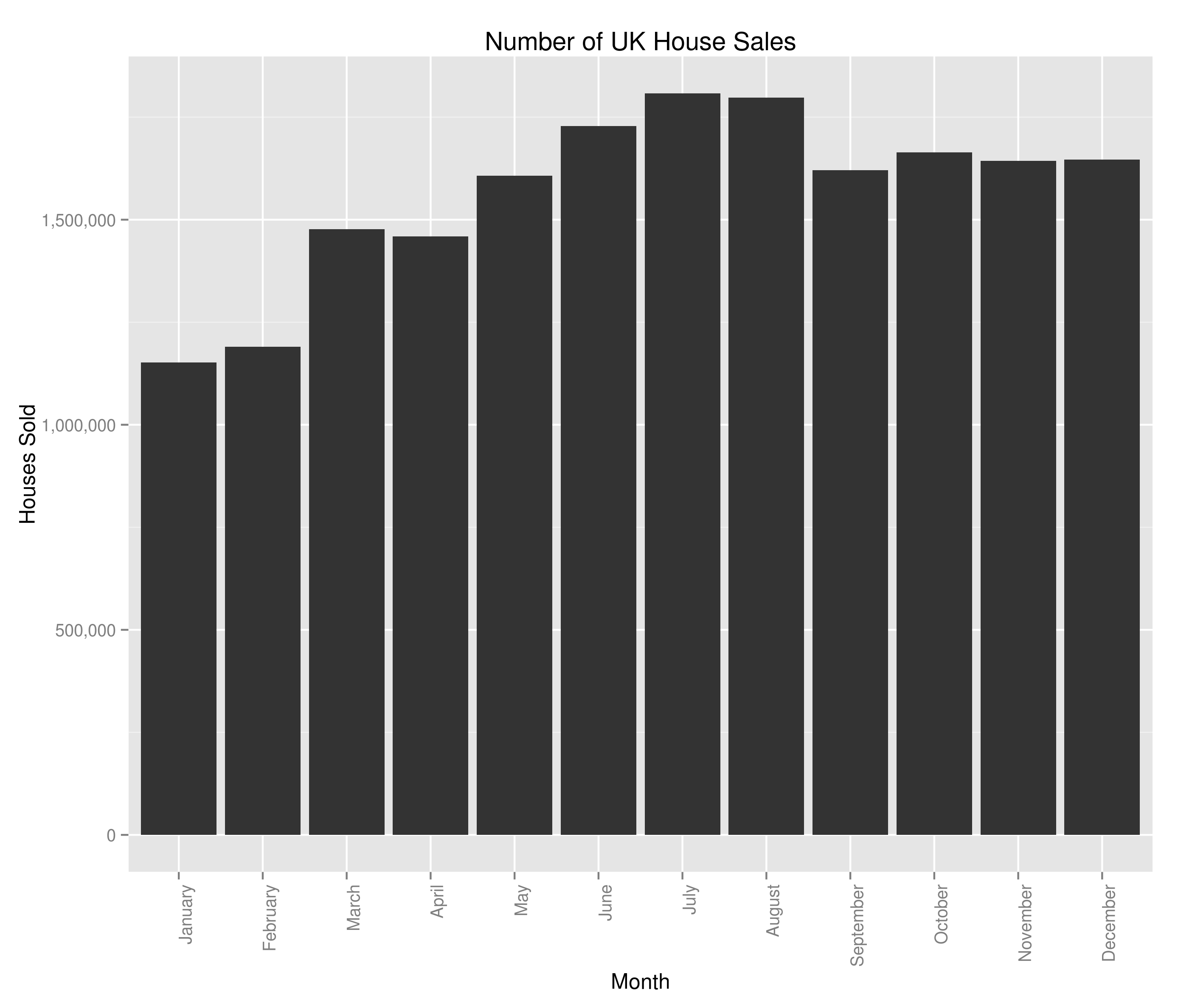
Giving us what’d I’d class as a couple of very interesting graphs:

Number of UK House Sales by Year

Number of UK House Sales by Year

and:

UK House Sales by Month

Number of UK House Sales by Month

In terms of the housing crash, we saw it a bit in the average house sale price but we can see the main impact was a complete slow-down on the number of houses sold. There are potentially hints of a re-awakening in 2013 but I guess we’ll have to see how this year ends up panning out. The monthly variation is interesting and at first glance, counter-intuitive when viewed alongside the average house price data. Naively, you’d expect the average house price to be highest when fewer houses were being sold (what with number of houses being the denominator and all). I’m not too bothered in digging into the relationship between number of houses sold and average house sale price (I’ve got the feeling that it’s the sort of thing economists would concern themselves with) so won’t really be looking at that. I am however now at least a bit interested in the most sold houses in the UK – I don’t know what I’ll uncover but I’m marking it down as something to look at in the future.

Anyway, now we’ve had a first look at our data let’s see if we can track the proportion of UK house sales made by each region. There are likely a few ways to do this in R; I’ll be picking the SQL-esque way because I use SQL a lot more than I use R and so am more familiar with the ideas behind it. I’d be glad to be shown a more paradigmically R way to do it (in the comments):

myData$Year <- format(myData$Datey, "%Y")
myData <- merge(x=myData, y=byYear, by = "Year")
myData$Percent <- 100*(myData$Sales/myData$houseSales)
## I'm not very London-centric but given that they're the biggest house sellers in the UK...
londontimeseries <- ts(myData[myData$Region == 'GREATER LONDON',]$Percent, frequency=12, start=c(1995, 1))
london_decomposed <- decompose(londontimeseries)
plot(london_decomposed)
seasonality <- data.frame(london_decomposed$seasonal[c(1:12)])
colnames(seasonality) <- c("Sales", "Month")
ggplot(seasonality, aes(x=Month, y=Sales)) + geom_bar(stat="identity") + ggtitle("Seasonal variations in London's proportion of UK House Sales") + theme(axis.text.x = element_text(angle=90, hjust=1)) + scale_y_continuous(name="$ of London's % of total UK house sales", labels=percent)

giving:

London's proportion of UK House Sales

The percent of UK house sales that were made in Greater London between 1995 and 2014 and inferences around the overall trend and seasonality

and the bit we were after:

Seasonal Variations in London's Percent of the UK Housing Market (by number sold)

Seasonal Variations in London’s Percent of the UK Housing Market (by number sold)

Well, I don’t really know if that’s good news or bad. It’s good in the fact that we thought to check the factors behind seasonal variations in house price. It’s bad because I can no longer advise people to buy houses in the winter (I’ve checked and there’s a seasonal variation for every region I tried). In all honesty, I think the two graphs above are really interesting. I’m saying that the housing crash effected London more strongly than the rest of the country, but that the market in London bounced back within a year and is now above pre-crash levels. The size of the seasonal variations is pretty marked as well, with 20% swings either way from London’s mean value of percent of total house sales (sorry if the language seems verbose – I’m being careful to be precise).

What does this mean for our investigation into the seasonality of the average house price? Well, I’m confident that the average house price is seasonal but I’m also confident that we can’t use that to advise people when they should be selling their house (just yet).

There are a couple of pieces of analysis I’d now like to do on this data. I think it’d be really interesting to get an idea of the ‘most-sold’ house in the UK since 1995. I also think there may be surprises around the correlation between the number of times a house is sold and its selling price. However, this seasonality by region is also really interesting and I think I’d like to try to cluster regions based on the seasonality of their housing market. It’d be interesting to graph the clusters and see if the divide is North/South, City/Country or something else entirely. Additionally, the (G.C.S.E) economist in me is screaming out for the same investigation as above but with total sale price instead of number sold.

UK House Prices – Seasonality in Time Series with R

Hi All,

After work over one year (approximately 800,000 data points) it’s time to start ramping things up a bit and we’ll be heading into the realms of big data. There are a bunch of definitions of big data floating around but I’m going to go with the one I like the most: “Big data is the point at which the size of your data becomes part of the problem.” That of course depends entirely on the hardware you’ve got and given my current hardware situation, as soon as we start looking at multiple years of house sale data, we’re firmly in ‘big data’ territory. In fact, the size of the data isn’t really that large – only ~20 million rows with a total size of 3.2GB. I could upgrade my RAM for a small amount and we’d be fine to deal with this in the usual ways. However, I’m cheap, the shops are closed and I’d rather think of a less hardware bound way of doing it.

Unfortunately for me, while working at home on my own projects, I don’t have access to any cluster of computers so won’t be throwing my data into HDFS and getting my mappers and reducers polished. At work we’re soon to be adding 40TB of storage and 10 more nodes to our existing cluster and that set up would chew through this sort of thing like nobody’s business. Given an i5 and 6GB of RAM, we’re going to have to be a tad more creative 😉 It’s also worth noting that, for 3.2GB of data, distributing the problem isn’t likely the most efficient solution. Just because I’m talking about big data, there’s no reason we can’t use R, Python, SQL or anything else that will solve the problem.

I liked what we were able to do in R and don’t feel I’ve had a sufficiently deep dive into the statistical functions it offers and so will be trying to use it again. Fitting all the data in memory isn’t going to work but R offers a number of packages for working with data that exceeds the RAM you’d be willing to give it; I’ll be using bigmemory.

First things first, all the data is split across text files. If we want to have them read into a single table I think we’ll be best creating that text file in bash and adding a new column with the year – bash to the rescue:


for file in pp-*.csv
do
echo "Processing $file...";
year=${file:3:4};
awk -F, -v year=$year '{print year","$0}' $file >> pp-all.csv;
done

At the risk of stating the obvious, that will loop over all the relevant files, extract the year from the title of the file, prepend it to the start of the line and then append the line to pp-all.

O.K – originally I was going to use bigmemory but have found it unsuitable for the task (namely, I couldn’t even get it to load the file from disk). I’m sure that’s more a damning indictment of my own ability rather than bigmemory but I’ll proceed in a different way for now.


cut -d ',' -f3,4 pp-all.csv | tr -d '"' | cut -d '-' -f1,2 | awk -F, '{ total_array[$2] += $1; count_array[$2] += 1} END {for (region in total_array) print region"t"total_array[region]/count_array[region]}' | tr '-' ' ' | sort -nk1 -nk2 | sed -e 's/s+/-/' > price_summary_by_month.txt

OK – it’s a bit of a nasty one-liner but it basically:
1.) Gets the date and house sale price
2.) Formats the output
3.) Create an array of the count and sum of sale prices per month
4.) Sort by date and format
5.) Output to price_summary_by_month.txt

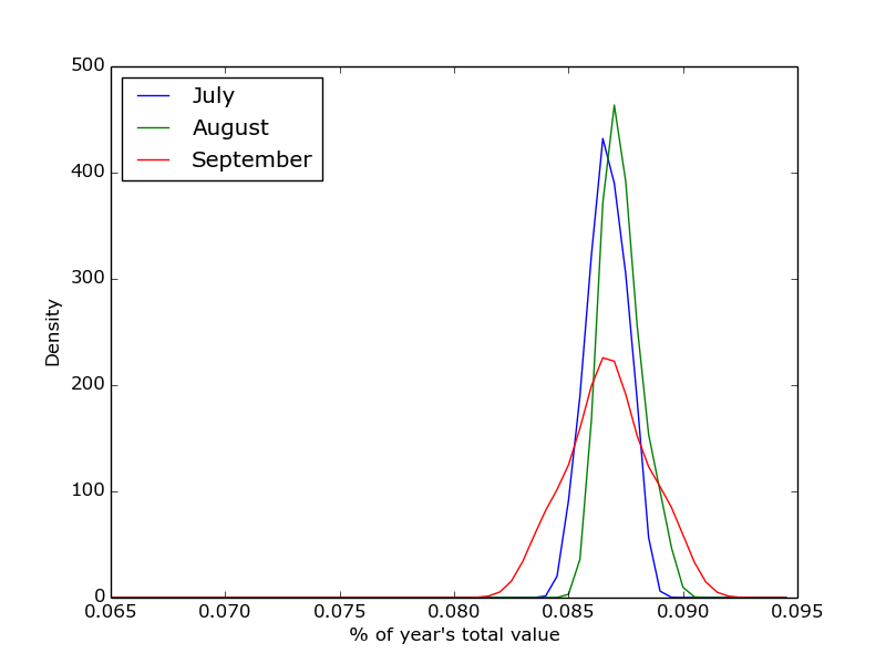
Now I’ve got myself a lovely text file – I decided to have a dig into Python and especially, Matplotlib. As it’s not really relevant to the overall direction of this analysis I won’t include the code here but it’s available on my Github. As a summary, this script looks at the percentage of total value of the year’s sales made in each month. A vector is built for each month and then the Gaussian density is calculated for that month. This is plotted versus the surrounding months. I’m aware that’s likely a poor explanation but if you’re interested, have a look at the code and feel free to drop me a comment. The output is something like this:

Python sample figure

% of value of house sales since 1995, by month.

Anyway, back to the main thread of the investigation. I’ve got a relatively small time-series and I’m investigating the periodicity of the data – I’m right back in native R territory.

priceSummary <- read.table('price_summary_by_month.txt', header=F, col.names=c("date", "price"))
pricetimeseries <- ts(priceSummary$price, frequency=12, start=c(1995,1))
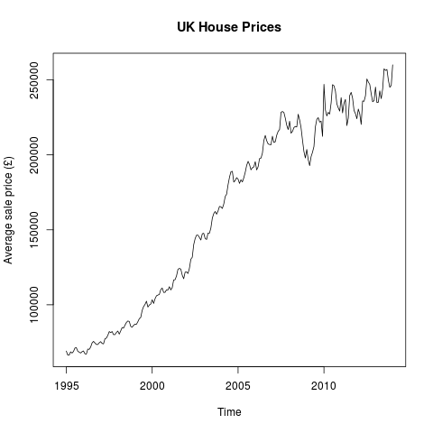
plot(pricetimeseries, ylab="Average sale price (£)", main="UK House Prices")

Giving us:

UK House Prices

Average UK House Price (by month)

That’s pretty much as you’d expect – generally rising prices with a bit of a wobble around the housing crash. Disappointingly, there doesn’t seem to be that much evidence of seasonality being a factor. However, R provides us the tools to see whether or not that’s the case:

library(ggplot2)
library(scales)
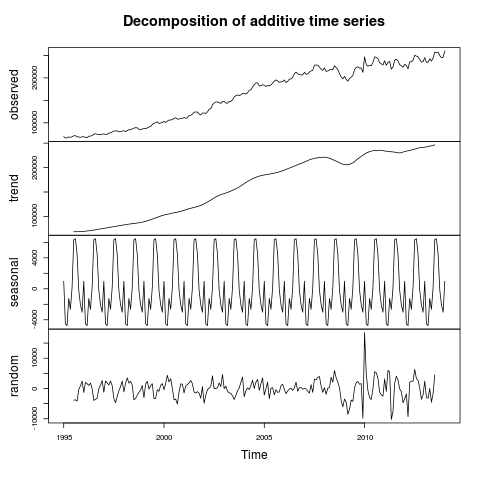
pricetimeseriescomponents <- decompose(pricetimeseries)
plot(pricetimeseriescomponents)
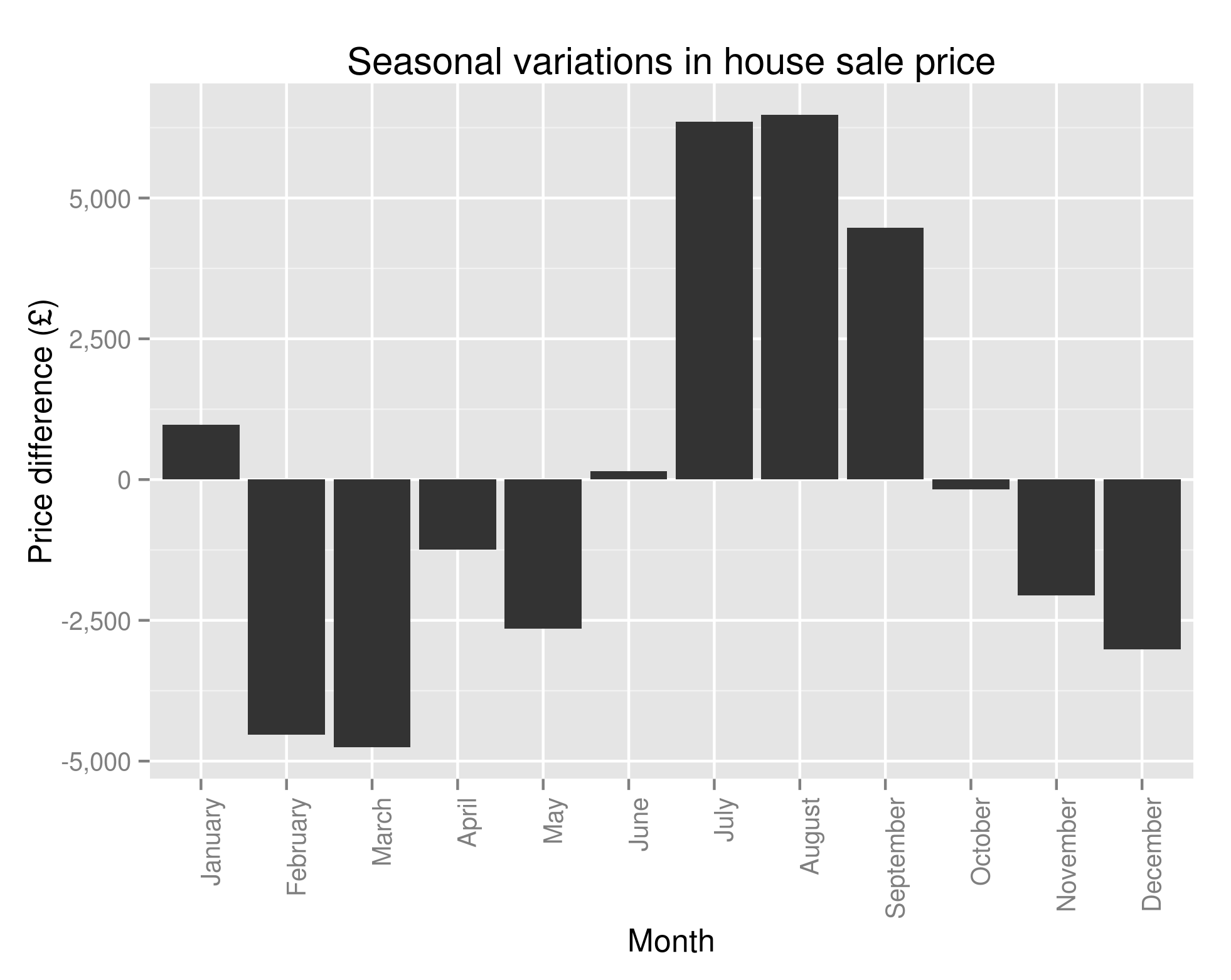
seasonality <- data.frame(pricetimeseriescomponents$seasonal[c(1:12)])
seasonality$Month <- factor(month.name, levels=month.name)
colnames(seasonality) <- c("Price", "Month")
ggplot(seasonality, aes(x=Month, y=Price)) + geom_bar(stat="identity") + ggtitle("Seasonal variations in house sale price") + theme(axis.text.x = element_text(angle=90, hjust=1)) + scale_y_continuous(name="Price difference (£)", labels=comma)
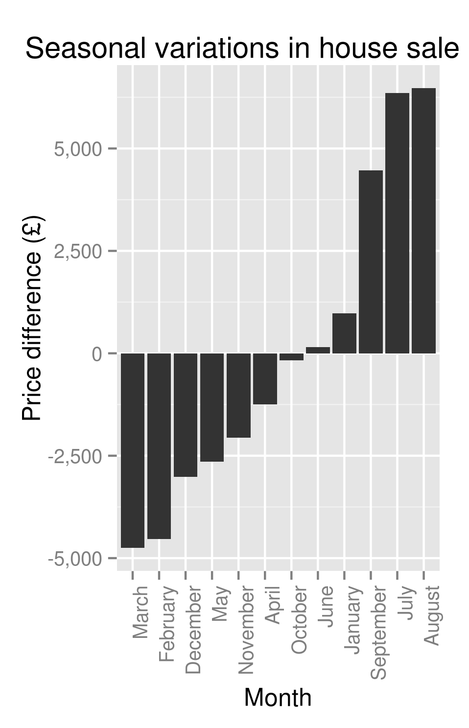
orderedSeasonality <- transform(seasonality, Month = reorder(Month, Price))
ggplot(orderedSeasonality, aes(x=Month, y=Price)) + geom_bar(stat="identity") + ggtitle("Seasonal variations in house sale price") + theme(axis.text.x = element_text(angle=90, hjust=1)) + scale_y_continuous(name="Price difference (£)", labels=comma)

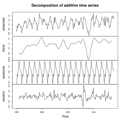
This gives us our first hint at some real cyclicity to the housing market:

Decomposition of UK House Prices

Decomposition of UK House Prices


House price seasonality

Seasonality of House Prices – the amount above/below average you’ll pay for a house based on the month

and a perhaps more helpful, sorted version:

Ordered house price seasonality

Ordered seasonality of House Prices – the amount above/below average you’ll pay for a house based on the month

Well well well. Time to throw the cowboy hat into the air, unholster our pistol and start firing wildly into the sky? Or at least quietly inform those who I know who are looking to buy/sell a house that they can likely save/make themselves an extra £10,000 or so if only they’re willing to wait until summer before selling?

Unfortunately, I’m not confident enough to say that just yet. I’ve already fairly conclusively shown that there are a bunch of factors that affect the sale price of a house. Now while I’m happy to say that the month of the year is significant in determining the sale price, I don’t really know why. It could be that people are more inclined to buy houses in the south during summer. As these houses are more expensive, we see the average house price rise in the summer months. It could be that people are less inclined to buy terraced houses during the summer (heating concerns?) and, as terraced houses are generally cheaper, the average sale price is inflated.

If either of those statements, or indeed, any other like it that I’ve not thought of are true it could lead to me giving bad advice in specific cases. To be able to report anything especially useful (and ultimately, actionable) we’ll need to look a bit closer at the causes of seasonality. My next post will hopefully address these issues and will try to determine whether or not the average UK house buyer is better off waiting until winter before buying.

Monthly House Price Variation – an adventure in R

So we’ve got our data set, we’ve had a cursory investigation and now we’re ready to see if we can find anything interesting. I’m going to proceed in a fairly methodical way and be precise in the way I do things – let’s do this scientific like.

So let’s start with a null hypothesis: “The month alone has no impact on the average selling price of houses“.

At this point, I don’t really know whether or not that’s true but it seems likely that it’s not. I can imagine that the housing market is, to some extent, cyclical. The first thing I’ll do is plot the data – there are a number of reasons why this is a good idea and I’d advise plotting your data wherever possible as a first step.

I’ll run this example investigation in R – it’s great for exploratory analysis and it allows me to produce graphics that I can share really easily.

housingData <- read.csv('pp-2013.csv', header=TRUE)
housingData$date <- as.Date(housingData$date, "%Y-%m-%d %H:%M")
# We're only interested in the month at this point
housingData$month <- strftime(housingData$date, "%m")
housingDataSummary <- data.frame(aggregate(housingData$price, by=list(housingData$month), FUN=mean)
colnames(housingDataSummary) <- c("Month", "Price")
# It's nice to have a look at the data before we perform our test on it, just to get an idea of how it looks and to check we think what we've done up to this point is reasonable.
# Let's take advantage of a very commonly used R library - ggplot2
library(ggplot2)
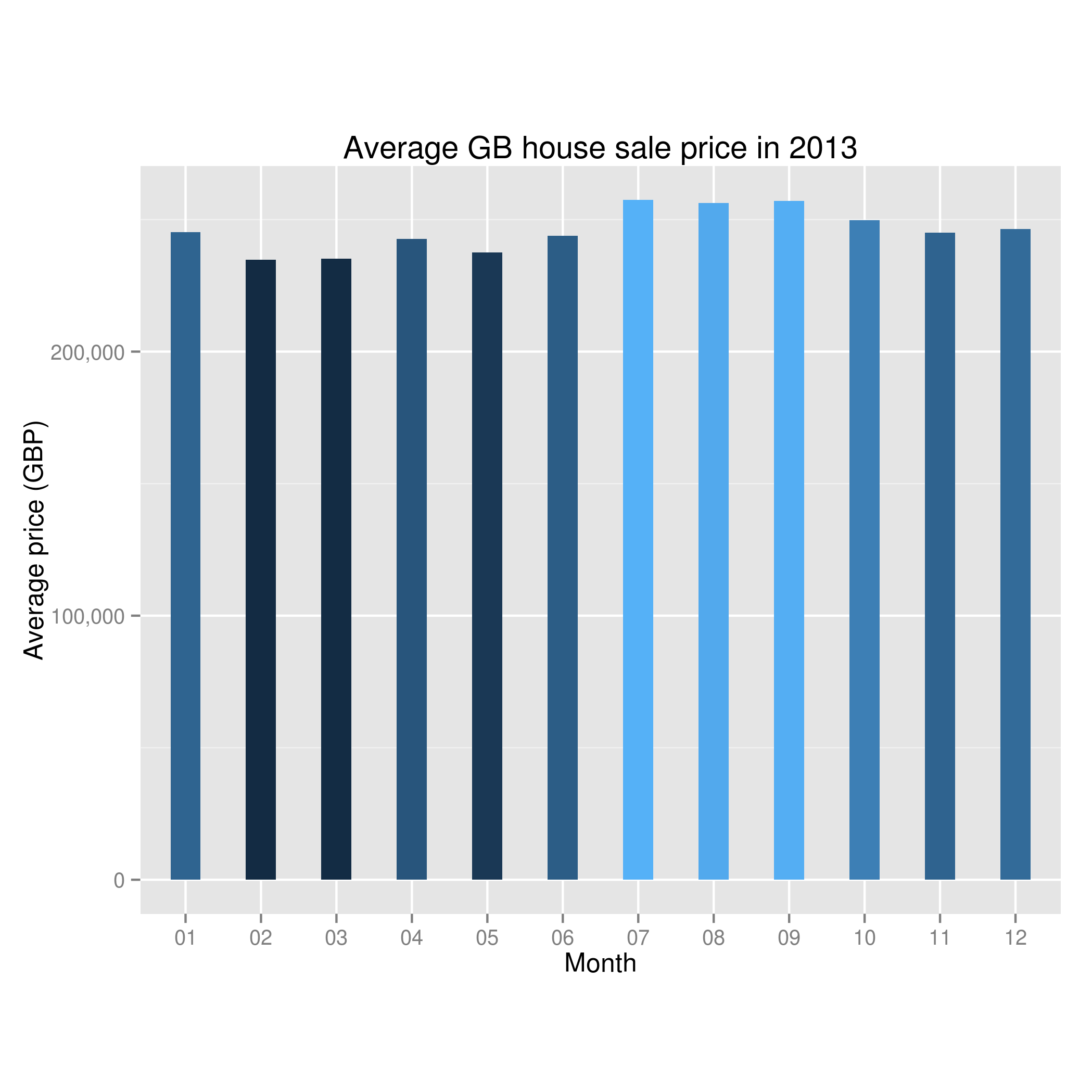
ggplot(housingDataSummary, aes(x=housingDataSummary$Month, y=housingDataSummary$Price, fill=housingDataSummary$Price)) + geom_bar(stat="identity", width=0.4, position=position_dodge(width=0.5)) + guides(fill=FALSE) + xlab("Month") + ylab("Average price") + ggtitle("Average GB house sale price in 2013")+ scale_y_continuous(labels=comma) + coord_fixed(ratio=0.000035)

Giving us:

Average house price by month in the UK in 2013

Average house price by month in the UK in 2013

O.K – I don’t know about you but looking at the graph I’d say it looks like there might be something to the theory that the month is important in house sales. In this year, we can see a dip in the early months and then a peak when we get to summer.

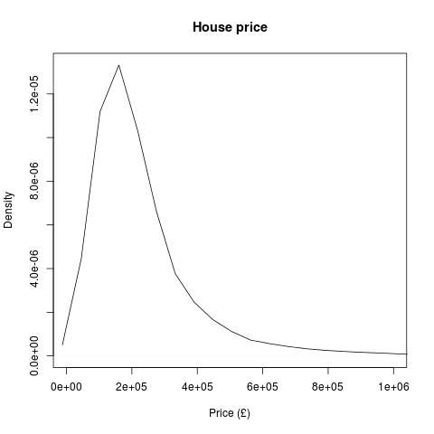
Let’s shore up the mathematics behind this – I’m going to imagine the situation where I’ve got twelve test groups (one for each month) where my values are the sold house prices. There’s a whole lot of statistical tests designed for this situation. To compare the means of these groups with each other I’d perform a one-way ANOVA (analysis of variance) – a multivariate extension of the t-test. Technically, the assumptions made in performing a one-way are independence of measurements (I’m happy that the sale price of one house is independent of the sale of another), continuity of the dependent variable (house price is continuous) and the dependent variables come from a normal distribution. A simple density plot shows us that the house prices aren’t normally distributed:

2013 house price density plot

2013 house price density plot

However, fear not. The t-test is still a good choice of test under violations of normality, especially so when there are lots of data points (we’ve got over 700,000) . As a little check, let’s also have a go at comparing the medians of the test groups. To do this we can use the Mann-Whitney U test and its multivariate brother, the Kruskal-Willis test. These are non-parametric tests (don’t require normally distributed data) and so if these say the medians of the groups are significantly different and the one-way ANOVA has shown the means of the groups are significantly different, we can be fairly confident they are!

month_aov <- aov(price ~ month, data=housingData)
summary(month_aov)
print(model.tables(month_aov, "means"), digits=2)
kruskal.test(price ~ as.factor(month), data=housingData)

Giving us:


Df Sum Sq Mean Sq F value Pr(>F)
month 11 4.463e+13 4.057e+12 46.38 <2e-16 ***
Residuals 781167 6.834e+16 8.748e+10
---
Signif. codes: 0 ‘***’ 0.001 ‘**’ 0.01 ‘*’ 0.05 ‘.’ 0.1 ‘ ’ 1


Tables of means
Grand mean

246834.8

month
01 02 03 04 05 06 07 08 09 10 11 12
245200 234879 235136 242679 237509 243942 257421 256289 256988 249722 245077 246392
rep 43404 45238 54692 51025 66357 66175 73526 79119 69314 76042 80986 75301


Kruskal-Wallis rank sum test

data: price by as.factor(month)
Kruskal-Wallis chi-squared = 1642.505, df = 11, p-value < 2.2e-16

There’s an awful lot of that that we’re not interested in – the key bits for us to pick out are the p-values on the ANOVA and the Kruskal-Wallis tests – both of which are < 2e-16. We can fairly conclusively say that there are statistically significant differences between the mean and median of the average house prices by month.

However, let’s have a think what assumptions we’re making and whether we’re comfortable making them. Firstly, a previous investigation has hinted that the region the house is in makes a difference to the sale price. This could impact our data in any number of ways – it could be that each region sells their houses at different times and as average house value per region is different then the average house value per month ends up being different. Obviously, region isn’t the only concern – I singled that out as I’ve previously looked at it and know it’s a contributing factor to house price.

Additionally, we’re only looking in one year. That means that any overall change in house prices (ala the property market crash) will completely throw our results off and give us the (possibly false) impression of a cyclical housing market.

There’s an awful lot more we’ll have to consider if we’re to answer our question satisfactorily: does the month impact the selling price of a house? In the next post in this series I’ll be looking at ways of unpicking dependencies (MANOVA and MANCOVA) and will likely have to do bits of the analysis in a distributed way as there’s no way the entire dataset (since 1995) is going to fit in my RAM!

Installing R on Ubuntu 14.04

A quick break from our analysis of UK Government house sale data – I’ve decided that I’d like to do the analysis in R (reasons for this will be explained in a later post). A new version of Ubuntu is out (Trusty Tahr) and, after updating, I realised I didn’t have R on my computer. So, a quick and simple guide to installing R:

Step 1:

Assuming you’ve got the internet and everything set up as it should be run:
sudo apt-get install r-base-core

Go ahead and accept the new 147MB (or thereabouts) and you should now be able to type R at the terminal and see R (verion 3.0.2 at the time of writing) fire up. If this hasn’t worked, drop me a comment and I’ll see what we can do about it.

Step 2:

Now – assuming you’re going to want a bit more than the standard packages (I’d strongly advise ggplo2 – it’s well good), you’ll want r-base-dev. I’d give the following command a go:

sudo apt-get install r-base-dev

Fortunately, it looks to me like this is bundled with r-base-core now so that command didn’t do anything so might not be necessary. But no harm done, eh?

Now, open up R with sudo privileges (if you don’t do this and have the standard permissions and install locations, R won’t have permissions to write to /usr/lib – you can use your personal library if you like, but I won’t):

sudo R

and (for here in on, we’re in the R terminal) run:

update.packages()

There are a bunch of libraries you may be interested in, but for me (and indeed, for the next bit of data analysis I’m going to do) ggplot2 will suffice.

install.packages('ggplot2', dependencies=TRUE)

If that worked you should now be able to type library(ggplot2) without errors.

Step 3:

While I’m sure you’re a big fan of just bashing out your R code in the terminal, sometimes it’s nice to have an IDE and RStudio is at the front of the pack when it comes to R IDEs. Getting this on Ubuntu is a doddle.

Head on over to the R Studio download site and download the version with Ubuntu in the name (RStudio 0.98.501 – Debian 6+/Ubuntu 10.04+ (64-bit) for my system at the time of writing). You can then open this file using Ubuntu Software Centre (it should open in this by default) – click install and you’re on your way!

Now, everything being OK you should be able to open up R Studio and develop away to your heart’s content 🙂 If there are any problems with this, I’d encourage you to leave comments and we’ll see if we can get to the bottom of this. As a point of interest, if you need any more packages installing, you’ll need to pop into terminal, open up R in sudo mode and install them from there. There are fixes for this (check out the official R documentation for this) but I don’t think it’s that much of a problem that it’s worth bothering with.

© 2024 DogDogFish

Theme by Anders NorenUp ↑