So we’ve got our data set, we’ve had a cursory investigation and now we’re ready to see if we can find anything interesting. I’m going to proceed in a fairly methodical way and be precise in the way I do things – let’s do this scientific like.
So let’s start with a null hypothesis: “The month alone has no impact on the average selling price of houses“.
At this point, I don’t really know whether or not that’s true but it seems likely that it’s not. I can imagine that the housing market is, to some extent, cyclical. The first thing I’ll do is plot the data – there are a number of reasons why this is a good idea and I’d advise plotting your data wherever possible as a first step.
I’ll run this example investigation in R – it’s great for exploratory analysis and it allows me to produce graphics that I can share really easily.
housingData <- read.csv('pp-2013.csv', header=TRUE)
housingData$date <- as.Date(housingData$date, "%Y-%m-%d %H:%M")
# We're only interested in the month at this point
housingData$month <- strftime(housingData$date, "%m")
housingDataSummary <- data.frame(aggregate(housingData$price, by=list(housingData$month), FUN=mean)
colnames(housingDataSummary) <- c("Month", "Price")
# It's nice to have a look at the data before we perform our test on it, just to get an idea of how it looks and to check we think what we've done up to this point is reasonable.
# Let's take advantage of a very commonly used R library - ggplot2
library(ggplot2)
ggplot(housingDataSummary, aes(x=housingDataSummary$Month, y=housingDataSummary$Price, fill=housingDataSummary$Price)) + geom_bar(stat="identity", width=0.4, position=position_dodge(width=0.5)) + guides(fill=FALSE) + xlab("Month") + ylab("Average price") + ggtitle("Average GB house sale price in 2013")+ scale_y_continuous(labels=comma) + coord_fixed(ratio=0.000035)
Giving us:
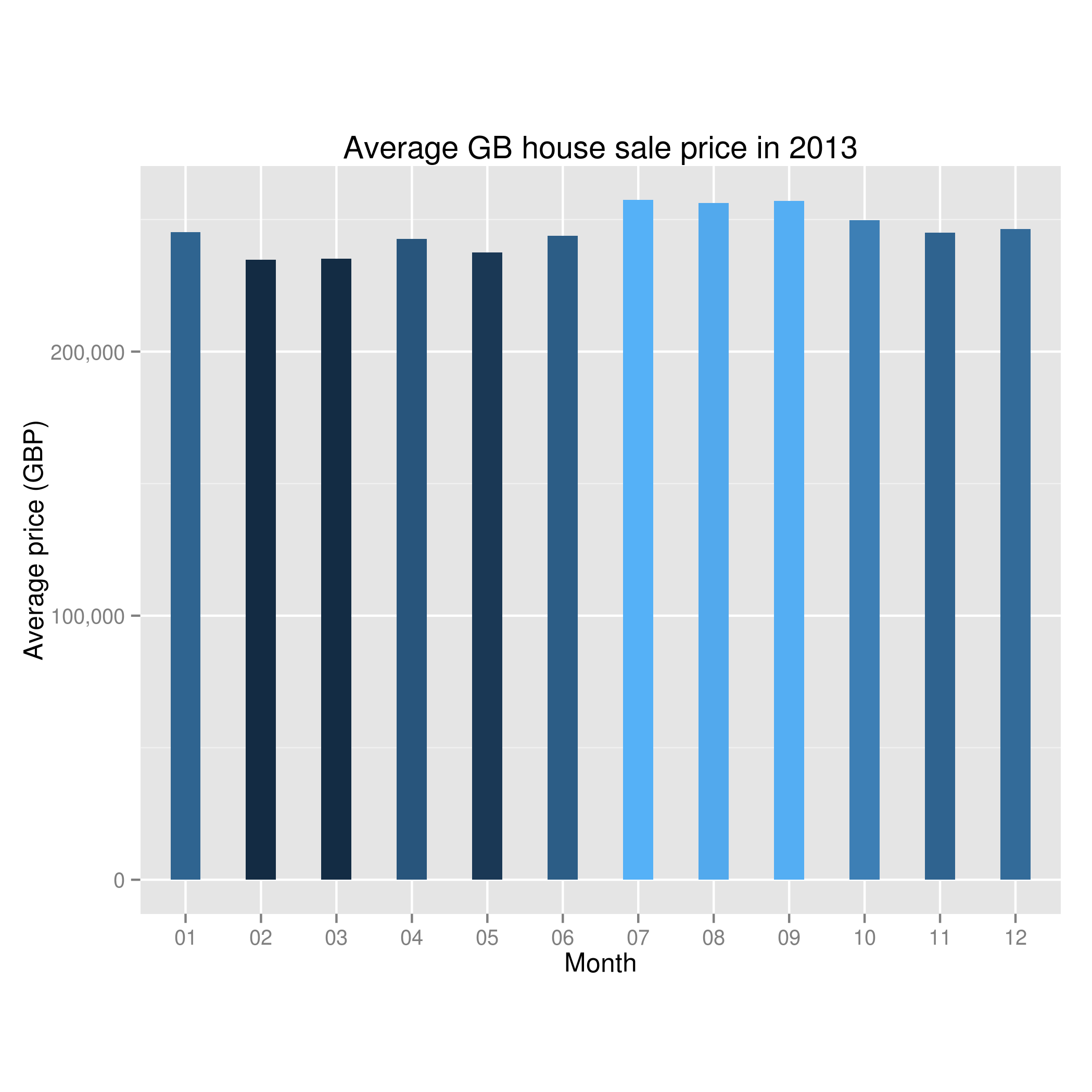
Average house price by month in the UK in 2013
O.K – I don’t know about you but looking at the graph I’d say it looks like there might be something to the theory that the month is important in house sales. In this year, we can see a dip in the early months and then a peak when we get to summer.
Let’s shore up the mathematics behind this – I’m going to imagine the situation where I’ve got twelve test groups (one for each month) where my values are the sold house prices. There’s a whole lot of statistical tests designed for this situation. To compare the means of these groups with each other I’d perform a one-way ANOVA (analysis of variance) – a multivariate extension of the t-test. Technically, the assumptions made in performing a one-way are independence of measurements (I’m happy that the sale price of one house is independent of the sale of another), continuity of the dependent variable (house price is continuous) and the dependent variables come from a normal distribution. A simple density plot shows us that the house prices aren’t normally distributed:
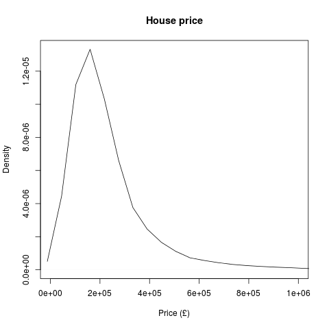
2013 house price density plot
However, fear not. The t-test is still a good choice of test under violations of normality, especially so when there are lots of data points (we’ve got over 700,000) . As a little check, let’s also have a go at comparing the medians of the test groups. To do this we can use the Mann-Whitney U test and its multivariate brother, the Kruskal-Willis test. These are non-parametric tests (don’t require normally distributed data) and so if these say the medians of the groups are significantly different and the one-way ANOVA has shown the means of the groups are significantly different, we can be fairly confident they are!
month_aov <- aov(price ~ month, data=housingData)
summary(month_aov)
print(model.tables(month_aov, "means"), digits=2)
kruskal.test(price ~ as.factor(month), data=housingData)
Giving us:
Df Sum Sq Mean Sq F value Pr(>F)

month 11 4.463e+13 4.057e+12 46.38 <2e-16 ***

Residuals 781167 6.834e+16 8.748e+10

---

Signif. codes: 0 ‘***’ 0.001 ‘**’ 0.01 ‘*’ 0.05 ‘.’ 0.1 ‘ ’ 1
Tables of means

Grand mean
246834.8
month
01 02 03 04 05 06 07 08 09 10 11 12
245200 234879 235136 242679 237509 243942 257421 256289 256988 249722 245077 246392
rep 43404 45238 54692 51025 66357 66175 73526 79119 69314 76042 80986 75301
Kruskal-Wallis rank sum test
data: price by as.factor(month)
Kruskal-Wallis chi-squared = 1642.505, df = 11, p-value < 2.2e-16
There’s an awful lot of that that we’re not interested in – the key bits for us to pick out are the p-values on the ANOVA and the Kruskal-Wallis tests – both of which are < 2e-16. We can fairly conclusively say that there are statistically significant differences between the mean and median of the average house prices by month.
However, let’s have a think what assumptions we’re making and whether we’re comfortable making them. Firstly, a previous investigation has hinted that the region the house is in makes a difference to the sale price. This could impact our data in any number of ways – it could be that each region sells their houses at different times and as average house value per region is different then the average house value per month ends up being different. Obviously, region isn’t the only concern – I singled that out as I’ve previously looked at it and know it’s a contributing factor to house price.
Additionally, we’re only looking in one year. That means that any overall change in house prices (ala the property market crash) will completely throw our results off and give us the (possibly false) impression of a cyclical housing market.
There’s an awful lot more we’ll have to consider if we’re to answer our question satisfactorily: does the month impact the selling price of a house? In the next post in this series I’ll be looking at ways of unpicking dependencies (MANOVA and MANCOVA) and will likely have to do bits of the analysis in a distributed way as there’s no way the entire dataset (since 1995) is going to fit in my RAM!
Leave a Reply