Hi all,
Can’t promise that this post won’t be bitty – I’m trying to simultaneously run an SVM and a random forest on a bunch of particle physics data for the Kaggle competition. Check it out, it’s pretty cool. Anyway, my computer is straining under the weight of those calculations and so while that was happening I decided to have a look at stock prices using Python/Pandas again.
After chatting with co-blogger Sean, and based on my (limited, and hilariously bad) experiences of stock trading we decided it’d be interesting to identify volatile stocks that don’t seem to have greatly varying fundamental value. We’re basically looking for the position of a harmonic oscillator in a stock. I’m not graphing that – look it up yourself. The logic being, there’ll be a point at which it it’s profitable to buy a stock like this on a down and sell again when it’s back up. Of course, this requires the assumption that the stock itself isn’t having a fundamental value shift – it’s just suffering from cyclicity. I don’t really know if/how this’ll work but that’s half the fun…
Right, back to it (I’ve caught up with Game of Thrones – get it watched). I’ve thought a reasonable amount about this and have decided our first job is to look at maximizing the following quantity:
$latex frac{Volatility}{Change_{daily}^n Change_{weekly}} $
I might also throw in an additional concern – I’d like to be able to enter and exit the market whenever I want – I don’t see this being a big problem for me (I’m not going to be using a lot of money) but it’ll certainly be a concern for bigger players. Let’s cross that bridge if we need to.
So, to start off with, my daily volatility I’m going to define as
$latex frac{sum_{i={day_1}}^{Today} frac{HighPrice_i – LowPrice_i}{ClosePrice_i}}{NumberOfDays} $
Hopefully nothing earth-shattering there, just want to see how much it varies over a day. Now while I want the stock price to vary a lot, I want it to head back to where it started. A rapidly increasing/decreasing stock is going to have wildly varying days. However, it’s also going to have a large overall trend. That’s no good for the purposes of finding stocks to buy/sell on a short time period.
$latex Change_{daily} = sqrt{frac{sum_{i={day_1}}^{Today} (frac{ClosePrice_i – OpenPrice_i}{OpenPrice_i})^2}{NumberOfDays}} $
$latex Change_{weekly} = sqrt{frac{sum_{i={week_1}}^{Today} (frac{ClosePrice_i – OpenPrice_i}{OpenPrice_i})^2}{NumberOfWeeks}} $
Easy does it – the reason I’ve squared the result is basically that I don’t care whether the stock is rising or falling. I’m trying to minimize the overall long-term variations from the mean.
So, how easy is this in Python? Remarkably so. Let’s start off by plotting a scatter graph of some of the more promising stocks.
import numpy as np
from pandas.io.data import DataReader
import pandas as pd
from datetime import datetime
from pylab import savefig

## A list of American Stock Symbols
company_information = pd.read_csv('allcompany.csv')

volatility_measure = []
daily_change_measure = []
weekly_change_measure = []
labels = []

## Let's start out with the biggest 10 companies in my list

for company in company_information.sort(['MarketCap'], ascending=False).head(10)['Symbol']:
    try:
        company_frame = DataReader(company.strip(), 'yahoo', datetime(2013,1,1), datetime.now().date())
        company_frame['Volatility'] = (company_frame['High'] - company_frame['Low'])/company_frame['Close']
        volatility_measure.append(company_frame['Volatility'].mean())
        company_frame['Daily_Change'] = company_frame['Close'].diff()
        daily_change_measure.append(np.sqrt(np.mean(company_frame['Daily_Change']**2)))
        ## Take every 5th row
        weekly_company_frame = company_frame[::5]
        weekly_company_frame['Change'] = weekly_company_frame['Close'].diff()
        weekly_change_measure.append(np.sqrt(np.mean(weekly_company_frame['Change']**2)))
        labels.append(company.strip())
    except:
        print "Problem parsing %s" % company.strip()

for i in range(1,7):
    change_metric = [daily * (weekly ** (1./i)) for daily, weekly in zip(daily_change_measure, weekly_change_measure)]
    ax = plt.subplot(3,2,i)
    plt.xlabel('Log of overall change metric')
    plt.ylabel('Volatility metric')
    plt.title('Weekly power %.2f' % float(1./i))
    plt.scatter(change_metric, volatility_measure, c = volatility_measure, cmap=plt.get_cmap('Spectral'), label='Weekly power %.2f' % float(1./i))
    for label, x, y in zip(labels, change_metric, volatility_measure):
        plt.annotate(label, (x,y), xytext=(0,8), textcoords='offset points')

    plt.gca().set_xscale('log')
    plt.gca().legend_ = None

plt.suptitle('Daily Volatility of Stocks versus Overall Trend')
plt.tight_layout()
plt.show()
savefig('StockVolatility.png')
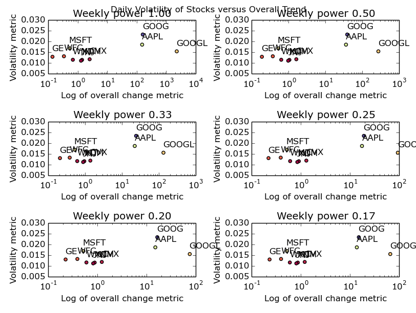
OK – it’s not especially pretty but it gives us the following picture:
You could also make a fair point that I’ve formatted it poorly. Open it up as big as your browser will let you and you’ll be able to see it nicely. Or, just run the code and create your own picture. It’s dead easy. I promise.
So what can we infer from that picture? I’m going to go ahead and say not a huge deal. Apple & Google have made some crazy ups and downs over the last year or two (mostly ups) and hence I’ve been forced to use a log plot. Other than that, we can see a cluster of the remaining companies with GE seeming the most stable all round. One point I’d like to make now: by defining my metrics in such a way that they don’t really match to anything in reality, I’ve lost the ability to understand exactly what I’ve plotted. What I’m trying to say, is that the log of an overall change metric isn’t an intuitive quantity. Usually, it’s a good idea to pick metrics that have a fairly firm grounding in the real world unless you’ve got a really good reason not to. In my case, my reason is that all I’m trying to do here is identify stocks in the upper left most corner – I don’t care what their values are yet.
I’d also like to make the point here that for this data set, the change of power associated with the weekly metric seems to make no difference. I put it there to express the idea that we’re likely to want a different weighting on the daily and weekly variability depending on how often we want to trade the stock. As I’m hoping to trade multiple times daily, the daily variability is more important to me than the weekly variability (hence my choice of fractional powers of the weekly variable). If you’re looking at trading less regularly, change your parameters accordingly.
Now I’m going to go out on a limb and say that, when looking for daily volatility, the biggest companies in America aren’t the place to go looking. I’m sure that the algorithmic trading people are all over this kind of trade with fancy-pants C++ code designed to execute multiple trades/second. To do this at a reasonably large scale (and to overcome transaction/infrastructure costs) I’m going to say those guys will play with these big companies where a purchase of £1 million+ of shares isn’t going to be such a big deal. Playing in those markets must be the equivalent of going barracuda fishing with a thumb tack and a tie. I think we should start our search towards the lower market caps and work our way up until we’ve got a few hopefuls.
volatility_measure = []
daily_change_measure = []
weekly_change_measure = []
labels = []

for company in company_information[company_information['MarketCap'] > 10000000].sort(['MarketCap']).head(25)['Symbol']:
    try:
        company_frame = DataReader(company.strip(), 'yahoo', datetime(2013,1,1), datetime.now().date())
        company_frame['Volatility'] = (company_frame['High'] - company_frame['Low'])/company_frame['Close']
        volatility_measure.append(company_frame['Volatility'].mean())
        company_frame['Daily_Change'] = company_frame['Close'].diff()
        daily_change_measure.append(np.sqrt(np.mean(company_frame['Daily_Change']**2)))
        ## Take every 5th row
        weekly_company_frame = company_frame[::5]
        weekly_company_frame['Change'] = weekly_company_frame['Close'].diff()
        weekly_change_measure.append(np.sqrt(np.mean(weekly_company_frame['Change']**2)))
        labels.append(company.strip())
    except:
        print "Problem parsing %s" % company.strip()

for i in range(1,7):
    change_metric = [daily * (weekly ** (1./i)) for daily, weekly in zip(daily_change_measure, weekly_change_measure)]
    ax = plt.subplot(3,2,i)
    plt.xlabel('Log of overall change metric')
    plt.ylabel('Volatility metric')
    plt.title('Weekly power %.2f' % float(1./i))
    plt.scatter(change_metric, volatility_measure, c = volatility_measure, cmap=plt.get_cmap('Spectral'), label='Weekly power %.2f' % float(1./i))
    for label, x, y in zip(labels, change_metric, volatility_measure):
        plt.annotate(label, (x,y), xytext=(0,8), textcoords='offset points')

    plt.gca().set_xscale('log')
    plt.gca().legend_ = None
    plt.autoscale(tight=True)

plt.suptitle('Daily Volatility of Stocks versus Overall Trend')
plt.tight_layout()
plt.show()
savefig('SmallerCompanies.png')
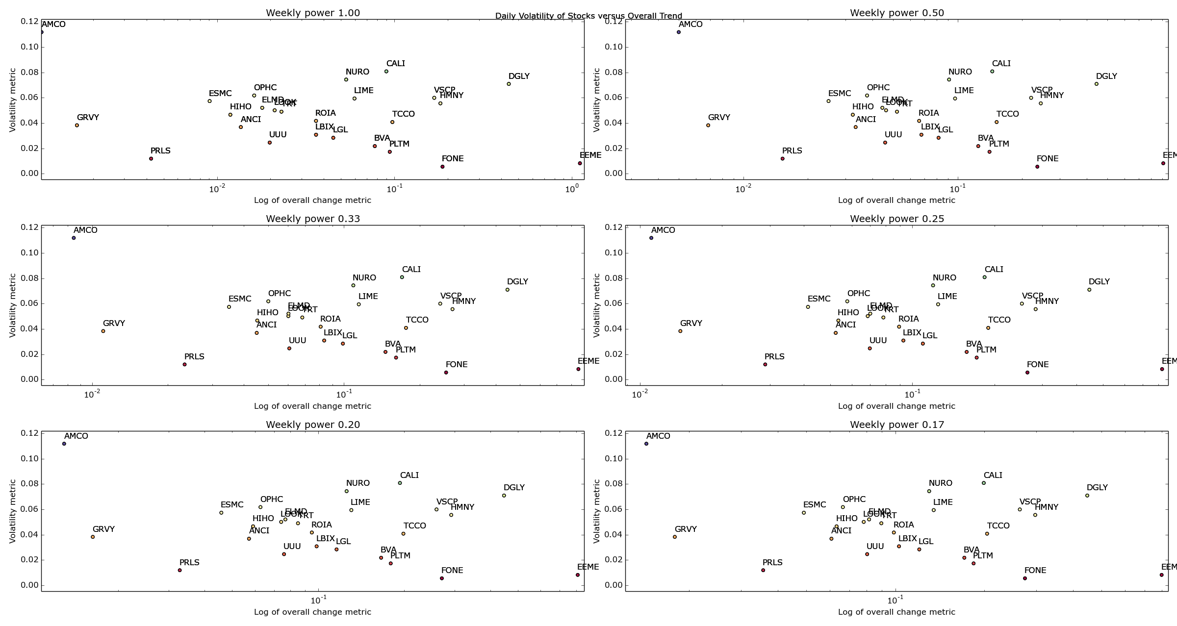
Well bugger me. I don’t know about you but that looks pretty cool to me. Ignore all the gumph in the middle and look at the outliers – AMCO, GRVY, PRLS, DGLY and EEME. These are great examples of companies that are going to be either maximums or minimums for our given metric.
OK – I’m going to call it a night for now but just think of the possibilities open to us now! We can change our date ranges, play around with our metrics and loop through as many stocks as we can find symbols for (harder than you’d think!) until we’ve got a reasonable amount of stocks that we think are great candidates for regularly buying and selling.
Next time, I’ll finalize my list of stocks and hopefully start to gain an idea of when one of these stocks becomes a buy, and when it becomes a sell. That sounds fairly difficult actually. Ah well, that’s the fun.
Winter is coming.

