So the average sale price of houses in the UK is seasonal. Does that mean it’s sensible to advise house buyers to only purchase in the winter months? Let’s try to see.
I’m going to have a look and see if the data we have implies that the change in average sale price of a house with the month is actually just a function of some other monthly variation. I don’t really know how to go about doing this but it’s probably best to not let things like that stop me – I’m thinking the first port of call is likely calculate the correlation between the month each of the other factors (excluding price). If there’s a decent correlation (positive or negative) then we might be in trouble and will have to investigate that variable with a bit more seriousness.
Again, that’d be a delightfully easy task if I could hold the entire dataset in memory. Unfortunately I’m not that lucky and so I’ll have to do a bit of aggregation before importing the data to R/Python.
So my independent variables:
1.) Region
2.) Type of house
3.) New or old house
4.) Freehold or leasehold
I’m thinking of the work we did in the last blog post in Python and that that might be the best way to proceed; to generate vectors containing the average proportion of sales due to each ‘test group’ (the factors of the independent variable in question) in each of the relevant years. Once I’ve got that, I’m initially thinking of a twelve variant paired t-test. We’ve got 12 different months – in each month we’ve got a year for which each of the other test groups have a corresponding year, hence the choice of paired t-test. However, previously when I grievously abused the normality assumption required to run a t-test I had a whole bunch of data (800,000 points) and so I was sort of O.K with it. Now, I’ve got 18. We may have to investigate other options – Kruskal-Wallis being at the forefront of those. Anyway – let’s worry about that when we have to.
First things first, let’s get this data into a format we can load into memory:
awk -F, '{print $4"-"$(NF-1)}' pp-all.csv | cut -d '-' -f1,2,4 | tr -d '"' | tr '-' ' ' | sed -e 's/s+/-/' | sed -e 's/s+/,/' | sort | uniq -c | sort -s -nk2 | sed 's/^ *//' | sed -e 's/s+/,/' | awk -F, '{if ($3 != "2014-01") print $0}' > number_of_sales_by_region.txt
Again, a horrible one-liner that I’ll have to apologise for. All it does is give me an output file with the format: Count | Month | Region – off of the back of that I can now use R:
library(plyr)
library(ggplot2)
library(scales)
myData <- read.csv('number_of_sales_by_region.txt', header=F, sep=',', col.names=c("Sales", "Datey", "Region"))
## To store as a date object we need a day - let's assume the first of the month
myData$Datey <- as.Date(paste(myData$Datey, 1, sep="-"), format="%Y-%m-%d")
## I'm not too worried about January 2014 - it makes the lengths of the 'month vectors' uneven and ruins the below graphs
myData <- myData[format(myData$Datey, "%Y") < 2014,]
byYear <- data.frame(aggregate(Sales ~ format(Datey, "%Y"), data = myData, FUN=sum))
colnames(byYear) <- c("Year", "houseSales")
ggplot(byYear, aes(x=Year, y=houseSales)) + geom_bar(stat="identity") + ggtitle("Number of UK House Sales") + theme(axis.text.x = element_text(angle=90, hjust=1)) + scale_y_continuous(name="Houses Sold", labels=comma)
byMonth <- data.frame(aggregate(Sales ~ format(Datey, "%m"), data = myData, FUN=sum))
colnames(byMonth) <- c("Month", "houseSales")
byMonth$Month <- factor(month.name, levels=month.name)
ggplot(byMonth, aes(x=Month, y=houseSales)) + geom_bar(stat="identity") + ggtitle("Number of UK House Sales") + theme(axis.text.x = element_text(angle=90, hjust=1)) + scale_y_continuous(name="Houses Sold", labels=comma)
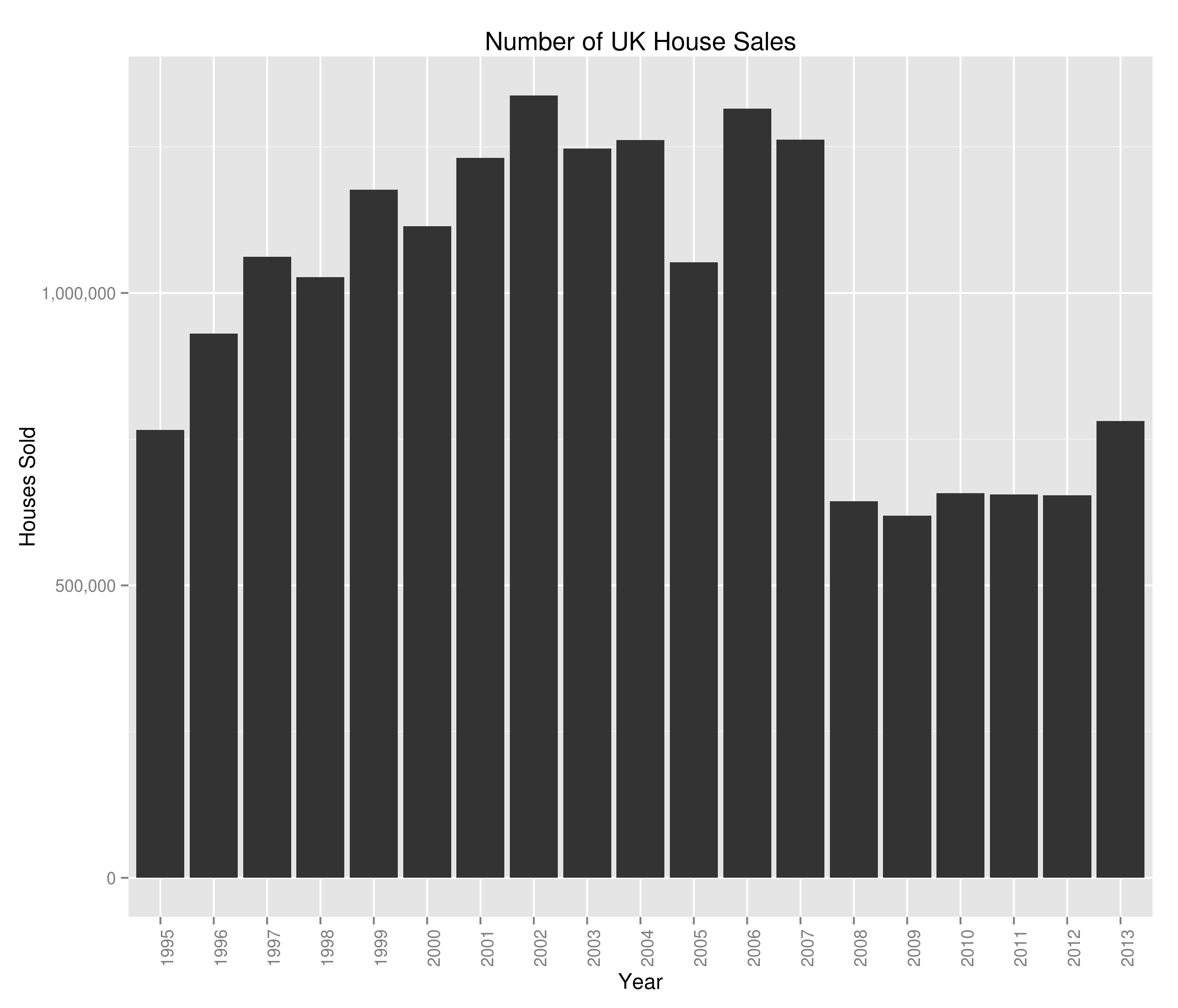
Giving us what’d I’d class as a couple of very interesting graphs:
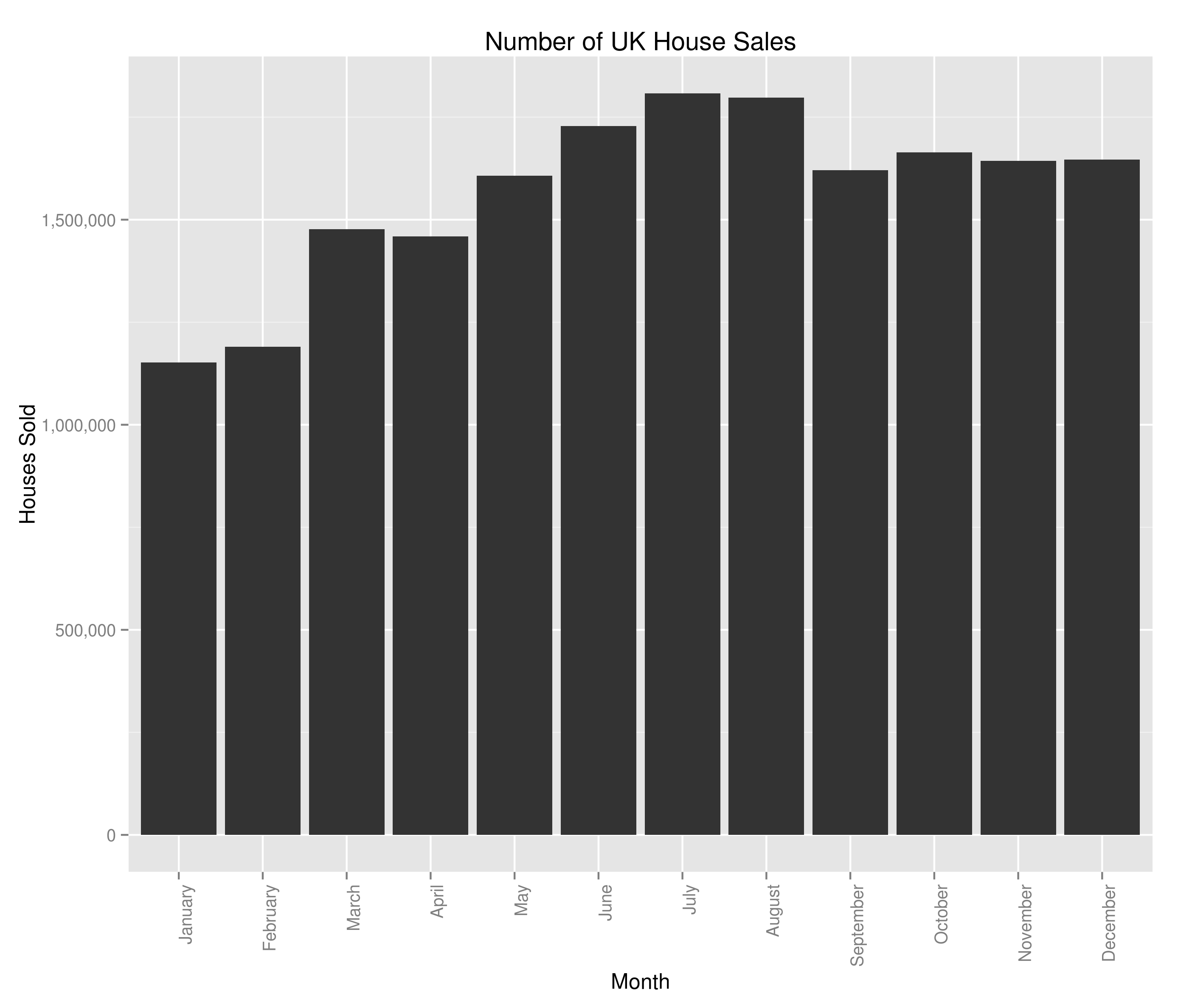
and:
In terms of the housing crash, we saw it a bit in the average house sale price but we can see the main impact was a complete slow-down on the number of houses sold. There are potentially hints of a re-awakening in 2013 but I guess we’ll have to see how this year ends up panning out. The monthly variation is interesting and at first glance, counter-intuitive when viewed alongside the average house price data. Naively, you’d expect the average house price to be highest when fewer houses were being sold (what with number of houses being the denominator and all). I’m not too bothered in digging into the relationship between number of houses sold and average house sale price (I’ve got the feeling that it’s the sort of thing economists would concern themselves with) so won’t really be looking at that. I am however now at least a bit interested in the most sold houses in the UK – I don’t know what I’ll uncover but I’m marking it down as something to look at in the future.
Anyway, now we’ve had a first look at our data let’s see if we can track the proportion of UK house sales made by each region. There are likely a few ways to do this in R; I’ll be picking the SQL-esque way because I use SQL a lot more than I use R and so am more familiar with the ideas behind it. I’d be glad to be shown a more paradigmically R way to do it (in the comments):
myData$Year <- format(myData$Datey, "%Y")
myData <- merge(x=myData, y=byYear, by = "Year")
myData$Percent <- 100*(myData$Sales/myData$houseSales)
## I'm not very London-centric but given that they're the biggest house sellers in the UK...
londontimeseries <- ts(myData[myData$Region == 'GREATER LONDON',]$Percent, frequency=12, start=c(1995, 1))
london_decomposed <- decompose(londontimeseries)
plot(london_decomposed)
seasonality <- data.frame(london_decomposed$seasonal[c(1:12)])
colnames(seasonality) <- c("Sales", "Month")
ggplot(seasonality, aes(x=Month, y=Sales)) + geom_bar(stat="identity") + ggtitle("Seasonal variations in London's proportion of UK House Sales") + theme(axis.text.x = element_text(angle=90, hjust=1)) + scale_y_continuous(name="$ of London's % of total UK house sales", labels=percent)
giving:

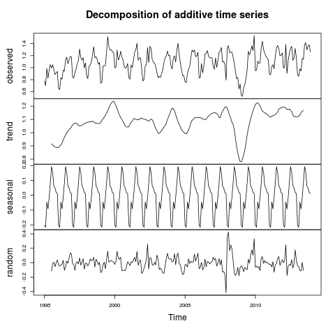
The percent of UK house sales that were made in Greater London between 1995 and 2014 and inferences around the overall trend and seasonality
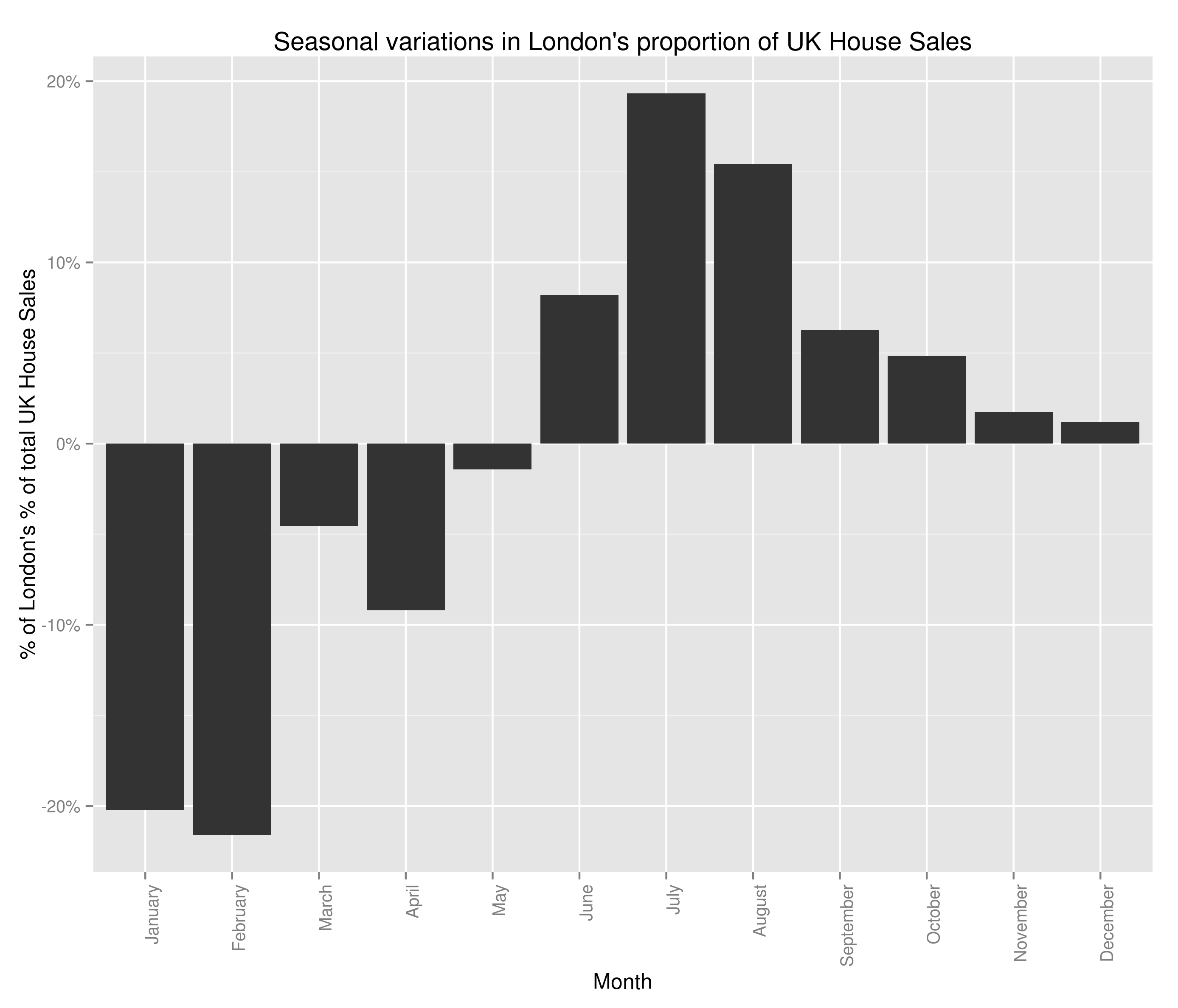
and the bit we were after:
Well, I don’t really know if that’s good news or bad. It’s good in the fact that we thought to check the factors behind seasonal variations in house price. It’s bad because I can no longer advise people to buy houses in the winter (I’ve checked and there’s a seasonal variation for every region I tried). In all honesty, I think the two graphs above are really interesting. I’m saying that the housing crash effected London more strongly than the rest of the country, but that the market in London bounced back within a year and is now above pre-crash levels. The size of the seasonal variations is pretty marked as well, with 20% swings either way from London’s mean value of percent of total house sales (sorry if the language seems verbose – I’m being careful to be precise).
What does this mean for our investigation into the seasonality of the average house price? Well, I’m confident that the average house price is seasonal but I’m also confident that we can’t use that to advise people when they should be selling their house (just yet).
There are a couple of pieces of analysis I’d now like to do on this data. I think it’d be really interesting to get an idea of the ‘most-sold’ house in the UK since 1995. I also think there may be surprises around the correlation between the number of times a house is sold and its selling price. However, this seasonality by region is also really interesting and I think I’d like to try to cluster regions based on the seasonality of their housing market. It’d be interesting to graph the clusters and see if the divide is North/South, City/Country or something else entirely. Additionally, the (G.C.S.E) economist in me is screaming out for the same investigation as above but with total sale price instead of number sold.


