Hi all,
A reasonably big part of the job I do involves running AB tests and I think that’s usually something that falls under the remit of data scientists. Now I could go on and on about the difficulties around tagging tests, choosing test groups, choosing goals and the like. I won’t, but I’ll make at least one point. All of the aforementioned points are very important and are very non-trivial. If you don’t absolutely understand all of the steps a user might take, and how your test will handle these, work a bit harder on that. And outsourcing this problem to your AB testing framework provider…well, I’d not advise it.
Anyway, I recently read this blog post by the engineers over at Lyst and thought it was a really interesting idea. I’m really not a fan of p-values and think that a probability distribution is a much nicer way of communicating a result. With that in mind, the basic logic behind Lyst’s post (if you’ve not got the time/inclination to read it):
1.) You presumably have a reasonable idea about the distribution of whatever metric you’re plotting – for instance, you’re reasonably confident conversion % lies somewhere between 0 and 25% with the most likely value to be around 15% (as an example). You assume both test groups follow this distribution until you start getting data in to corroborate/contradict that.
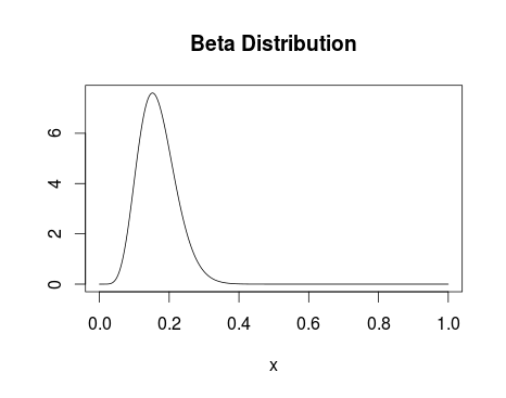
Beta Distribution with alpha parameter 8 and beta parameter 40.
2.) On getting data in, you update your distribution to take into account these new data points – the distributions evolve with the new data.
3.) Your end result (see below) gives you a probability distribution for the conversion of both test groups.
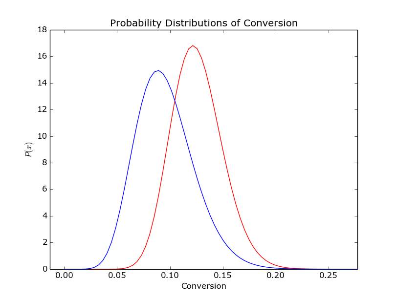
The distribution of conversion for two (randomly generated) test datasets
I’d argue the above picture is much clearer than even the best explained set of p-values. It also really clearly lends itself to calculations along the lines of ‘What is the probability that test group A is better than test group B?’ or ‘how sure are you that test group A is 2% better than test group B?’
Enamoured with this new way of reporting test results, I figured I mayerswell build something to do so. Instead of writing something where the test set-up is tied in with the result plotter I wrote my plotter to take input from stdin.
First things first then, I want something to generate a stream of conversion events:
import random
import time

for _ in range(2000):
    group = 'test' if random.random() > 0.3 else 'control'
    if group == 'test':
        convert = 1 if random.random() < 0.16 else 0
    else:
        convert = 1 if random.random() < 0.10 else 0
    print '%s:%d' % (group, convert)
Easy does it – we’ll look at varying those numbers later. For the uninitiated, that’ll give us fairly uneven test groups with reasonably different conversion percentages.
Now for the plotter. I’ll confess, this is still a work in progress. It currently doesn’t assume anything about the test groups, including the names (taking those from the input stream). However, in future I’m hoping to extend the program to be able to perform multivariate Bayesian AB tests. If it appears messy in places, that’s either because I’m expecting the poor coding practices to lead to me having an easier time extending the code to allow multivariate testing, or because I’m a messy coder.
At this point, massive props to this book: it forms the basis of almost all of this code.
import pymc as pm
import numpy as np
from matplotlib import pyplot as plt
import sys

results_dictionary = {}

## Store all our test results in memory - doesn't allow real-time updating and could get a bit serious if we've got a big set of results
for line in sys.stdin:
    if line == '':
        break
    group, conversion = line.strip().split(':')
    try:
        results_dictionary[group].append(int(conversion))
    except:
        results_dictionary[group] = [int(conversion)]

test_group_a, test_group_b = results_dictionary.keys()

## We'll run this twice, once with uniform prior and once with a beta prior
prior_dict = dict((group, pm.Uniform(group, 0, 1)) for group in results_dictionary.keys())
prior_dict_beta = dict((group, pm.Beta(group, 3, 50)) for group in results_dictionary.keys())

@pm.deterministic
def delta(p_A = prior_dict[test_group_a], p_B = prior_dict[test_group_b]):
    return p_A - p_B

@pm.deterministic
def beta_delta(p_A = prior_dict_beta[test_group_a], p_B = prior_dict_beta[test_group_b]):
    return p_A - p_B

## Bernoulli distribution with the events we've got
observations = dict((group, pm.Bernoulli('obs_%s' % str(group), prior_dict[group], value=events, observed=True)) for group, events in results_dictionary.items())
beta_observations = dict((group, pm.Bernoulli('obs_%s' % str(group), prior_dict_beta[group], value=events, observed=True)) for group, events in results_dictionary.items())

## Markov chain Monte-Carlo methods - returning samples from our updated distributions
mcmc = pm.MCMC([prior_dict[test_group_a], prior_dict[test_group_b], delta, observations[test_group_a], observations[test_group_b]])
mcmc_beta = pm.MCMC([prior_dict_beta[test_group_a], prior_dict_beta[test_group_b], beta_delta, observations[test_group_a], observations[test_group_b]])
mcmc.sample(20000,1000)
mcmc_beta.sample(20000,1000)

## Grab all the samples we need
samples = dict((key, mcmc.trace(key)[:]) for key in results_dictionary.keys())
delta_samples = mcmc.trace('delta')[:]
beta_samples = dict((key, mcmc_beta.trace(key)[:]) for key in results_dictionary.keys())
beta_delta_samples = mcmc_beta.trace('beta_delta')[:]

## It's this easy to work out probabilities of success
prob_a_better = (delta_samples < 0).mean()
prob_a_better_beta = (beta_delta_samples < 0).mean()

### Plotting
ax = plt.subplot(321)
plt.hist(samples[test_group_a], histtype='stepfilled', bins=50, alpha=0.85, label='Uniform posterior of %s' % test_group_a, color='#A60628', normed=True)
plt.suptitle('Posterior distributions of %s, %s, and $Delta$ unknowns' % (test_group_a, test_group_b))
plt.title('Uniform posterior of %s' % test_group_a)
plt.autoscale()
#
ax = plt.subplot(323)
plt.hist(samples[test_group_b], histtype='stepfilled', bins=25, alpha=0.85, label='Uniform posterior of %s' % test_group_b, color='#A60628', normed=True)
plt.title('Uniform posterior of %s' % test_group_b)
plt.autoscale()
#
ax = plt.subplot(325)
plt.hist(delta_samples, histtype='stepfilled', bins=25, alpha=0.85, label='Uniform posterior of $Delta$', color='#A60628', normed=True)
plt.vlines(0, 0, 50, linestyle='--', color='black')
plt.title('Uniform posterior of $Delta$')
plt.autoscale()
plt.annotate('Probability %s nis greater nthan %s: %.2f' % (test_group_a, test_group_b, prob_a_better), (0,30))
#
ax = plt.subplot(322)
plt.hist(beta_samples[test_group_a], histtype='stepfilled', bins=25, alpha=0.85, label='Beta posterior of %s' % test_group_a, color='#A60628', normed=True)
plt.title('Beta posterior of %s' % test_group_a)
plt.autoscale()
#
ax = plt.subplot(324)
plt.hist(beta_samples[test_group_b], histtype='stepfilled', bins=25, alpha=0.85, label='Beta posterior of %s' % test_group_b, color='#A60628', normed=True)
plt.title('Beta posterior of %s' % test_group_b)
plt.autoscale()
#
ax = plt.subplot(326)
plt.hist(beta_delta_samples, histtype='stepfilled', bins=25, alpha=0.85, label='Beta posterior of $Delta$', color='#A60628', normed=True)
plt.vlines(0, 0, 50, linestyle='--', color='black')
plt.autoscale()
plt.annotate('Probability %s nis greater nthan %s: %.2f' % (test_group_a, test_group_b, prob_a_better_beta), (0,30))
plt.title('Beta posterior of $Delta$')
#
plt.tight_layout()
plt.show()
Giving us:
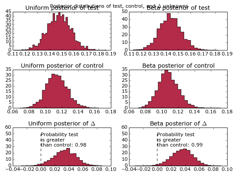
Graphs comparing the conversion of one test group against another, using a Beta distribution and a Uniform distribution as a prior.
First things first, why are there 6 graphs? Well, realistically, given that this is designed to model website conversion, I know what the distribution is likely to look like. Therefore, I say that my initial priors are beta distributions with parameters alpha = 10 and beta = 30. However, I’m well aware that naysayers might quibble with the idea of making such strong assumptions before running the test. Alongside that prior, I’ve included the completely uninformative uniform prior. That basically says that the conversion is equally likely to fall anywhere between 0 and 100%. Another reason for doing this is to show what difference it makes – when we’re looking at < 10 data points, you’ll see fairly big differences between the different prior assumptions. Increase the number of events up past 1000 and the two prior assumptions converge to the same value.
Additionally, we’ve fed in information about the test and control group – where has this delta come from and what’s it all about? That’s simply the difference between the test groups, as a probability distribution. How good is that? Really, that’s what people are interested in and, instead of making them compare two distributions and look at overlaps, we’ve done that for them and presented it as a probability distribution. Well done us.
Move along there.