Data Science, amongst other things.

Tag: python (Page 2 of 2)

Hadoop wordcount in Python

Hi all,

There’ll be a follow up post to this detailing how to run a mapreduce using Eclipse and Java but, as I’ve found myself in permissions hell in running that, I’ll go with the easy one first. Hadoop comes with a streaming jar that allows you to write your mappers and reducers in any language you like – just take input from stdin and output to stdout and you’re laughing. I’ll show you how to achieve this using Python.

Cluster Set-up

I’m going to assume you’ve followed a tutorial and have got Hadoop installed and working – if you haven’t, follow one (maybe even mine) and then come back here. Make sure you’ve got HDFS and Yarn running by executing the following commands:

su - hduser ## Only need this if you created a user called hduser to interface with Hadoop
cd /usr/local/hadoop ## If you followed the tutorial - otherwise, wherever your Hadoop home directory is
sbin/start-all.sh

Let’s see about putting a text file into HDFS for us to perform a word count on – I’m going to use The Count of Monte Cristo because it’s amazing. Honestly, get it read if you haven’t. It’s really really good. Anywho, enough fandom – this little command will download the whole book and stick it into whichever directory you happen to be in when you run the command.

 cd ~
wget -O 'count_of_monte_cristo.txt' http://www.gutenberg.org/cache/epub/1184/pg1184.txt

Now we’ve got the file in our home directory (really, it was that easy, check it out if you don’t believe me – then read the book). However, that’s not in HDFS – we need to explicitly put it there. I’m going to create a directory in HDFS called input and then put the file in there:

/usr/local/hadoop/bin/hadoop fs -mkdir /input
/usr/local/hadoop/bin/hadoop fs -put ~/count_of_monte_cristo.txt /input

Has it worked?

Run this command:

 /usr/local/hadoop/bin/hadoop fs -ls /input | grep count_of_monte_cristo | awk -F '/' '{print $3}' | cut -d '.' -f1 

If it returns a warning followed by ‘count_of_monte_cristo’ then you’re in the money. If you don’t understand the commands above, don’t worry. But do find out about them.

Otherwise, drop me a comment and I’ll see what can be done.

The Mapper

With this bit of code we’re going to go over every line in the text file and output the word and the number of instances of that word (one, for now) – easy does it:

#!/usr/bin/python

import sys

for line in sys.stdin:
    for word in line.strip().split():
        print "%st%d" % (word, 1)

Save that file as something sensible at a sensible location – I’m going to use /home/hduser/word_mapper.py.
Also, make sure it’s executable:

chmod +x /home/hduser/word_mapper.py

Has it worked?
Run this little beaut’ of a command:

 /usr/local/hadoop/bin/hadoop fs -cat /input/count_of_monte_cristo.txt | /home/hduser/word_mapper.py 

If you’ve gone maverick and used a different filename or file location then that’s fine – just substitute that in where I’ve used

/home/hduser/word_mapper.py

. If you’ve gone maverick but don’t really know what you’re doing and don’t know what I’ve just said, that’s basically on you. Keep trooping on, you’ll get there.

Either way, don’t stop until that code outputs a stream of words followed by the number 1. Don’t worry – you can stop it by pressing Ctrl and C together.

The Reducer

We’ve got ourselves a nice stream of words. The Hadoop streaming jar will take care of the sorting for us (though we can override the default behaviour should we choose) so we just need to decide what to do with that stream of words. I’m going to propose this:

#!/usr/bin/python

import sys

current_word = None
current_count = 1

for line in sys.stdin:
    word, count = line.strip().split('t')
    if current_word:
        if word == current_word:
            current_count += int(count)
        else:
            print "%st%d" % (current_word, current_count)
            current_count = 1

    current_word = word

if current_count > 1:
    print "%st%d" % (current_word, current_count)

Follow the code through and try to think of the different cases it’s trying to catch. The first and last lines are tricky but play around with it – what happens if I just feed a file containing one word? What about a file with no duplicate words? Think about all the different cases and hopefully – the above code handles them all as you’d expect. If not, please let me know. That’d be real embarrassing.

Has it worked?

Make sure that file is executable:

 chmod +x /home/hduser/word_reducer.py 

Run this:

 /usr/local/hadoop/bin/hadoop fs -cat /input/count_of_monte_cristo.txt | /home/hduser/word_mapper.py | head -n 100 | sort | /home/hduser/word_reducer.py 

If everything’s gone to plan you should see a bunch of lines and associated counts – some of them should be non-one.

Super.

Run the Mapreduce

This is what you’ve been waiting for. Well – it’s what I’ve been waiting for at least. Run this command and you’ll basically be a Hadoop hero:

 cd /usr/local/hadoop
bin/hadoop jar share/hadoop/tools/lib/hadoop-streaming-2.4.0.jar -files /home/hduser/word_mapper.py,/home/hduser/word_reducer.py -mapper /home/hduser/word_mapper.py -reducer /home/hduser/word_reducer.py -input /input/count_of_monte_cristo.txt -output /output

And off it goes – enjoy watching your mapreduce race through at what I’m sure is a barely tolerable crawl.

Has it worked?

Run this beauty:

 /usr/local/hadoop/bin/hadoop fs -cat /output/part-00000 

If you see a stream of likely looking results – you’re golden. If you want to get the file out of HDFS for inspection run something like this:

 /usr/local/hadoop/bin/hadoop fs -get /output/part-00000 /home/hduser/monte_cristo_counted.txt
less /home/hduser/monte_cristo_counted.txt 

Hope that’s worked well for you – it’s not the most glamorous of Hadoop jobs but it’s a good stepping stone. In a post coming to you soon I should be able to show you how to get Eclipse set up to run Hadoop jobs and give you an example or two in Java.

(Pseudo) Distributed Wishes
Estimating Pi using the Monte Carlo Method in Python

Hi all,

If you were especially upset then I’m sorry it’s been a while since I posted – I discovered Game of Thrones. In a later post I’ll chart the effect of Game of Thrones on overall productivity. I think there’ll be some unsurprising results. Anyway, I spend a reasonable amount of time on the train with my (oft abused) laptop each morning/evening; I don’t have the internet and I don’t have any textbooks so it’s basically a question of what I can work on given only the documentation on my computer and whatever I can remember about programming/maths/stuff.

I was having a think and remembered that you could estimate Pi using a Monte Carlo method and thought like that sounded like the sort of thing I should do. The logic is basically as follows:

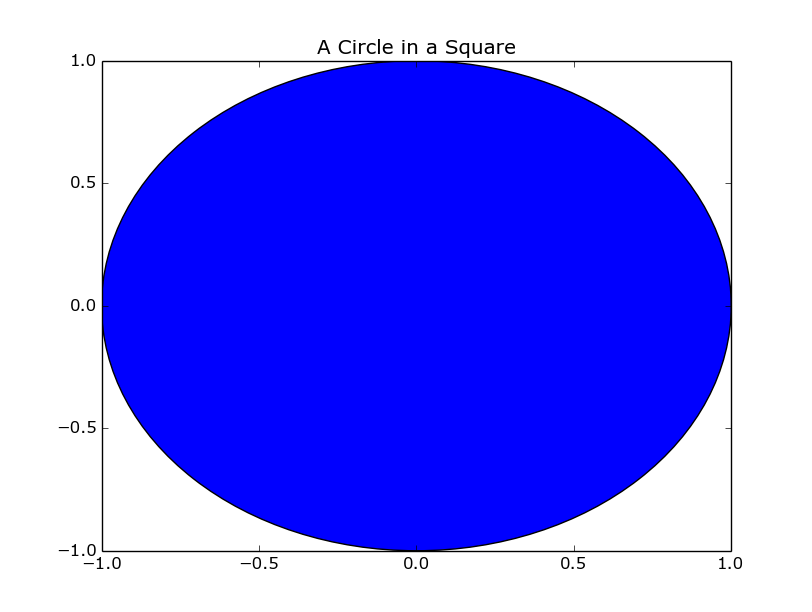
Let’s draw a square of side length 2r and a circle centred exactly in the middle of the square with radius r. A well organised blogger would show you a diagram of this set-up, screw it, this is the code to do it and this is what it looks like:

import matplotlib.pyplot as plt
fig = plt.figure()
axis = fig.add_subplot(1,1,1)
circle = plt.Circle((0,0), 1)
axis.add_patch(circle)
axis.set_xlim([-1,1])
axis.set_ylim([-1,1])
axis.set_title('A Circle in a Square')
plt.show()
A Circle in a Square

A Circle in a Square

Brilliant – was it worth it? Probably not. But there you have it – with that set up we can now start the Monte Carlo bit. We’ll throw darts at that picture randomly; you’d expect the number of darts in the circle to be proportional to the area of the circle and the number of darts in the square to be proportional to the area of the square. Using that fact and the formulae for the areas of a circle and a square you can estimate Pi using the ratio of darts in the circle and in the square.

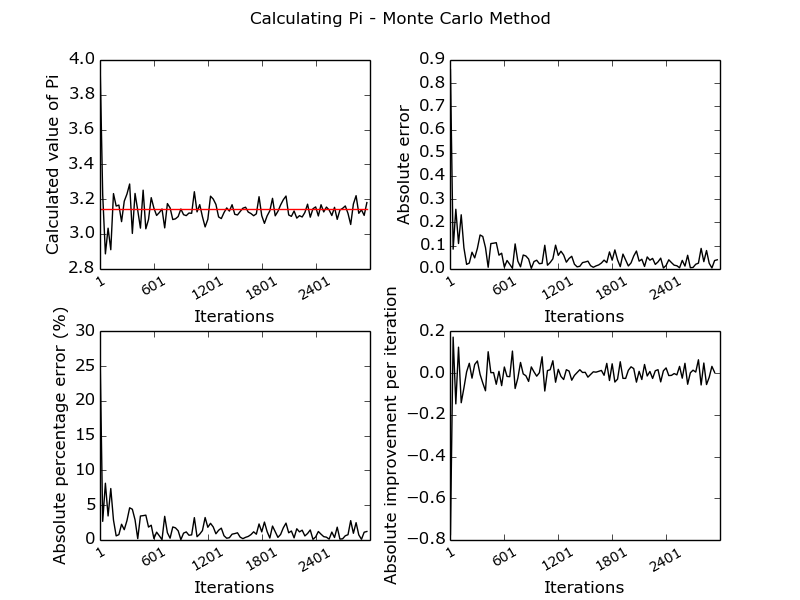
Sound good? It’s fairly easy to run this in Python and graph the output using Matplotlib. You’ll see I’ve used Object Oriented Python for this particular exercise, I don’t really know why. Especially because I had a chance to use inheritance and didn’t. Well done me. I’ve let everybody down. Anyway – this is the code I came up with and the graph below shows what I ended up with:

#!/usr/bin/python

import numpy as np
import math
import matplotlib.pyplot as plt

"""
Calculate pi using Monte-Carlo Simulation
"""

"""
First - the maths:
A circle has area Pi*r^2
A square wholly enclosing above circle has area 4r^2
If we randomly generate points in that square we'd expect the ratio of points in the square/points in the circle to equal the area of the square divided by the circle.
By that logic n_in_sq/n_in_cir = 4/Pi and so Pi = (4 * n_in_cir)/n_in_sq
"""

class pi_calculator(object):

    def __init__(self, radius, iterations):
        self.radius = radius
        self.iterations = iterations
        self.square = square(radius)
        self.circle = circle(radius)

    def scatter_points(self):
        for _ in range(self.iterations):
            point_x, point_y = ((2*self.radius) * np.random.random_sample(2)) - self.radius
            self.square.increment_point_count(point_x, point_y)
            self.circle.increment_point_count(point_x, point_y)

    def return_pi(self):
        return (4.0*self.circle.return_point_count())/self.square.return_point_count()

    def calculate_accuracy(self, calc_pi):
        absolute_error = math.pi - calc_pi
        percent_error = 100*(math.pi - calc_pi)/math.pi
        return (absolute_error, percent_error)

    def return_iterations(self):
        return self.iterations

class square(object):

    def __init__(self, radius):
        self.radius = radius
        self.lower_x = -radius
        self.lower_y = -radius
        self.upper_x = radius
        self.upper_y = radius
        self.point_count = 0


    def in_square(self, point_x, point_y):
        return (self.upper_x > point_x > self.lower_x) and (self.upper_y > point_y > self.lower_y)


    def increment_point_count(self, point_x, point_y, increment = 1):
        if self.in_square(point_x, point_y):
            self.point_count += increment

    def return_point_count(self):
        return self.point_count

class circle(object):

    def __init__(self, radius):
        self.radius = radius
        self.point_count = 0

    def in_circle(self, point_x, point_y):
        return point_x**2 + point_y**2 < self.radius**2

    def increment_point_count(self, point_x, point_y, increment=1):
        if self.in_circle(point_x, point_y):
            self.point_count += increment

    def return_point_count(self):
        return self.point_count


if __name__ == '__main__':
    axis_values = []
    pi_values = []
    absolute_error_values = []
    percent_error_values = []
    for _ in range(1,3000,30):
        pi_calc = pi_calculator(1, _)
        pi_calc.scatter_points()
        print "Number of iterations: %d    Accuracy: %.5f" % (pi_calc.return_iterations(), math.fabs(pi_calc.calculate_accuracy(pi_calc.return_pi())[0]))
        axis_values.append(_)
        pi_values.append(pi_calc.return_pi())
        absolute_error_values.append(math.fabs(pi_calc.calculate_accuracy(pi_calc.return_pi())[0]))
        percent_error_values.append(math.fabs(pi_calc.calculate_accuracy(pi_calc.return_pi())[1]))

    improvement_per_iteration = [absolute_error_values[index] - absolute_error_values[index-1] for index, value in enumerate(absolute_error_values) if index > 0]
    fig = plt.figure()
    fig.suptitle('Calculating Pi - Monte Carlo Method')
    ax1 = fig.add_subplot(2,2,1)
    ax2 = fig.add_subplot(2,2,2)
    ax3 = fig.add_subplot(2,2,3)
    ax4 = fig.add_subplot(2,2,4)
    plt.subplots_adjust(wspace=0.3, hspace=0.3)
    ax1.set_xticklabels([str(entry) for entry in axis_values[::len(axis_values)/5]], rotation=30, fontsize='small')
    ax1.set_xlabel('Iterations')
    ax1.set_ylabel('Calculated value of Pi')
    ax1.plot(pi_values, 'k')
    ax1.plot([math.pi for entry in axis_values], 'r')
    ax2.set_ylabel('Absolute error')
    ax2.set_xticklabels([str(entry) for entry in axis_values[::len(axis_values)/5]], rotation=30, fontsize='small')
    ax2.set_xlabel('Iterations')
    ax2.plot(absolute_error_values, 'k', label="Total Error")
    ax3.set_ylabel('Absolute percentage error (%)')
    ax3.set_xticklabels([str(entry) for entry in axis_values[::len(axis_values)/5]], rotation=30, fontsize='small')
    ax3.set_xlabel('Iterations')
    ax3.plot(percent_error_values, 'k', label="Percent Error")
    ax4.set_ylabel('Absolute improvement per iteration')
    ax4.set_xticklabels([str(entry) for entry in axis_values[::len(axis_values)/5]], rotation=30, fontsize='small')
    ax4.set_xlabel('Iterations')
    ax4.plot(improvement_per_iteration, 'k', label="Absolute change")
    plt.savefig('pi_calculation.png')
    plt.show()


giving us:

Monte Carlo estimation of Pi - an Investigation

Monte Carlo estimation of Pi – an Investigation

I can only apologise for any dodgy code in there – in my defence, it was early in the morning. As you can see, it only takes around 100 ‘darts thrown at the board’ to start to see a reasonable value for Pi. I ran it up to about 10,000 iterations without hitting any significant calculation time. The fourth graph doesn’t really show anything interesting – I just couldn’t think of anything to put there.

That’ll do for now – I built something that’ll stream tweets on the Scottish Independence Referendum but don’t know what to do with it yet; there’ll likely be some sort of blog post. There’s a chance I’ll do some sentiment analysis but I’m not sure yet.

When you play the Game of Thrones, you win or you die.

UK Housing Data – Data Munging for Machine Learning

Hey all,

I’ve been tentatively threatening to write this post for a while now and I’ve been itching to do a bit of machine learning – I’m going to be walking through the steps required to run linear regression and an SVM on our housing sale data to try to predict future house sale prices. I’m not overly confident that it’s going to give us a huge deal of predictive power – any example I see online uses useful things like area of house or number of bedrooms. All I’ve got is when you sold it, where you sold it and the type of house (new or old, detached or terraced, freehold or leasehold) e.t.c. Not to worry – it’ll be a blast all the same.

First things first, which machine learning technique should we use? We’ll be using a supervised algorithm as we have a labelled training set (we can tell our classifier what the right answer is). We’re looking at a regression problem, not a classification problem (we’ve trying to predict a continuous variable, not a discrete one). All in all, that’s screaming linear regression to me. As an additional bonus though, I also happen to know that SVMs work very well for this kind of problem and have used Libsvm for similar things in the past.

In terms of the bits of kit I’ll be using – let’s start off, as I always seem to, in bash.

cut -d ',' -f3- pp-all.csv | cut -d ',' -f1-13 | tr -d '"' > pp_all_for_weka.txt 

Just a bit of formatting but, if you’ve followed the posts through then you’ll have pp-all.csv on your computer. If you’ve not see here for how to get it.

Now we’re here, you may notice the strange filename – Weka is a machine learning library for Java. We’ve been using it a bit at work recently and I fancied getting a bit more experience of it. I’ll be using Weka for the linear regression; I’ve not got the heart to do a Weka installation post just yet (it’s not difficult, I’m just tired) but will do one if there’s any demand. I’m going to be using LibSVM for my support vector machine calculations and again, not going to talk you through the install unless you fancy it. The reason I’ve told you about that is because I’m now going to convert my CSV file into an ARFF file and a libsvm formatted file. While I’m at it, I’m going to convert all of my values (postcodes, dates e.t.c.) into numbers. Doing this allows me to very easily feed this data set into the above programs and get an answer out relatively easily.

Could we write the algorithms ourselves? Sure – but not nearly as well as they’ve already been written. Sidebar: if you’re interested in understanding how all these algorithms work I’d encourage you to check out Andrew Ng’s lecture series on Coursera. It’s excellent.

Anyway, to run the conversion and to output the two different files I wrote the following Python script:

#!/usr/bin/python

class mapping_dictionary(object):

    def __init__(self, output_file, svm_file):
        self.mapping = {}
        self.mapping_count = {}
        self.column_names = ['date', 'postcode', 'f_map', 'n_map', 'l_map', 'addy', 'addy1', 'addy2', 'addy3', 'addy4', 'addy5', 'addy6', 'price']
        self.writer_file = open(output_file, 'w')
        self.svm_file = open(svm_file, 'w')

    def shut_file(self):
        self.writer_file.close()
        self.svm_file.close()

    def add_to_dictionary(self, column, key):
        if column not in self.mapping:
            self.mapping[column] = {}
            self.mapping_count[column] = 0
        if key not in self.mapping[column]:
            self.mapping[column][key] = self.mapping_count[column]
            self.mapping_count[column] += 1

    def interpret_list(self, listy):
        if len(listy) != len(self.column_names):
            print "Error - unexpected number of columns in the line: %d" % len(listy)
            return None
        for index, value in enumerate(listy):
            if index == 12:
                try:
                    value = int(value.strip().strip('n'))
                except:
                    break
            self.add_to_dictionary(self.column_names[index], value)
        self.write_to_file(listy)
        self.write_libsvm_file(listy)

    def write_to_file(self, listy):
        string_to_write = ','.join([str(self.mapping[self.column_names[index]][entry]) for index, entry in enumerate(listy) if index != 12])
        string_to_write += ",%sn" % str(listy[-1])
        self.writer_file.write(string_to_write)

    def write_libsvm_file(self, listy):
        string_to_write = ' '.join([str(index + 1) + ":" + str(self.mapping[self.column_names[index]][entry]) for index, entry in enumerate(listy) if index != 12])
        string_to_write = str(listy[-1]) + " " + string_to_write + "n"
        self.svm_file.write(string_to_write)

mapping = mapping_dictionary('nice_weka_output.txt', 'nice_libsvm_output.txt')
with open('pp_for_weka.txt', 'rb') as f:
    while True:
        line = f.next()
        mapping.interpret_list(line.strip().strip('n').split(','))
    mapping.shut_file()

A reasonable amount of Python happening there – if you were worrying about it, I really wouldn’t. All we’re doing is replacing every field (apart from price) with an integer and outputting that in two different formats as we work our way through the file. If I was being thorough I’d remove the hardcoded list at the top, require a header row, take the filenames as command line arguments and then it’d work as a general tool for formatting CSVs as libsvm and arff files. Actually, that doesn’t sound like a bad idea at all.

Now you’ve got your input files, it’s child’s play to run our algorithms to create models that we can pass new data to. I’ll create a separate post detailing the output of the above two classifiers but it looks like I’ll have to leave them running through the night!

Until then.

Markov Clustering – What is it and why use it?

Hi all,

Bit of a different blog coming up – in a previous post I used Markov Clustering and said I’d write a follow-up post on what it was and why you might want to use it. Well, here I am. And here you are. So let’s begin:

In the simplest explanation, imagine an island. The island is connected to a whole bunch of other islands by bridges. The bridges are made out of bricks. Nothing nasty so far – apart from the leader of all the islands. They’re a ‘man versus superman’, ‘survival of the fittest’ sort and so one day the issue a proclamation. “Every day a brick will be taken from every bridge connected to your island and the bricks will be reapportioned on your island back to the bridges, in proportion to the remaining number of bricks in the bridge.”

At first, nobody is especially worried – each day, a brick disappears and then reappears on a different bridge on the island. Some of the islands notice some bridges getting three or four bricks back each day. Some hardly ever seem to see a brick added back to their bridge. Can you see where this will lead in 1000 years? In time, some of the bridges (the smallest ones to start off with) fall apart and end up with no bricks at all. If this is the only way between two islands, these islands become cut off entirely from each other.

This is basically Markov clustering.

For a more mathematical explanation:

Let’s start with a (transition) matrix:

import numpy as np
transition_matrix = np.matrix([[0,0.97,0.5],[0.2,0,0.5],[0.8,0.03,0]])

Transition Matrix = begin{matrix}  0 & 0.97 & 0.5 \  0.2 & 0 & 0.5 \  0.8 & 0.03 & 0  end{matrix}

In the above ‘islands’ picture those numbers represent the number of bricks in the bridges between islands A, B and C. In the random-walk interpretation, those are the probabilities that you’ll end up at each node as the number of random walks tends to infinity. In my previous post on house prices, I used a correlation matrix.

First things first – I’m going to stick a one in each of the identity areas. If you’re interested in why that is, have a read around self-loops and, even better, try this out both with and without self-loops. It sort of fits in nicely with the above islands picture but that’s more of a fluke than anything else – there’s always the strongest bridge possible between an island and itself. The land. Anyway…

np.fill_diagonal(transition_matrix, 1)

Transition Matrix = begin{matrix}  1 & 0.97 & 0.5 \  0.2 & 1 & 0.5 \  0.8 & 0.03 & 1  end{matrix}

Now let’s normalize – make sure each column sums to 1:

transition_matrix = transition_matrix/np.sum(transition_matrix, axis=0)

Transition Matrix = begin{matrix}  0.5 & 0.485 & 0.25 \  0.1 & 0.5 & 0.25 \  0.4 & 0.015 & 0.5  end{matrix}

Now we perform an expansion step – that is, we raise the matrix to a power (I’ll use two – you can change this parameter – in the ‘random-walk’ picture this can be thought of as varying how far a person can walk from their original island).

transition_matrix = np.linalg.matrix_power(transition_matrix, 2)

Expanded Matrix = begin{matrix}  0.3985 & 0.48875 & 0.37125 \  0.2 & 0.30225 & 0.275 \  0.4015 & 0.209 & 0.35375  end{matrix}

Then we perform the inflation step – This involves multiplying each element in the matrix by itself (to a power) and then normalizing on column again. Again, I’ll be using two as a power – increasing this leads to a greater number of smaller clusters:

for entry in np.nditer(transition_matrix, op_flags=['readwrite']):
    entry[...] = entry ** 2

Inflated Matrix = begin{matrix}  0.15880225 & 0.23887556 & 0.13782656 \  0.04 & 0.09135506 & 0.075625 \  0.16120225 & 0.043681 & 0.12513906  end{matrix}

Finally (for this iteration) – we’ll normalize by row.

transition_matrix = transition_matrix/np.sum(transition_matrix, axis=0)

Normalized Matrix = begin{matrix}  0.44111185 & 0.63885664 & 0.40705959 \  0.11110972 & 0.24432195 & 0.22335232 \  0.44777843 & 0.11682141 & 0.36958809  end{matrix}

And it’s basically that simple. Now all we need to do is rinse and repeat the expansion, inflation and normalization until we hit a stable(ish) solution i.e.

Normalized Matrix_{n+1} - Normalized Matrix_n < epsilon
for some small epsilon.

Once we’ve done this (with this particular matrix) we should see something like this:

Final Matrix = begin{matrix}  1 & 1 & 1 \  0 & 0 & 0 \  0 & 0 & 0  end{matrix}

Doesn’t look like a brilliant result be we only started with a tiny matrix. In this case we have all three nodes belonging to one cluster. The first node (the first row) is the ‘attractor’ – as it has values in its row it is attracting itself and the second and third row (the columns). If we were to end up with the following result (from a given initial matrix):

Final Matrix = begin{matrix}  1 & 0 & 1 & 0 & 0\  0 & 1 & 0 & 1 & 0\  0 & 0 & 0 & 0 & 0\  0 & 0 & 0 & 0 & 0\  0 & 0 & 0 & 0 & 1\  end{matrix}

This basically says that we have three clusters {1,3} (with 1 as the attractor), {2,4} (with 2 as the attractor) and {5} on its lonesome.

Instead of letting you piece all that together here’s the code for Markov Clustering in Python:

import numpy as np
import math
## How far you'd like your random-walkers to go (bigger number -> more walking)
EXPANSION_POWER = 2
## How tightly clustered you'd like your final picture to be (bigger number -> more clusters)
INFLATION_POWER = 2
## If you can manage 100 iterations then do so - otherwise, check you've hit a stable end-point.
ITERATION_COUNT = 100
def normalize(matrix):
    return matrix/np.sum(matrix, axis=0)

def expand(matrix, power)
    return np.linalg.matrix_power(matrix, power)

def inflate(matrix, power):
    for entry in np.nditer(transition_matrix, op_flags=['readwrite']):
        entry[...] = math.pow(entry, power)
    return matrix

def run(matrix):
    np.fill_diagonal(matrix, 1)
    matrix = normalize(matrix)
    for _ in range(ITERATION_COUNT):
        matrix = normalize(inflate(expand(matrix, EXPANSION_POWER), INFLATION_POWER))
    return matrix

If you were in the mood to improve it you could write something that’d check for convergence for you and terminate once you’d achieved a stable solution. You could also write a function to perform the cluster interpretation for you.

As you were.

Stock Prices and Python – Pandas to the rescue

Hi all,

Today I fancy a bit of a play around with stock prices – I recently took the plunge into the world of stocks & shares and have been getting more and more interested in the financial world as I’ve become more and more exposed to it through savings. I’m a bit sceptical as to being able to find anything ‘new’ or any real arbitrage opportunities – mostly because there’s a billion (trillion?) dollar industry built off of the back of stock trading. It attracts some really smart people with some really powerful gear and a whole lot of money to invest. However, there’s no harm in having a look around and seeing what interesting things we can do with the data.

R is well good but I want a bit more freedom with this little project and I’m missing Python. I find that with R, I spend a lot of my time getting data into the right format to be able to use the tools that already exist. With Python, if I’m silly enough to decide on a strange data structure then I can. I shouldn’t, but I can.

Ordinarily I like the Python & SQL combination and tend not to rely too heavily on the ‘Python analysis stack’ of Pandas/iPython/Scipy/Matplotlib, only pulling things in when necessary. I was going to follow the same pure Python & SQL route for this project until I found an awesome little feature of Pandas – in-built Google and Yahoo stock data integration. It’s not that much work to build this sort of thing yourself but why reinvent the wheel? 🙂

So – I guess we should start with some sort of question, shall we see if we can plot some of the big tech players (AMZ, GOOGL, FB e.t.c.) against the whole tech sector. Given the recent headlines in that area it should be interesting and at least give us some ideas about future work.

As a lazy person, I’m not necessarily inclined to manually go through a list of stock symbols and decide if they’re tech or even go through a list of tech stock and type them into a text file. A quick google shows me that there’s nothing (that I could find) in the way of a regularly updated text file of what I’m after but it shouldn’t be too difficult to coax Python into doing this for me – let’s start off with the NASDAQ site.

If you have a look, you’ll see it’s fairly regular in its URL structure and the URLs are easily craftable – there’s an annoying amount of pagination but you can’t have everything. Actually, hold the phone. You can download the list as a CSV – winner winner chicken dinner.

Downloading all the company information we get a CSV with the following headers:

Symbol Name LastSale MarketCap ADR TSO IPOyear Sector Industry Summary Quote

All I’m really after for now is the sector and symbol – market cap will prove useful but basically I think I can agree we’ve hit the jackpot!

Time for the Python:

from pandas.io.data import DataReader
import pandas as pd
from datetime import datetime
import numpy as np
company_information = pd.read_csv('allcompany.csv')
mega_frame = [DataReader(company.strip(),  "yahoo", datetime(2014,1,1), datetime.now().date()) for company in company_information[company_information.Sector == 'Technology']['Symbol']]
symbol_list = [symbol for symbol in company_information[company_information.Sector == 'Technology']['Symbol']]

At this point we’ve got all the data since the start of the year on every tech stock listed on the NASDAQ, NYSE and AMEX and it’s taken us 6 lines. Note that the population of mega_frame takes a fairly long time. In retrospect, we should have filtered further

20 minutes later and I’m regretting my decision to get all of them.

Cancelled it and switched to the first 50 – will just prove concept first.

Right, now I’ve got a list containing data frames – one for each of the first 50 tech stocks. Let’s throw in a percentage change column and make sure all our data frames are of the same length to avoid problems at a later date:

mega_frame = [stock for stock in mega_frame if len(stock) == 79]
symbol_list = [symbol_list[index] for index in len(symbol_list) if len(mega_frame[i]) == 79]
for stock_index in range(len(mega_frame)):
    mega_frame[stock_index]['perc_change'] = 100*((mega_frame[stock_index]['Close'] - mega_frame[stock_index]['Open'])/mega_frame[stock_index]['Open'])
## The modal value is 79 hence 79
percentage_change_list = [stock['perc_change'] for stock in mega_frame]

Now we’re going to create a correlation matrix out of those lists to see the most strongly correlated tech stocks over that time period (and in our subset). I’m also going to look at the negatively correlated stocks – you wouldn’t expect to see a strong negative correlation for two stocks in the same sector and region but it won’t hurt to look:

correlation_matrix = np.corrcoef(percentage_change_list)
## Correlation with yourself is no big deal
for i in range(np.shape(correlation_matrix)[0]):
    for j in range(np.shape(correlation_matrix)[1]):
        if i == j:
             correlation_matrix[i][j] = 0
maximum_indices = np.argmax(correlation_matrix, axis=1)
minimum_indices = np.argmin(correlation_matrix, axis=1)
for index in range(np.shape(correlation_matrix)[0]):
    print "Stock %s is best correlated with stock %s: %.3g" % (my_list[index], my_list[maximum_indices[index]], correlation_matrix[index][maximum_indices[index]])
    print "Stock %s is worst correlated with stock %s: %.3g" % (my_list[index], my_list[minimum_indices[index]], correlation_matrix[index][minimum_indices[index]])

So there we have it (I’ll leave it to run over all the tech stocks overnight) – a fairly quick and simple way to find the most correlated tech stocks in America over a given time period.

Now this isn’t a particularly great way of doing this, as I said earlier, there are people who dedicate their lives to this. If the fancy takes me, I’ll have a look at a few of these (maximal spanning trees, stability of eigenvectors of correlation matrices e.t.c) and see what improvements we can make to our very simple model.

Average House Price Visualization using Python and Google Charts

Hi all,

Only yesterday I came across a rich store of data that I had hitherto been unaware of; namely, data.gov.uk. Giddy with joy, I perused the mountains of interesting data and thought it’d be fun to pull together a visualization based on some of it. One particular set caught my eye: all of the house sales in the UK in the last 19 years (link to the data at the bottom).

So,  the first question that sprung to mind was “How does the average house price vary by region?”

First things first, let’s calculate the average house price per locale using (only) Python:


def average_price(year):
    with open('pp-' + str(year) + '.csv', 'rb') as f:
        lines = f.readlines()[1:]
        for line in lines:
            try:
                identifier, price, date, postcode, type_of_house, new, freehold_or_leasehold, address_1, address_2, address_3, address_4, address_5, address_6, address_7, letter = line.split(',')
            except:
                continue
            try:
                data_dictionary[address_7.strip('"').lower()].append(int(price.strip('"')))
            except:
                data_dictionary[address_7.strip('"').lower()] = [int(price.strip('"'))]
        final_results = dict((key, sum(value)/float(len(value))) for key,value in data_dictionary.iteritems())
        return final_results

So, we’ve built ourselves a nice little function that’ll take the year as an input, open up the relevant data file, calculate the average house price by region and return the result in a dictionary. Easy does it.

Please note at this point that there are a million ways to do what we’ve just done ranging from sticking the raw CSV into Excel and using pivot tables, loading the data into R and performing an aggregate on the region, using Panda’s excellent data frames or in fact using a bash one-liner (a favourite of mine):
cut -d ',' -f2,14 pp-2014.csv | tr -d '"' | awk '{region[$2] += $1; region_count[$2]++;} END { for (area in region) print area"t"region[area]/region_count[area]}' .
However, I’m sticking to Python for reasons hopefully soon to become clear.

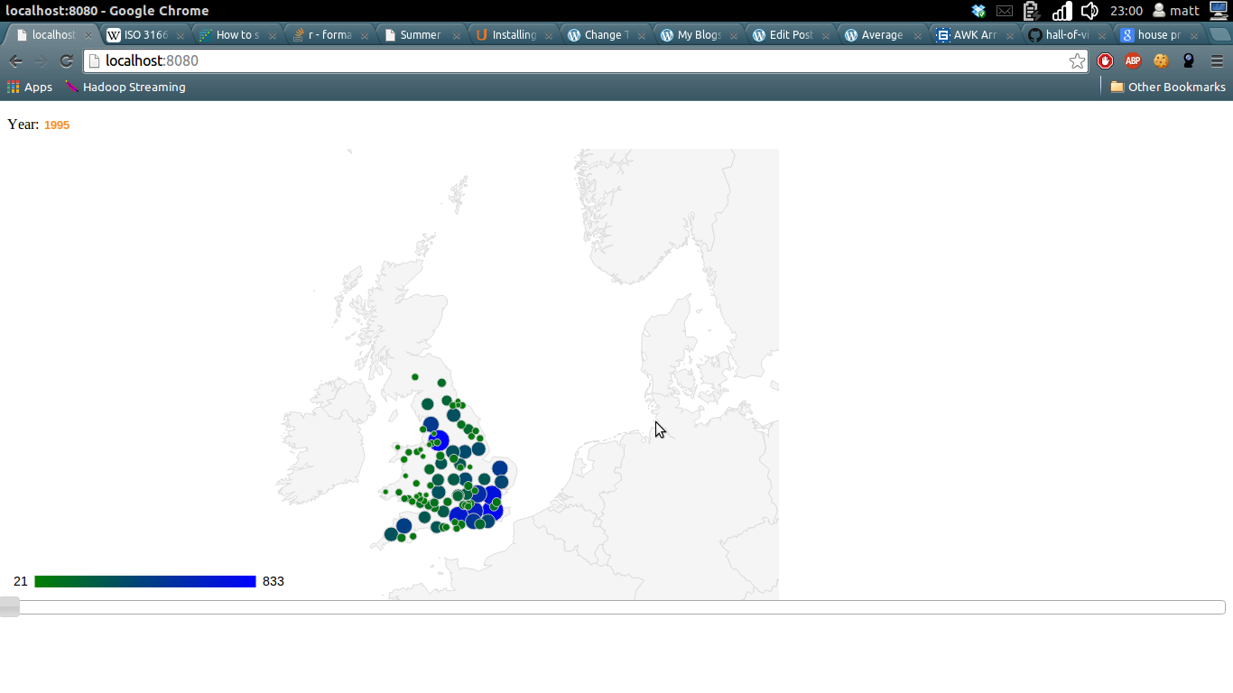
So now we can see that Stoke-on-Trent is very cheap and London is very expensive. Can we see this data changing over time?

I decided the nicest way of piecing this together was using a jQuery slider to select the year, a Google Geocharts frontend to visualize the data and then a lightweight Python web framework to hold the whole thing together. I chose web.py because I’ve used it before and think it’s great for work with AJAX and is also useful when you’ve already written your Python functions and just need something that won’t get in your way too much.

I’m not going to show all the code here but you can find my finished versions on my Github:
Back end
Front end

There are a couple of details that are contained in that code that I’ve not dealt with.

Firstly, Google Charts API doesn’t work with the place names listed in the Government data. As such, you’ll see I’ve written a little lookup function to map Government place names to ISO-3166 Codes as required by Google. There’s a bit of fuzzy matching going on here but if you navigate around in that repo, you’ll find I tested a few things and settled on a decent solution. When I can be bothered I’ll go and tidy that up by filling in the missing ISO codes manually.

Secondly, you’ll notice (if you get this running on your own computer) that the visualization is fairly slow. It runs calculations over the entire data set each time a query is run. What’s more, it then tries to render around 100 points on the Google Chart. Given that there are only a limited number of ways you’d ever want the user to be able to query the data and that the data doesn’t change day on day, you’d want to pre-aggregate the results and store them in a database somewhere.

Thirdly, you’ll note that this blog doesn’t contain the visualization. Pretty shoddy on my part, just haven’t got around to doing that yet.

That’s one of the problems with this data science malarkey, I could spend my time building my own blog platform that allows me to serve simple web apps. I could spend my time sticking in a simple database caching solution to speed up the apps on localhost. I could tidy up the fuzzy matching on the ISO codes to create an 100% correct mapping. However, it seems much more interesting to head off and see what else this data contains.

Next stop – is there a better time to buy/sell a house? Do house prices go up in certain months? I’ll try to answer that question fairly thoroughly with due consideration to statistical significance along the way.

Newer posts »

© 2024 DogDogFish

Theme by Anders NorenUp ↑